
EURO 2024 is upon us. With the hype behind the tournament reaching its peak, we take a look at the best and worst kits we’ll see in Germany this summer.
Every four years (or in this case three), Europe’s finest nations converge for what is the most hyped international tournament outside of the World Cup. Some even consider the EUROs more challenging than the global competition, as the gauntlet of European sides can be extremely hazardous.
With EURO 2024 nearly set for kickoff, just about every nation’s kit has released. As is custom around these parts, we take a look at the good (self-explanatory), the bad (decent idea, terrible execution), and the ugly (also self-explanatory).
The Good
England Away
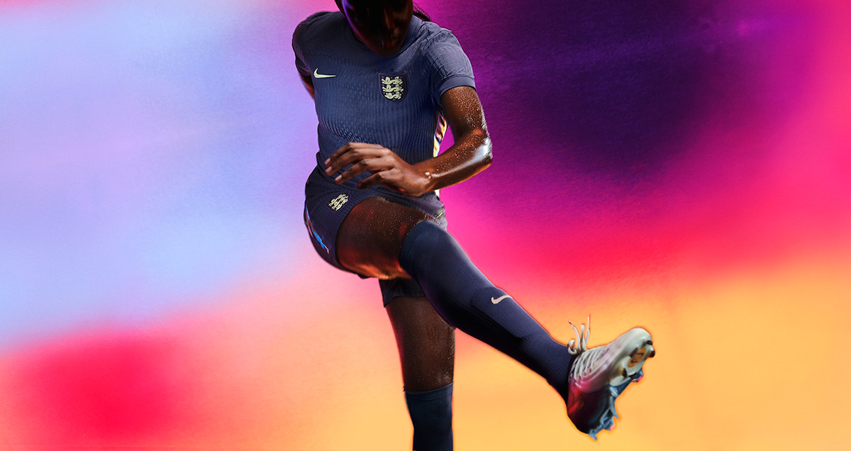
England’s away kit has arguably been the most talked about one heading into this year’s EUROs. A dark purple base, which represents a mixture of the red and blue traditionally found on England kits, is designed to show the future of the English program, one that is an immense melting pot of different cultures and backgrounds. Additionally, it features graphic side panels, giving the kits a bright, energetic feel that England kits can sometimes miss. Expect Jude Bellingham to create a moment that will live on in history in this kit.
France Home and Away
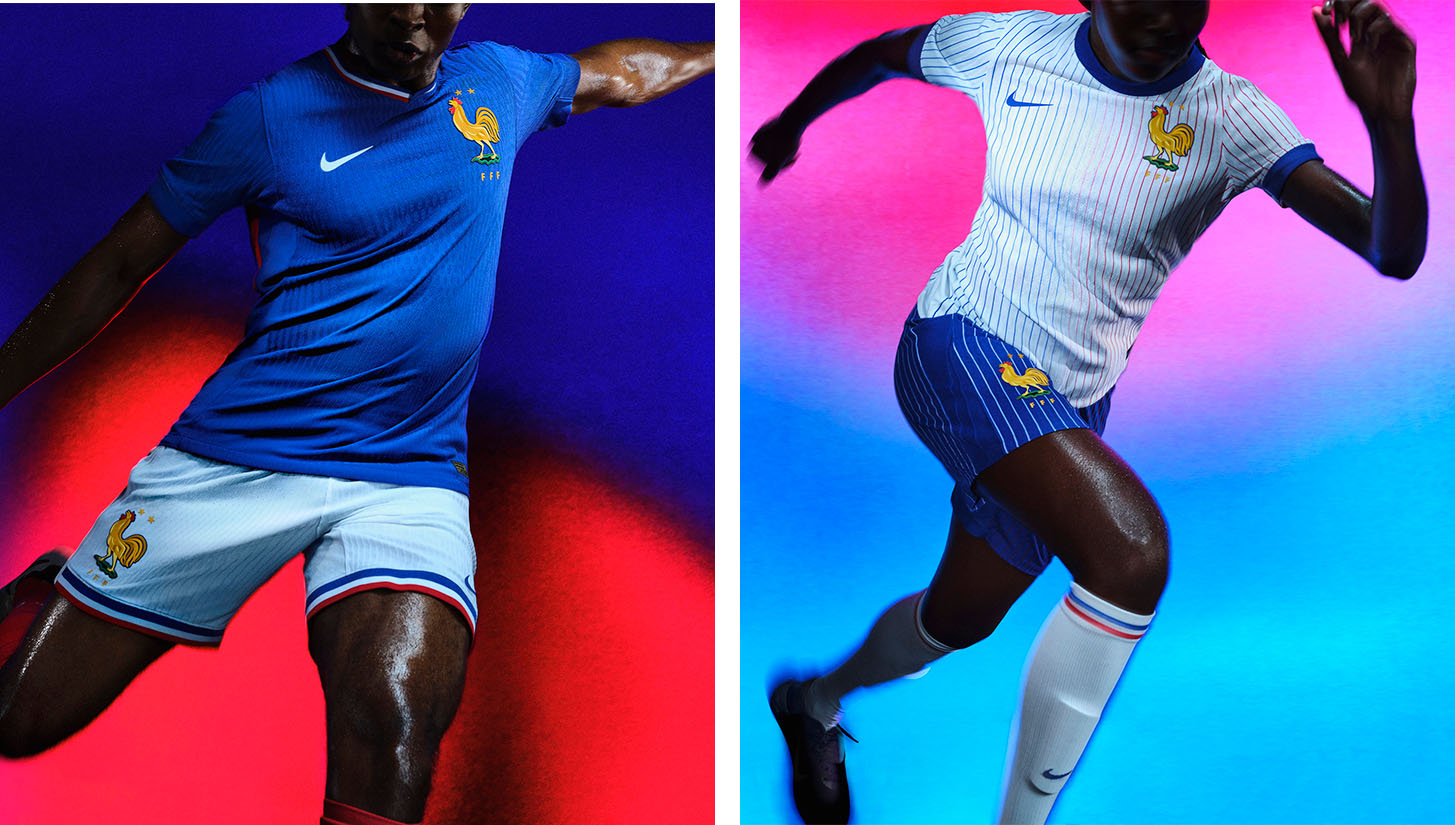
When it comes to international football kits, very few can go toe-to-toe with the French national team. In a way, it makes perfect sense. Historically, France has been home to some of the world’s most stylish footballers, from Eric Cantona to Jules Koundé.
France, unlike many other countries, doesn’t deviate much in its designs; instead, it uses conventional concepts and refines them to create kits that feel like a fresh breeze on a summer afternoon in the South of France. For the home kit, Les Bleus return to their royal blue roots after a dalliance with navy over the past few years, and add a gigantic French Rooster emblem that uses linework and a pop of green to create a new classic.
The away kit is the real piece de resistance of the collection. France and vertical stripes are undefeated, and this tricolor-inspired gradient design is no different. It actually might be the best pinstripe kit that I can think of.
If France wasn’t the favorite to win the tournament on the field based on squad depth and talent, it would still be the favorite purely through how incredible these kits are.
Germany Home
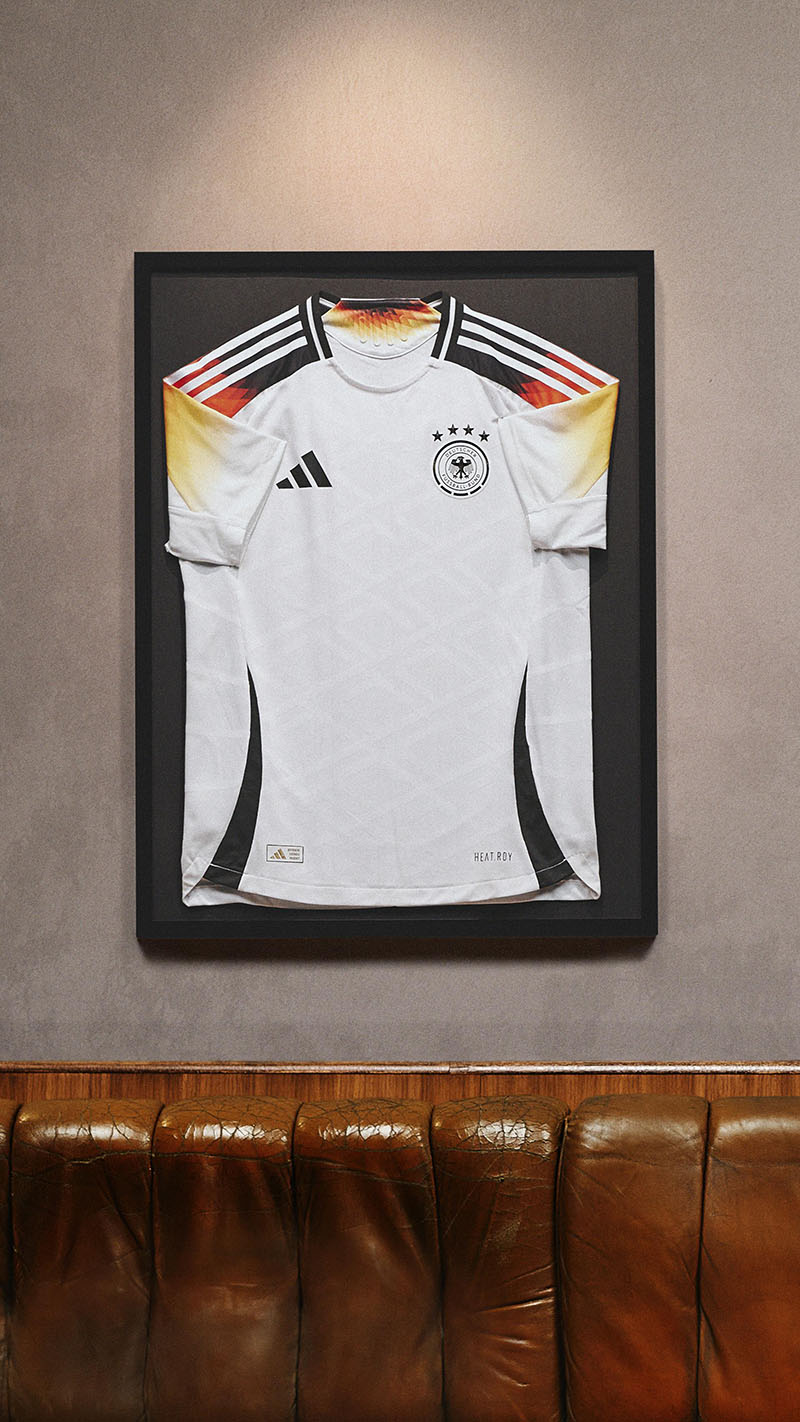
Inspired by the iconic 1994 World Cup kit, Germany’s 2024 home shirt is an excellent example of how to make a design simple yet interesting. All too often, kit designers either go minimalist or maximalist with no options in between. This German kit strikes a great balance.
Two additional details are the gradient design on the side stripe of the shorts and a minimalist all-white DFB logo sock that makes the full on-the-pitch look particularly clean. While people typically focus on the shirt, accessories can play a huge difference in the on-field aesthetic.
Portugal Away
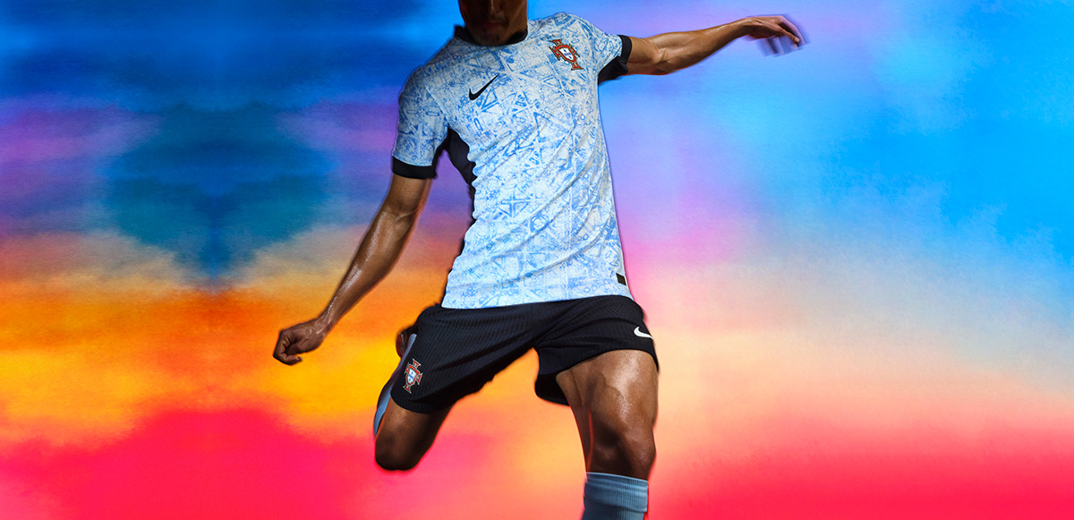
Featuring a stunning Azulejo design, the last Nike kit for Portugal (the nation is set to switch to PUMA in 2025) is undoubtedly a beauty that will catch the eye of more than just CR7 fanboys. There’s not much else to say about this kit — one look tells you all you need to know. I have no notes, just eyes that cannot look away and a wallet that is screaming “open me” repeatedly as I fight the urge to press “add to cart” 100 times.
Will this be the jersey that gives Cristiano Ronaldo a glorious send-off? There are worse kits to play your last International match in.
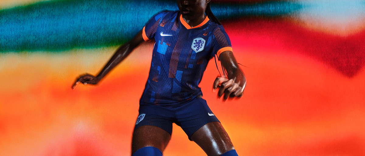
Netherlands Away
While France has already been crowned as the nation with the world’s best-dressed ballers, the Netherlands would be 1B to France’s 1A.
The Oranje have had an up-and-down history in recent years when it comes to on-field performance, but what hasn’t been inconsistent is their kits, as the unmistakable orange home shirts always look stunning. Their away kits are underrated in a sense, and my personal mission is to change that. In this iteration, the Netherlands will wear a dark blue kit with streaks and bolts of orange and lighter blue. It is distinct and will most certainly look perfect on the shoulders of Virgil Van Dijk.
The Bad
Belgium Away
It hurts me to put this here, as I love the comic series Tintin which inspired these kits. With a baby blue top and brown shorts, these kits certainly feel reminiscent of a simpler time in football. Yet, the execution feels disjointed. Now, I am not a color theorist, but the shade of brown and blue seem to clash quite aggressively. When you compare images from the comic to the kit, Tintin wears work pants in a shade closer to rust or ochre, whereas the best description for the Belgium shorts is “poop brown.”
Thankfully, if you wear just the top as a fashion piece, it is a decent kit with an old-school collar and baby blue that is accented by sandy-gold decals.
Italy
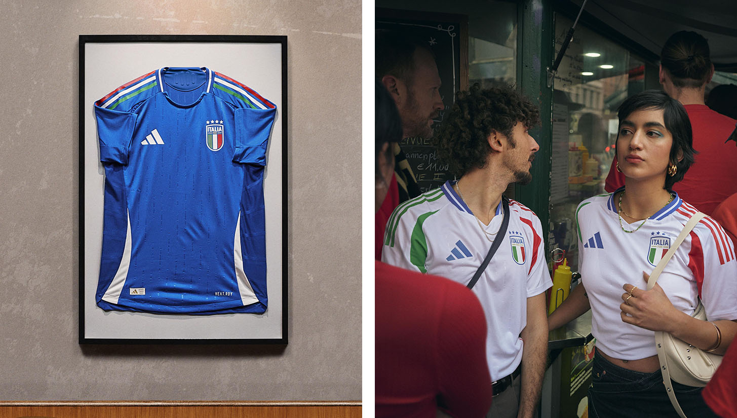
For decades, the Italian national team has worn PUMA kits. It was a piece of their heritage. Now, the Azzuri has switched to adidas, and this will be their first international tournament in the Three Stripes. Most brands would use the opportunity of signing a major team like Italy to bring out an astonishing kit that is deeply rooted in the country’s culture.
adidas, on the other hand, handed Italy a blue kit with no real features that make it Italian besides the flag. There is nothing inherently wrong with this kit, which is why it gets placed in the “Bad” section, but it leaves me wanting more. For a country with such a strong history of fashion, Italy’s kits should be at the level of France or England, not down at the bottom with the countries that get basic designs.
Scotland Home
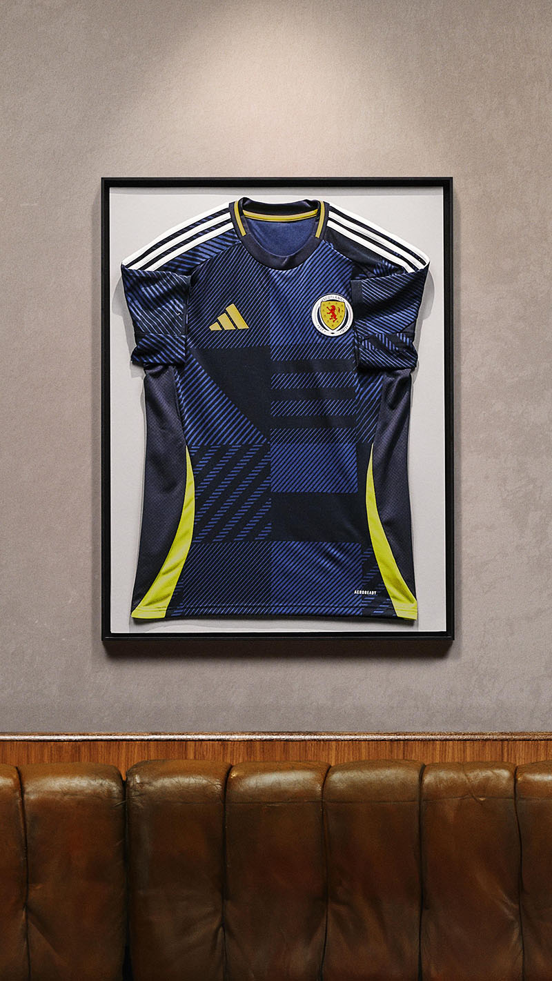
Scotland doesn’t qualify for big tournaments very often, not having participated in a World Cup since 1998, and before the 2020 EUROS, their last appearance at the tournament came in 1996. With a culture that loves wearing footy shirts to events, pubs, or really anywhere, you would think that they would capitalize on this rare opportunity.
The home kit for Scotland provides an iteration, or what can be more accurately described as a suggestion, of Scottish tartan. Too often, countries have great visual identities at their disposal, and designers and brands want to allude to it instead of using it in all its glory. Tartan may be brash, bold, and complex for the eyes, but who cares? It is a kit meant to evoke national pride, not one that is intended to fit into a business-casual dress code.
Spain Away
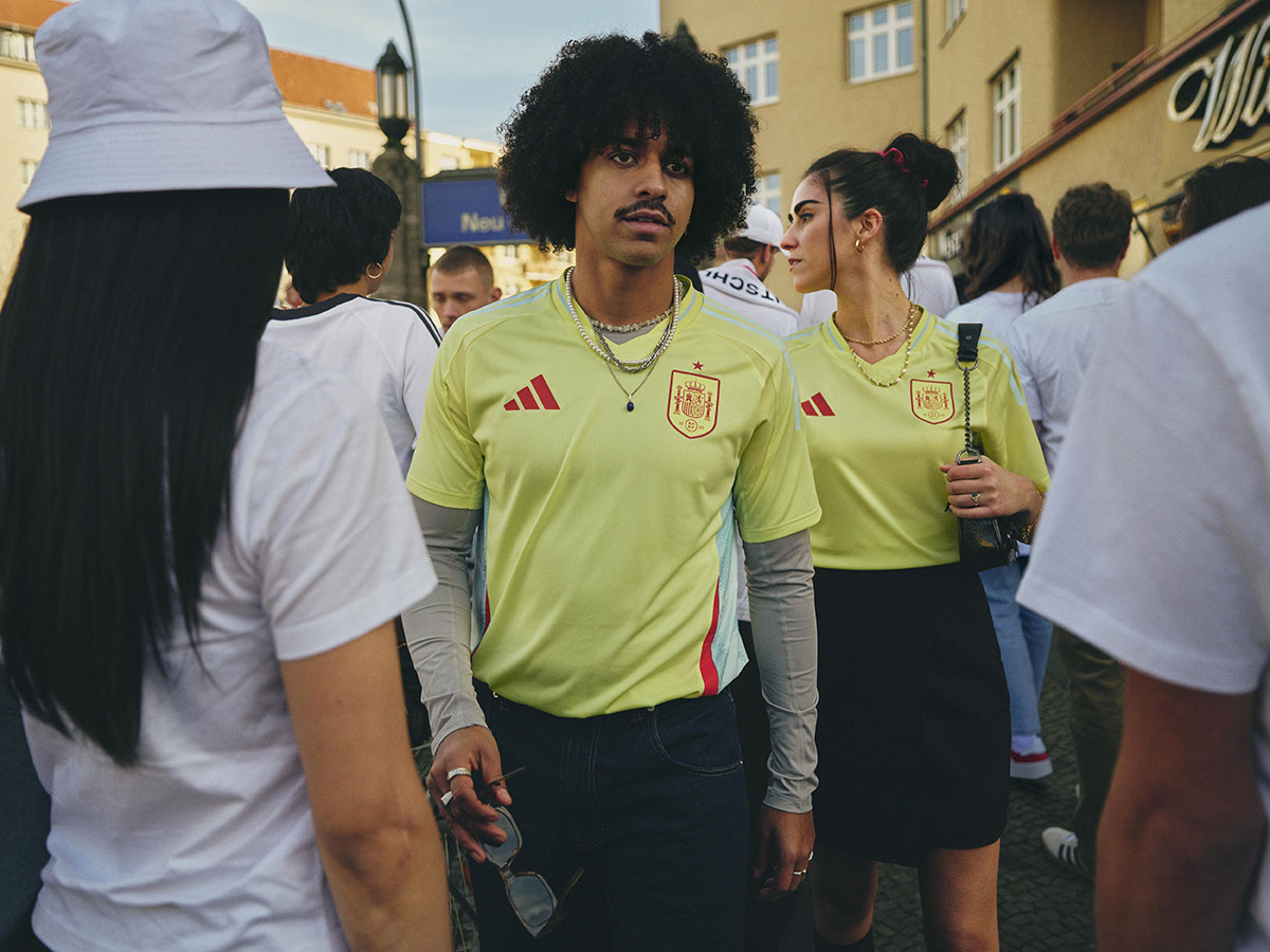
Spain is known for their dark and rich red and gold color scheme, which, once again, should be used at every opportunity available. This year, Spain and adidas have chosen to go with a color that can only be described as lemon-lime Gatorade for their away kits.
To me, it looks like adidas took an Arsenal training kit, took off the sponsor logos, added the Spain federation symbol and said, “Here you go.” As the kit is in this section, there are some good things, like the baby blue streak that goes down the side. If they had just stuck with the shades of gold and yellow on the Spanish flag, this kit would have been one of the best, but instead, they took a risk that didn’t pay off. I expect to see Spain be knocked out of the tournament while wearing this kit and, therefore, ruining it even more for the Spanish fans.
The Ugly
Poland Home
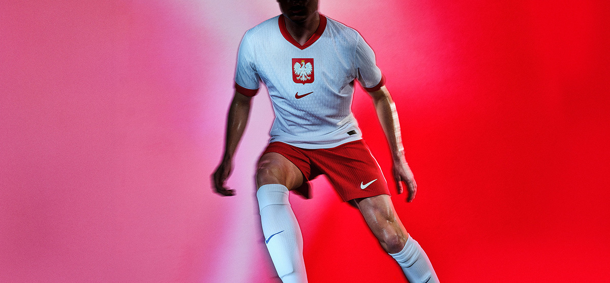
Poland has never really had visually stunning kits. Typically, they feature the national colors with the Polish eagle emblem on the chest, and nothing much else. In recent years, with Robert Lewandowski bringing the national team to new heights, Nike has experimented with designs, but it seems that now that the prolific striker is nearing the end of his career, Nike has also chosen to pack it in and give Poland a kit with no discerning features.
I could have designed this shirt using Canva in three minutes.
Slovenia
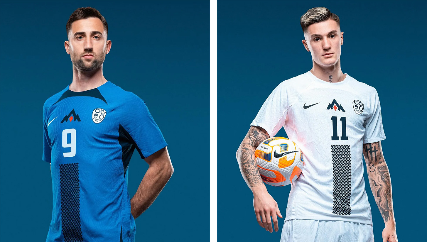
I had big hopes for Slovenia, as they reached a major tournament for the first time in recent memory. In the past, the nation has always had interesting kits that feature bold designs with nods to the Slovenian mountains. For the 2024 EUROs, they decided to modernize the kits, giving them a minimalist version of the mountain design and a dulled color scheme.
The kits themselves aren’t totally aesthetically poor. They’re just especially disappointing given the nation’s past success in kit design.
Turkey
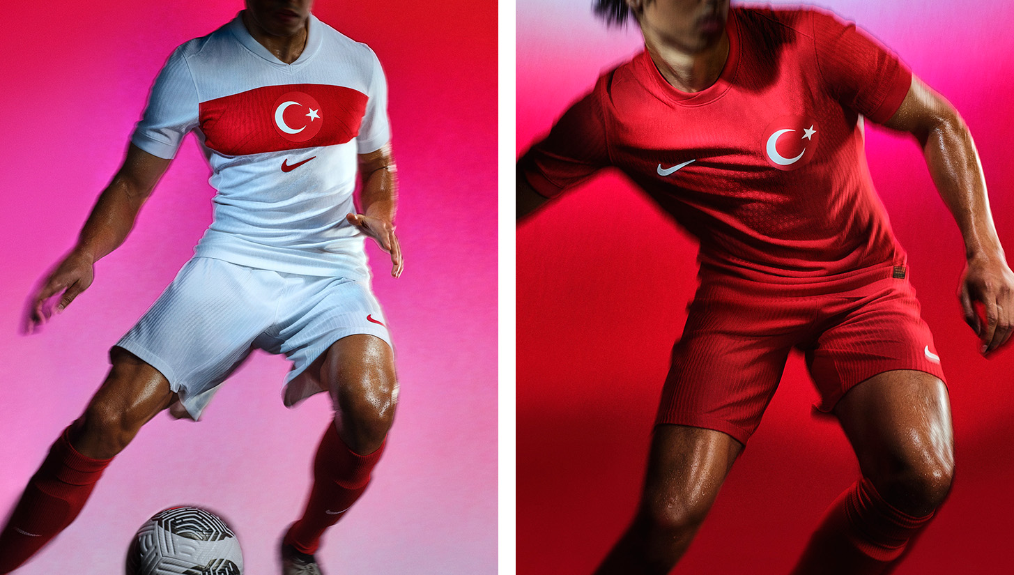
Turkey’s kits are like Poland’s. They are very basic, especially for a culture with such a rich architectural and design history. Certainly, Nike could have used distinct features or patterns that would breathe some life into the kit. I’m not mad, I’m just disappointed.


