
Our Good, Bad, Ugly series continues with the kits from the highly anticipated 2024 Copa America.
Copa America, just like the EUROs, is just around the corner. This year, with the event being hosted around the United States, we get to see not only the best of CONMEBOL but also the best of arguably the fastest-growing confederation, CONCACAF.
The 16 teams that will fight for the title include 10 teams from South America and six from North America, Central America, and the Caribbean. That gives us 32 different kits to parse through for our latest installment of the Good, the Bad (decent idea, but bad execution), and the Ugly.
The Good
Bolivia Home

Starting off with one of the smaller nations, Bolivia delivered an absolute gem with this one. Mint green is an underutilized color, and the splashes of traditional Bolivian print on the sleeves with the national colors on the collar make this jersey pick number one for this year’s Copa America. This is how you strike a balance between creativity and simplicity.
Brazil Home and Away
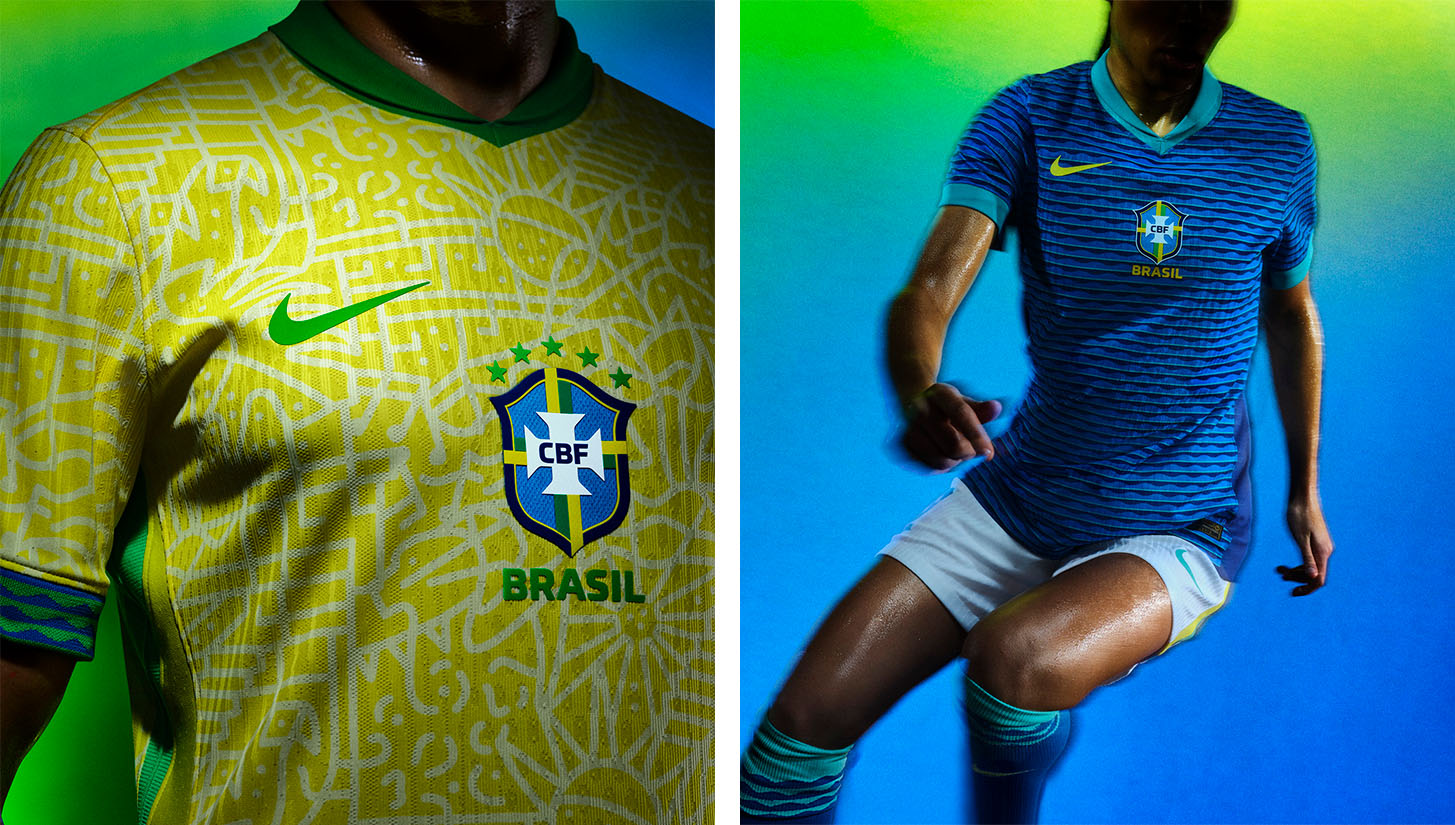
Look, sometimes being spoiled for choice is difficult, and in the case of Brazil’s home and away kit, picking just one is impossible. Nike brought back the federation logo in the center of the chest, paired it with slick and culturally-inspired patterns, and then topped it off with beautiful cuffs on the sleeves. If there are any critiques, the collar around the neck seems to be a mix between no collar and a golf polo collar. Nike’s golf division once called this design a “blade collar,” but the look never really became popular.
Mexico Away

It seems that mint green is the color of the summer, as Mexico joined Bolivia in utilizing the shade for their away kit. El Tri’s iteration features a striking sublimated pattern that takes inspiration from the country’s rich cultural history, while looking forward to its dynamic future. You can see this through the use of traditional patterns paired next to modern patterns, such as the arrows that go through the center of the kit. Additionally, the use of neon green for some accents pops, and they will look great under floodlights during night games.
Paraguay Away
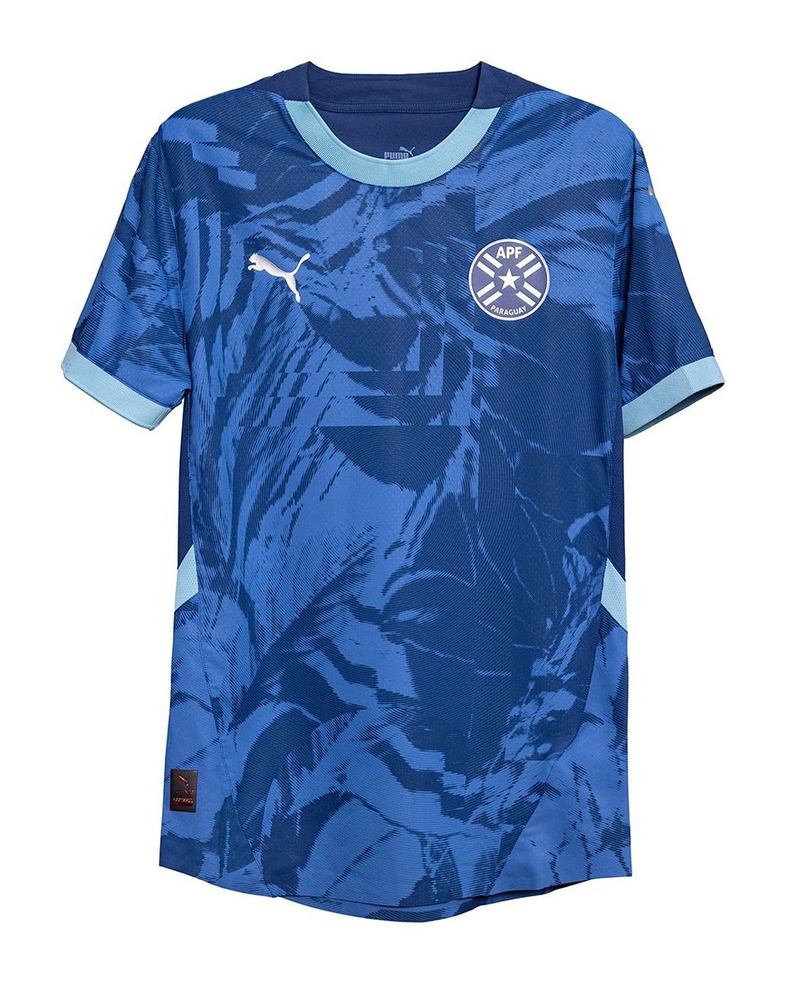
You may be noticing a theme here, but if a kit is inspired by something culturally important to a nation, it typically gets a high grade. In the case of the Paraguay away kit, the print is inspired by the natural marvel of the Amazon rainforest. Overall, it is a super solid design that honors one of the most bio-diverse parts of the world, which means so much to the Paraguayan people.
Jamaica Home
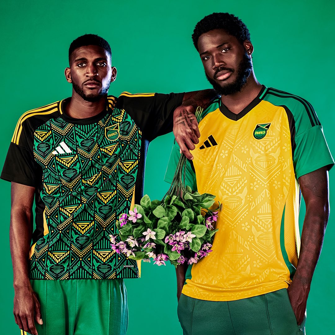
Jamaica always has interesting kits. When you have one of the best color schemes in all of sports it’s to be expected. This year’s home kit is built using a tessellation of Jamaican art that depicts the face of a traditional Jamaican warrior in the colors of the Jamaican national flag. From afar, the kit looks as if it is just a fun pattern, but up close, you can see its unique and highly detailed nature — hats off to the designers on this one.
The Bad
Canada Away

Many people were disappointed when Canada didn’t get new kits for the 2022 World Cup, so when it was announced that Nike would be giving the nation bespoke kits for this upcoming season instead of standard template kits, there was a lot of anticipation.
That excitement quickly fell when the kits were released, especially with this cream-colored, striped kit that features a weird mix and placement of retro logos. With thin vertical stripes going down the center (basically an inverse of Canada’s flag), the designers decided that the best placement for the logos would be with the lines going halfway through the Nike and Canada logos. If Nike had decided to reduce the number of stripes and have the logos have full space for their placement, this jersey would have been a knockout. Currently, it looks like someone misplaced their iron-on patches.
Otherwise, the color scheme is perfect for a Canadian kit.
Chile Home
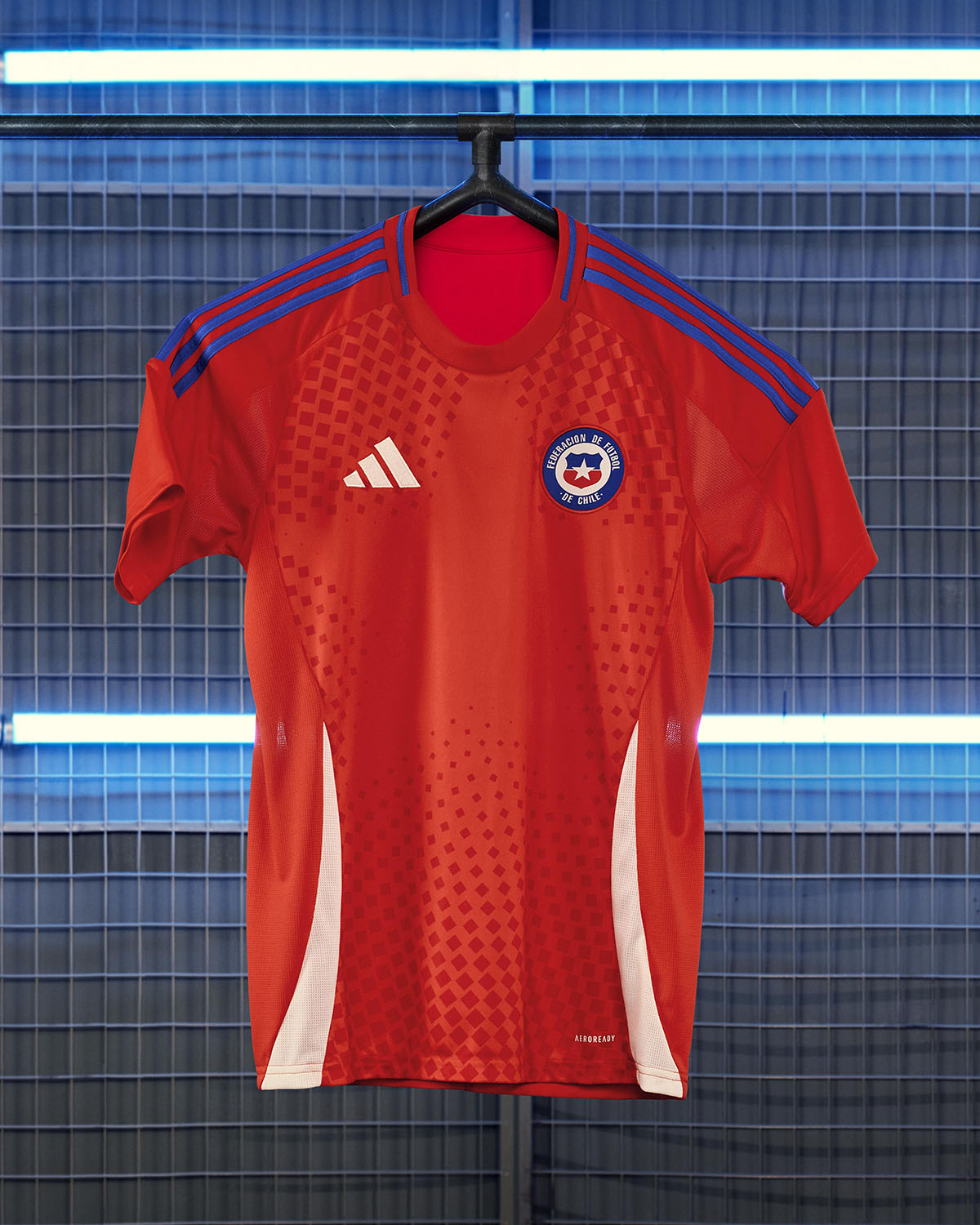
For the most part, adidas has played it safe for its 2024 international kits. For the Chile home kit, the brand acted like a striker who was on a bad spell in front of goal. It saw the opportunity, yet hesitated for just a moment before pulling the trigger.
adidas could have created a more complex and interesting design by highlighting the star on Chile’s flag. For example, instead of using sublimated squares to create the star shape in the middle of the kit, they could have used stars of various sizes and shapes.
There is lots of potential, but it is seemingly a half-hearted attempt at creating something that will stand out.
United States Away

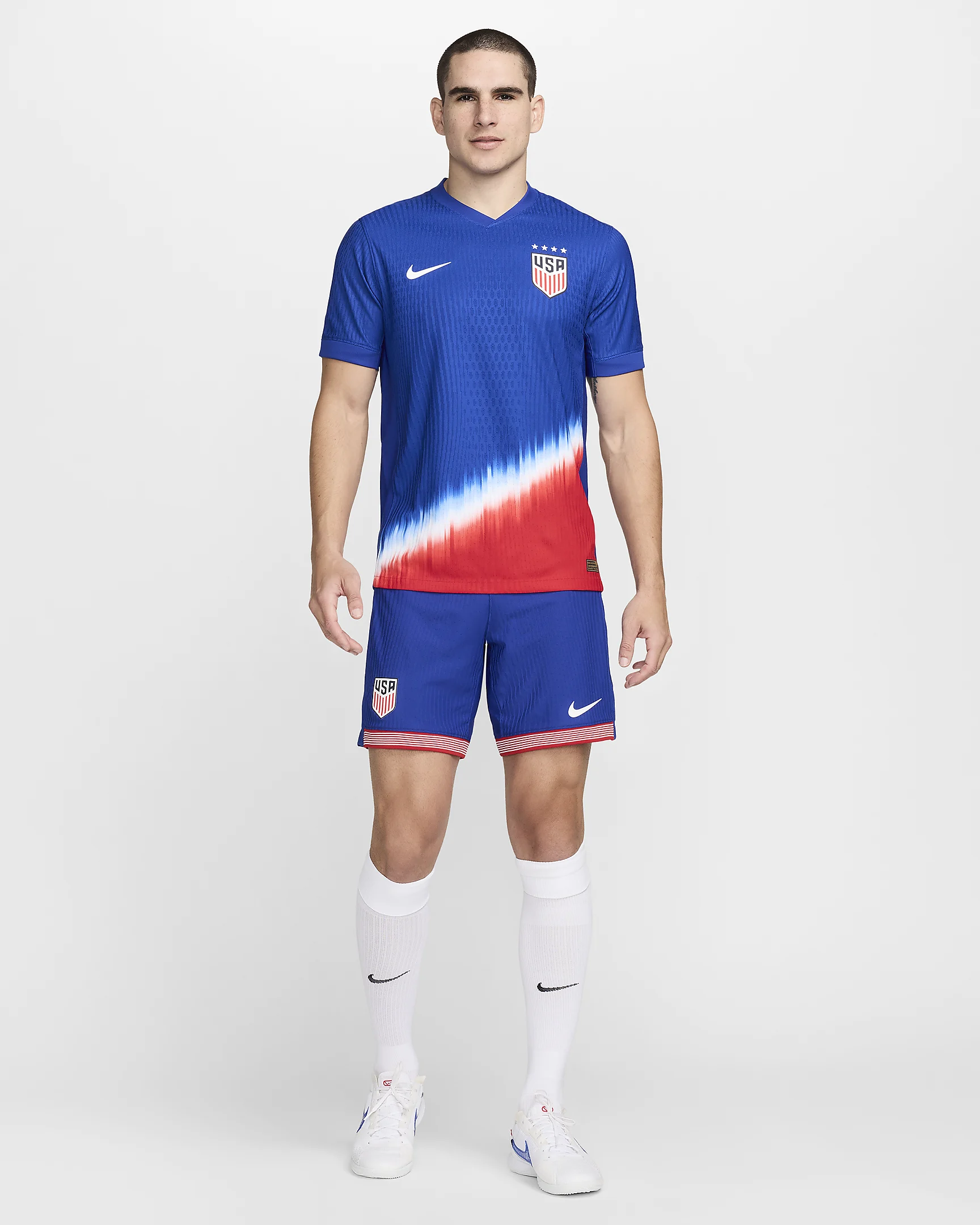
The kit itself is strong, but the issue is when it is worn with the corresponding shorts. Press release images show two variations: one where the player wears the kit with blue shorts and another where they are in red shorts.
When wearing the blue shorts, the focus on color gradient and creating defined color zones abruptly halts. However, when they wear red shorts, the look is cohesive, and the shift from blue to white and red continues throughout the kit. If the USMNT wants to put on their best performance from an aesthetic perspective, keep the blue shorts for the home kit entirely. This jersey should only be worn with red shorts.
Costa Rica Home
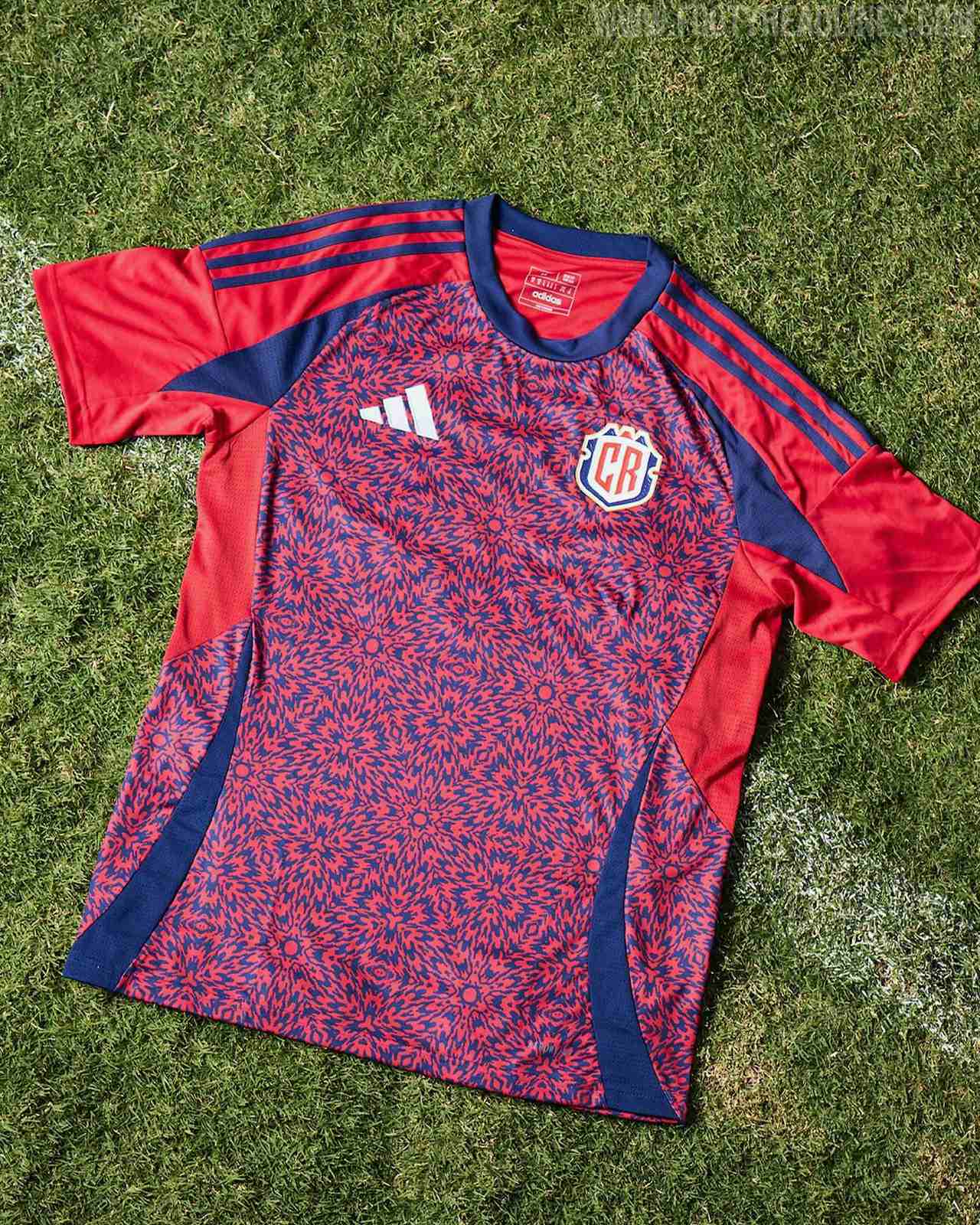
This choice might be contradictory to others on this list, especially considering what was said about adidas earlier. Costa Rica’s kit is too complicated. When you see it up close, it is beautiful, of course, but when you see it from afar (like in some of the press release images), it just looks like blue and red swirled together. With minor tweaks to the design, like enlarging the size, this could have been a 10 out of 10, but right now, it is vertigo-inducing.
The Ugly
Argentina Away

This is the design of a training kit that adidas and Argentina are going to sell for hundreds of dollars and pass off as a high-level design. Basic, templated kits need to be banned or price-capped. Otherwise, fans will be robbed of hard-earned money.
Chile Away

The exact same sentiment from the Argentina away kit carries over to Chile’s version. This is the generic kit that you start with when designing a team on FIFA Pro Clubs. It’s shockingly dull stuff here.
Colombia Away

Look, the home iteration of this kit for Colombia escaped the “ugly” rating because the color scheme is nice, but c’mon, how can you not be upset when countless teams have the exact same kit, just in different colors? It is not like these teams are ordering kits from a catalogue; these are massive federations that deserve better. It feels like adidas had a bunch of leftover blank kits and just pushed them on these federations as great options for this summer.
Costa Rica Away
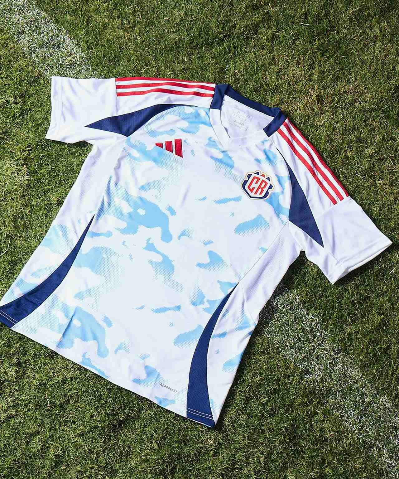
So… this kit is functionally the exact same as the 2023-24 Olympiacos away kit. Sure, the cloud graphics are slightly different, but not enough that you can call this a custom kit. If it wasn’t a direct copy, this kit wouldn’t even be rated, but by virtue of adidas hammering the copy and paste button, it makes its way into this category.


