As SSC Napoli enters a new kit sponsor era, we take a look back at the best kits from the 16-year Lete era.
On the heels of their first Scudetto in 33 years, SSC Napoli is on the brink of a new era. A core of promising talent will now have a new manager in Rudi Garcia, and the club will also have some aesthetic changes as well. In addition to the symbolic title-winning badge the club gets to don on its kits this season, it’s receiving a new sponsor, which is particularly significant for a club like Napoli.
As football fans, we have images of the iconic sponsors of Mars and Buitoni during the Diego Maradona days seared into our brains. But bringing it a bit closer to the present, and for me especially, the sponsor of Lete has been just as prominent, for better and for worse, during my life as a football fan.
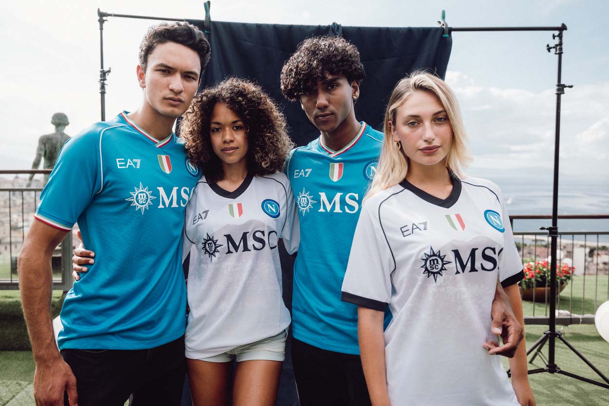
Napoli’s new kit is beautiful, though. It’s one of their strongest in recent years, whether it has the Lete box or not. From the tricolor trim on the collar and sleeves, to the the subliminal all over print, it’s a delightful home shirt fit for the champions of Italy.
The big red box of Napoli’s previous sponsor had been emblazoned across the chest of Napoli shirts since 2006-07, back when they were just starting their resurgence after some dark days down in Serie C. An interesting journey followed, with Lete front and center on the blue shirts. Marek Hamsik, Edison Cavani, Gonzalo Higuain, Dries Mertens, Jorginho, and many more stars donned the shirts during this era, and with the new kit taking them in another direction, it’s only right to pay our respects to these kits and pick out some of the best.
2011-12 Home
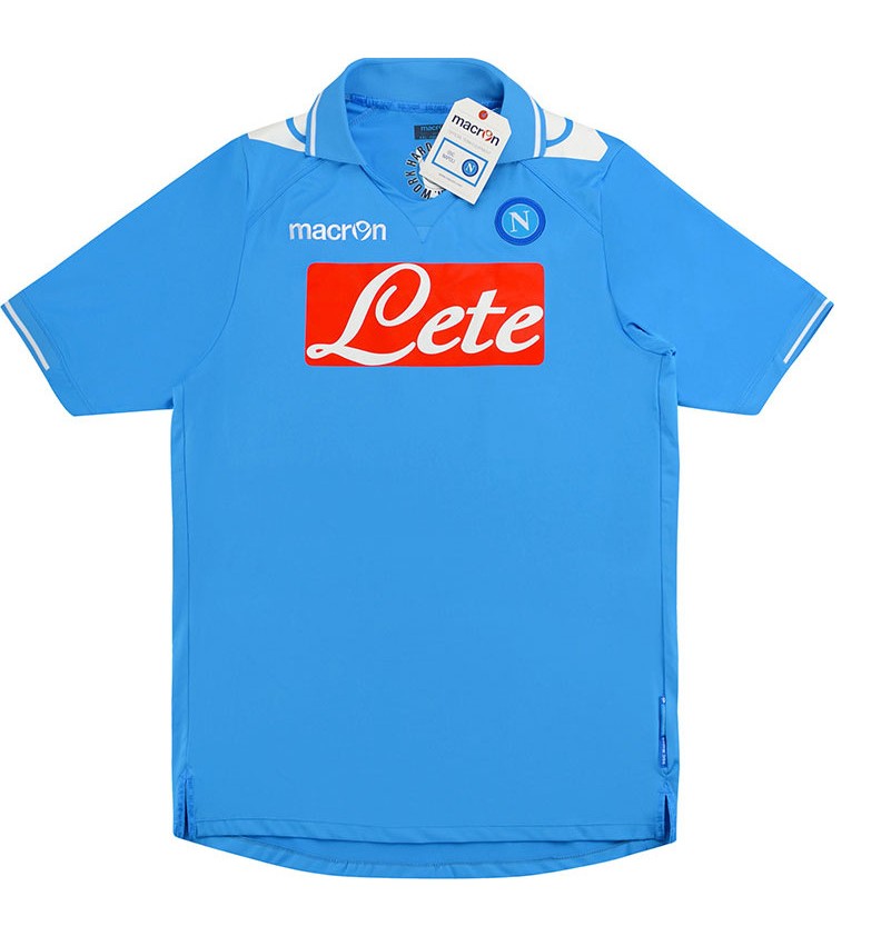
Manufacturer: Macron
Macron is a kit manufacturer that doesn’t get talked about often. They were Napoli’s kit brand from 2009 until 2015, and this home is definitely the pick of the bunch from their Neapolitan portfolio. In a Serie A dominated by Juventus and Inter, Napoli qualified for the Europa League this season, and the likes of Cavani, Ezequiel Lavezzi, and Gokhan Inler donned this Macron number as they went on to win the Coppa Italia for the first time since the Maradona days. The shirt features a standard collar and a white line in the trim, along with a pattern on the shoulder to finish it off. Don’t get me wrong, this kit will not blow you away, but looking back at Napoli’s kit history of the early to late 2000s, it’s up there at the top.
2014-15 Home
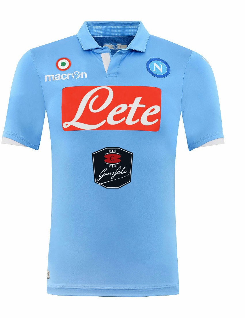
Manufacturer: Macron
This is the final kit of the Macron era in Naples, and it was certainly a valiant effort to bow out. The reason I felt obliged to include this is because of the outrageously big Lete sponsor and the fact that it sits so high up the chest. Throw in the sponsor below, and you’ve got a standard Napoli blue shirt with added quirks. Lorenzo Isigne, Marek Hamsik, and Dries Mertens are among the stars who have worn this kit and helped Napoli to another Europa League qualification spot.
2016-17 Third
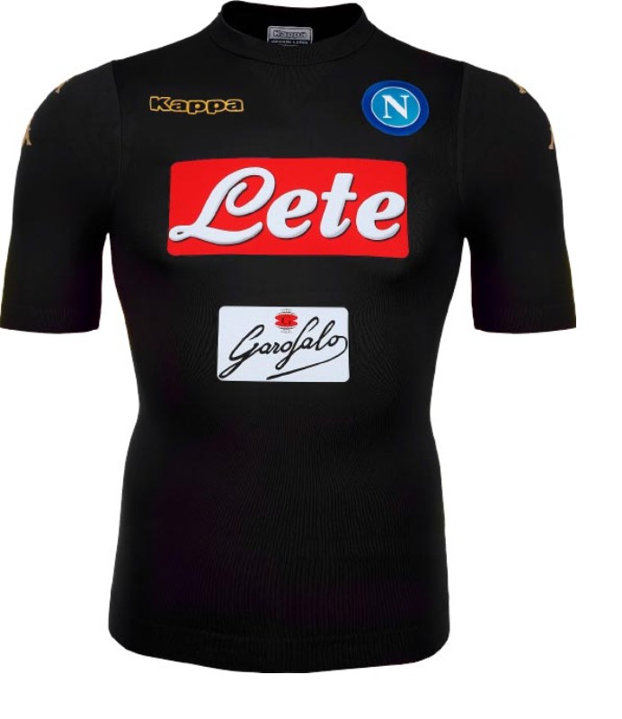
Manufacturer: Kappa
This is a very basic inclusion solely based on the slick aesthetic of the combination of the black base and the gold detailing. There’s nothing flashy about it. No experimental collar and no trims. Black and gold, with a big red box front and center. It’s a good shirt, one that was worn during a season that saw Napoli qualify for the Champions League.
2018-19 Home
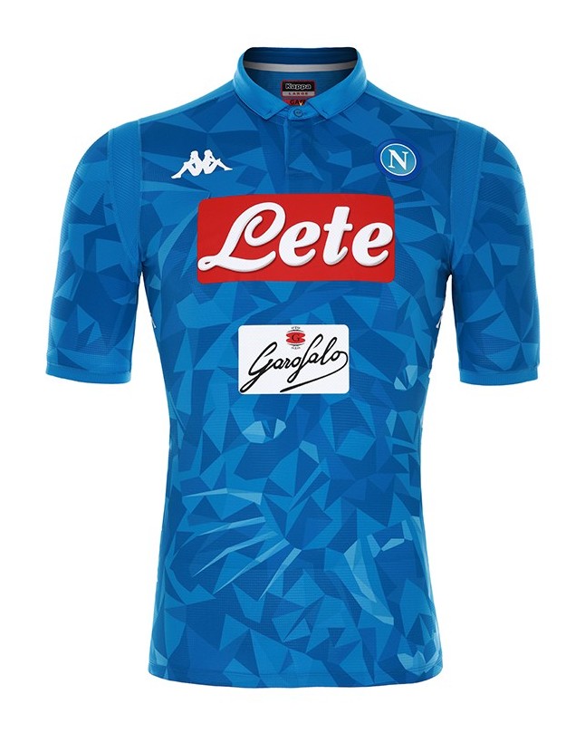
Manufacturer: Kappa
This one is a must-include in my eyes. It’s a bit extravagant and ventures away from the simple Napoli blue base as it includes a fragmented glass-style pattern as if we’re in some form of a Dr. Strange movie. It works, though, especially with the smart button-up collar.
2020-21 Special
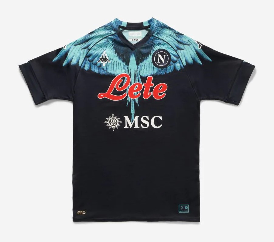
Manufacturer: Kappa
In recent years, Napoli has gone a bit mad with their kit production, making so many special kits that it’s hard to keep track of them. This one, though, is definitely memorable. It’s designed by Milanese fashion brand Marcelo Burlon and features their signature bird design across the top in the Napoli colors. The black base complements this well, giving a striking design that definitely catches eyes. The red box isn’t included with the sponsor, though, and instead, the font itself is red, a touch we saw in the final years of the partnership.


