
Recently released to the public, we take a look at the unique NOCTA Venezia FC kits, and see how they stand up to their illustrious predecessors.
When Venezia and Kappa separated, the kit world was shaken. It was the ending of a perfect partnership. Gone, never to come back. What the two of them accomplished during their dalliance was groundbreaking, elevating Venezia from your yo-yo Italian club to the epitome of cool, the pinnacle of football vogue.

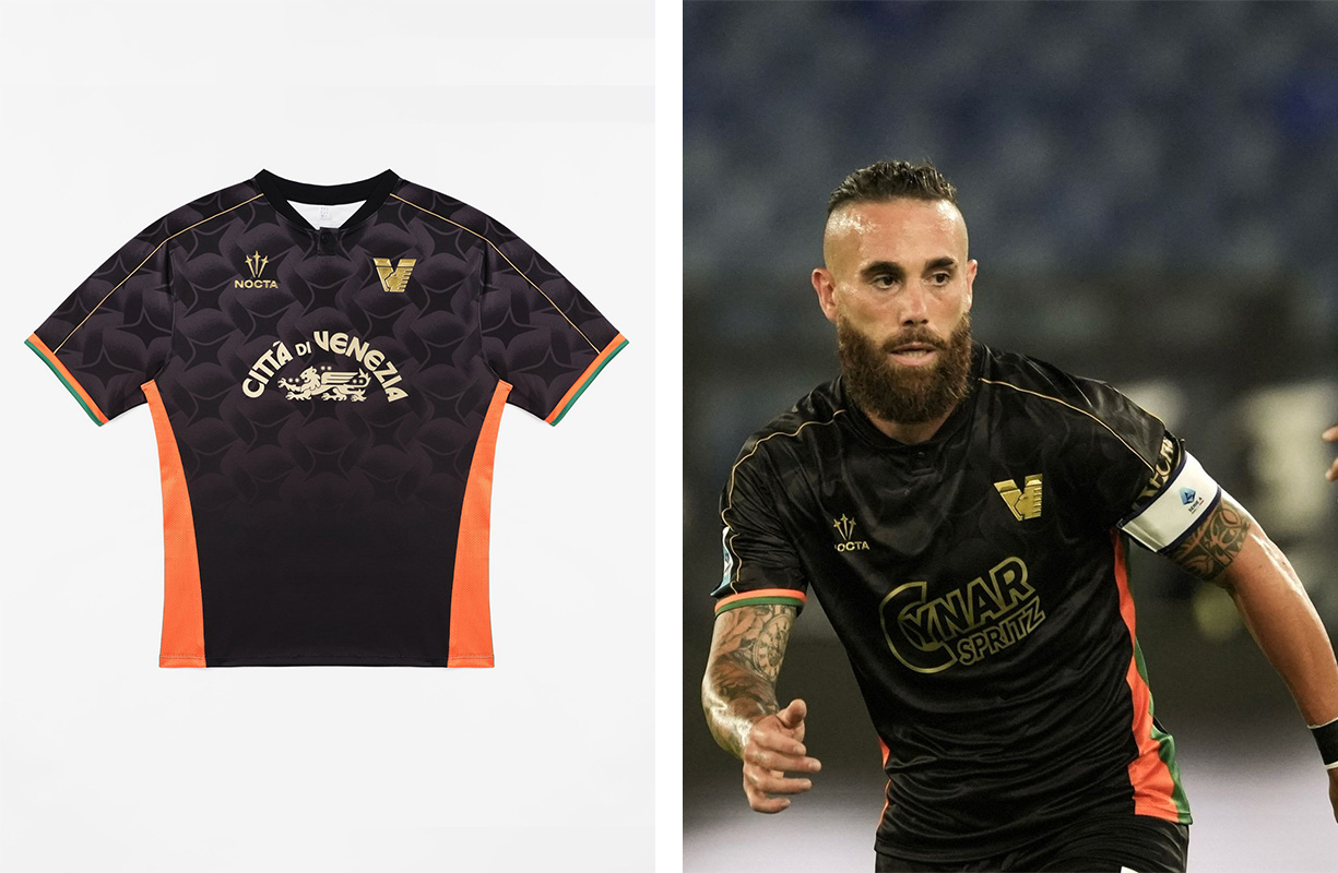
NOCTA, the Drake-owned sub-label of Nike, stepped in to replace Kappa (perhaps also saving Venezia financially in the process), and I wasn’t sure what to think. It was certainly an ambitious move for NOCTA, who went from having no previous football experience, to supplying what at the time was the most stylish club in the sport. And when the first leaks of the home kit were plastered all over social media, it was confirmed that this partnership was nothing short of a disaster.
As is often the case, the actual release softened the blow. It wasn’t as bad as the leaks portrayed, and it seemed that the kit was neither good nor bad and certainly nothing that would set the world alight. The “Città di Venezia” branding as a sponsor is a nice touch as usual, although Cynar Spritz will don the front of their shirts when playing in the league.
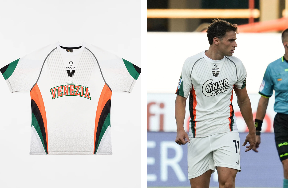
Their white away kit isn’t bad and with the Cynar Spritz sponsor, I can be okay with it. Maybe I am being too harsh given my favoritism and deep-rooted admiration of Kappa, but there is something about the kit that doesn’t give it the edge Venezia once had. I am a sucker for a central badge, too, though.
To finish off their suite of kits — the goalkeeper shirts are nothing and their pre-match shirt is an absolute hot mess and screams “What the f— is going on?!”
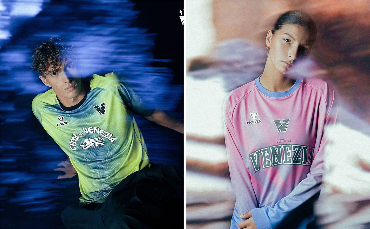

Throughout the entire release of Venezia’s kits this season, there is a prominence of the collegiate design approach, which I think is horrendous and outdated. They have changed the “Città di Venezia” to look like it’s your bog-standard American college, which I certainly do not like. It’s a weird pivot for Venezia, but given their ownership links and their prominence in both football and mainstream culture, you can understand why moves like this have been taken. I don’t have to be a fan of it, though. And I suspect, not many others are fans either.


