New kit season is here. We round up some of our favorites from around Europe!
With the new season of club football on the horizon, most of Europe and the world’s top teams have rolled out their fresh jerseys for the 2024-25 season.
In what’s become a summer Urban Pitch tradition, it’s time for Kit Watch — and with some beauties on display so far in preseason, there is no shortage of options to add to your kit collection.
Barcelona Home
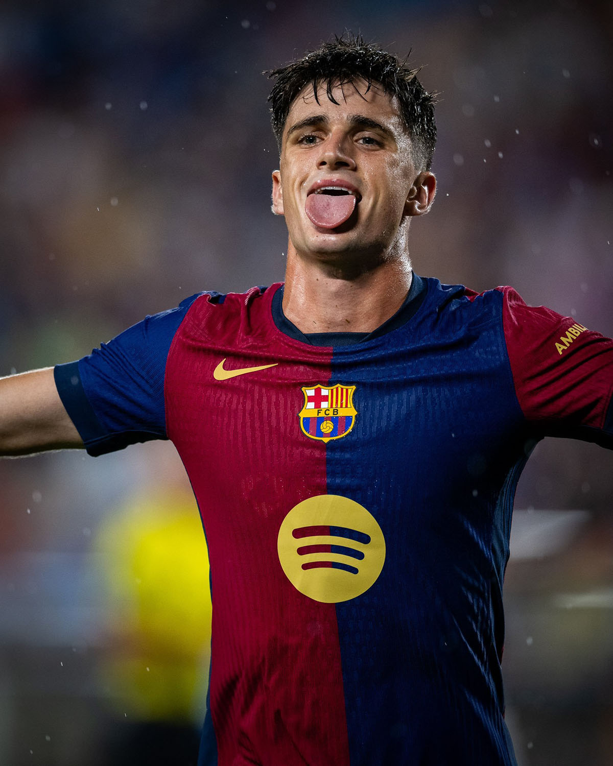
A beautiful ode to FC Barcelona’s 2000 kit, half-and-half Blaugrana tops always hit differently.
While the club’s deal with Spotify was laughed at in many circles, there is no denying that the gold sponsor logo fits perfectly with this design. The right sponsor can bring everything together and elevates a shirt from good to great. Nothing to fault here.
Newcastle Away
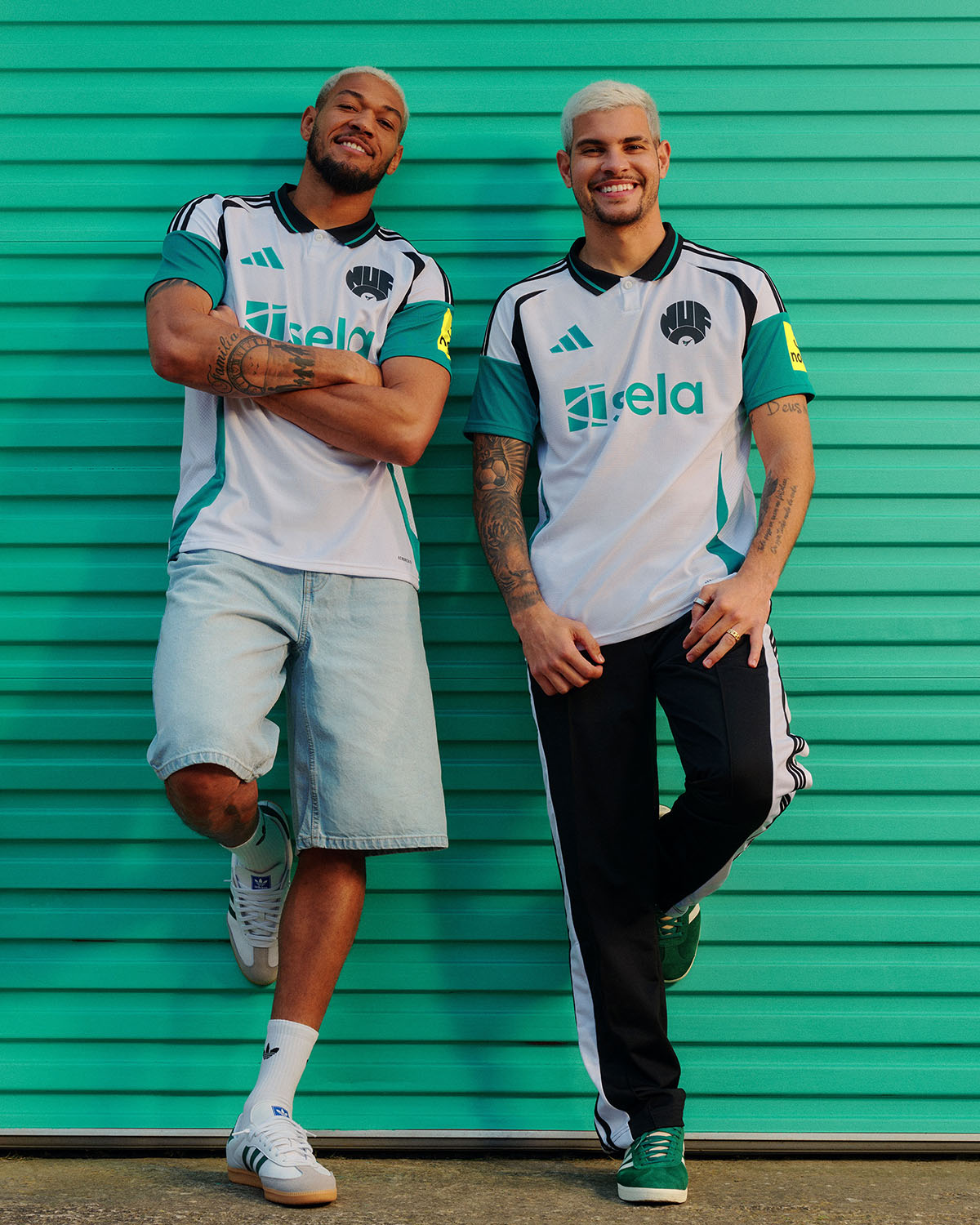
This one is just a bit outside the box, but I’m not mad at it. It would come as no surprise that this kit is polarizing, but I’ll sit firmly on the side of approval.
The throwback Newcastle badge and the black designs on the collar combine wonderfully with the powerful green color on the sleeves and sponsor.
Blackburn Rovers Third
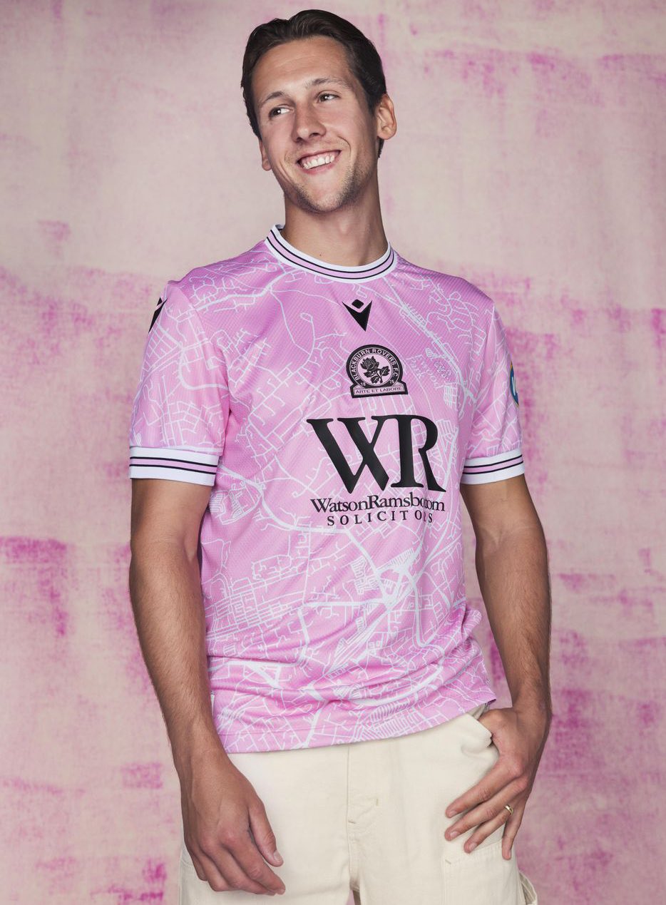
Pink kits are almost always divisive across fanbases. Many hate that they often go against the traditional colors of their clubs, while some may like that the designers went for something fresh and new.
In this case, the Blackburn kit lands firmly in the “good pink” category for me. The map of Blackburn in white pictured on the kit is a concept that has been done before, but something about this version just works better for me. The depiction of Ewood Park on the chest is a nice final touch.
FC Versailles Away
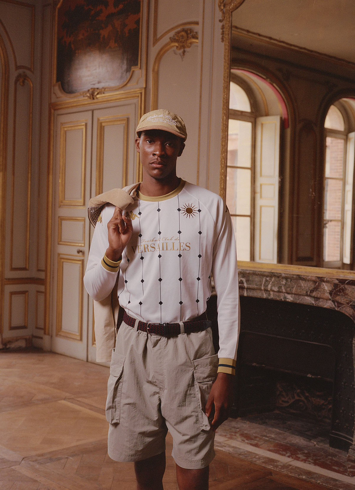
French semi-pro side FC Versailles may not be on the radar of most casual fans, but the team has made waves in select circles through a set of beautiful kits.
Kappa has become notorious for some of the greatest streetwear kits in history, and this is right up there with the very best. White and gold is a match made in heaven and the unique pinstripe pattern here is the cherry on top. Also, as far as club badges go, the sun of FC Versailles is so, so hard.
Manchester United Away
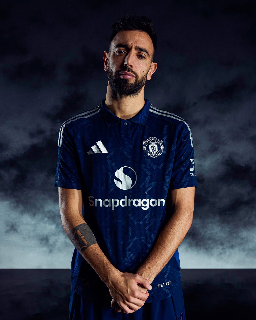
The Red Devils have a long history with blue kits. Every Premier League fan from the mid-late 2000s will remember the iconic blue AIG kit that Cristiano Ronaldo wore so beautifully in 2008 or the blue and red Vodafone number from 2005.
Manchester United have given their fans the best of the bunch with this one. Their new Snapdragon kit sponsor, as far as logos go, is pretty decent, and the M design woven into the entirety of the kit is a subtle but powerful nod to the city and its residents. It’s the first time in ages United dropped a proper blue kit, and I’m certainly glad they did.
AS Roma Home
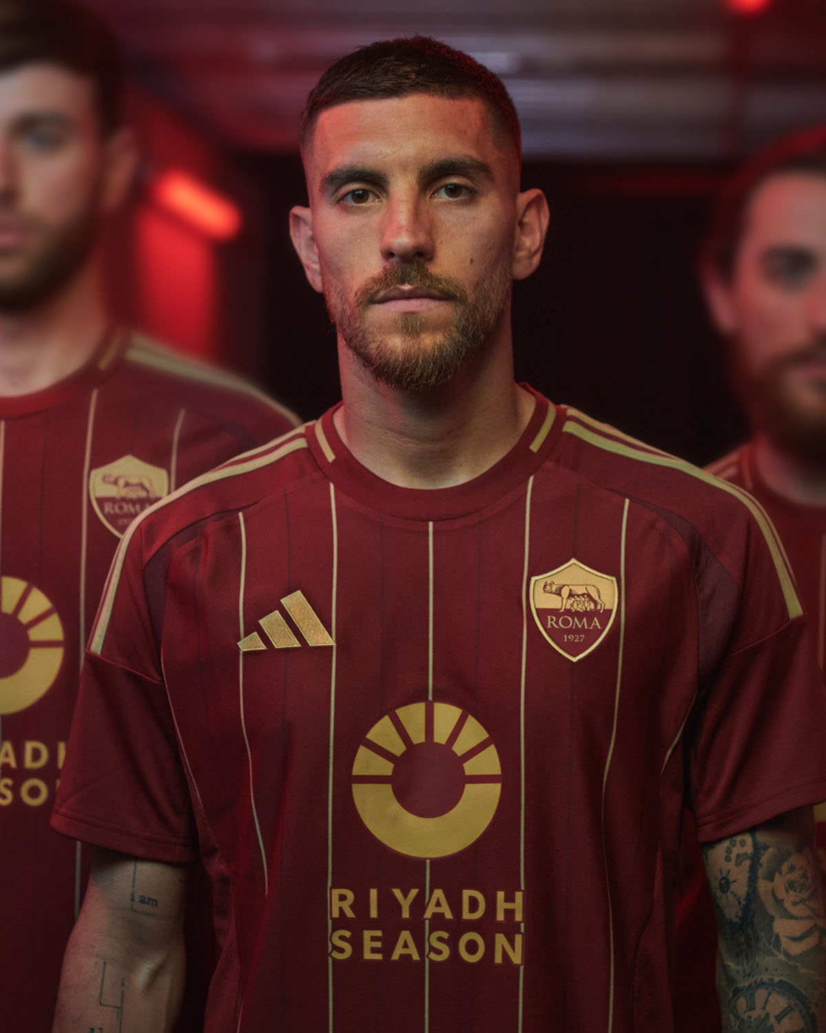
Pinstripes make the world go round, that’s the saying right?
The design change to the AS Roma logo might just go unnoticed if you don’t look twice. The normally yellow top and the burgundy bottom were swapped out for an entirely gold and burgundy logo, fitting in perfectly with the gold pinstripes and main sponsor that blend this kit wonderfully.
Milan Home and Away
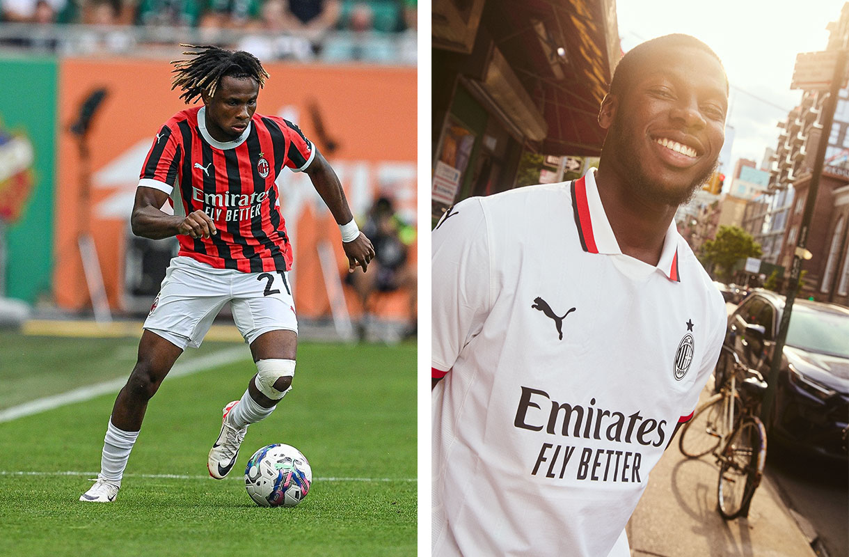
Call it a cop-out, I’m not quite sure I care. There are a few occasions where clubs will drop a deadly duo of kits and leave fans scrambling to take their pick, when the obvious choice is to just cop both.
The Rossoneri and PUMA have got it spot on this season. The home kit firstly, is a work of art. It’s really hard to mess up Milan’s classic red and black stripes, but in the recent seasons, they’ve dropped a fair few duds. This one might just be my favorite of the modern era. No messing about with the stripe design, proper classic vertical with an off-white collar/sleeve combo that provides the perfect accentuation. 10/10.
Their away strip goes the reverse, with a full white base and the club’s black and red colors artfully laced into the sleeves and foldable collar. You can tell from the first time you look at a kit if it’s going to be a hit in the streets, and I definitely have this feeling from Milan’s away design.


