
From their fantastic kits to a stellar rebrand, the Seattle Sounders have been on an aesthetic hot streak.
In a sea of templates, the Seattle Sounders have time and again delivered standout kits. In particular, their community jerseys have been among the best in MLS history. Starting with a Jimi Hendrix-inspired purple kit in 2021, the past three Sounders secondary shirts have been stunners.
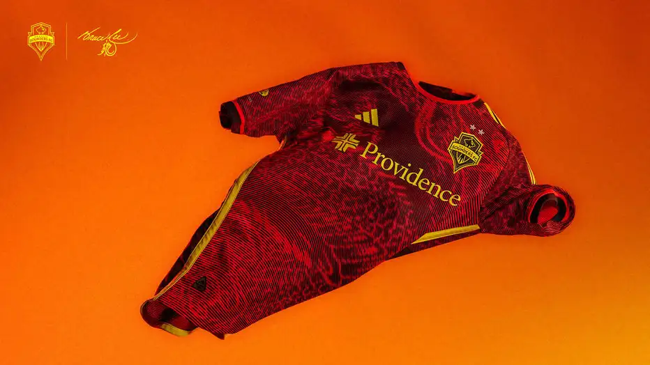
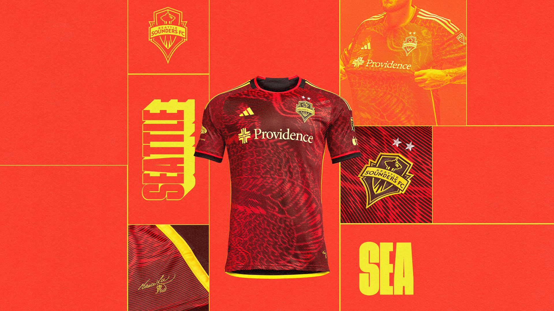
The club followed the “Purple Haze” look with an aggressive Bruce Lee-inspired design that incorporated a dragon print in 2023, and this year’s “Salish Sea” away kit, inspired and designed by Native American tribes that inhabit the Seattle area, continues the Sounders tradition of looking fantastic while representing their community.
Many MLS jersey designs over the years have been frustrating. You can’t go long without mentioning adidas’ stranglehold on league uniforms. Unlike many other top leagues in the world, the Three Stripes has a league-wide sponsorship and creates the design for each MLS club.
While there has been a concerted effort to increase the creativity and thought behind MLS jerseys in recent years, there’s only so much a single manufacturer can do before things become overly formulaic and repetitive. Templates, while frowned upon, are a necessity for brands the size of adidas, and when you assign a single template to an entire league, it leads to some dull designs. This is particularly frustrating with how much of a fashion item the soccer jersey has become.
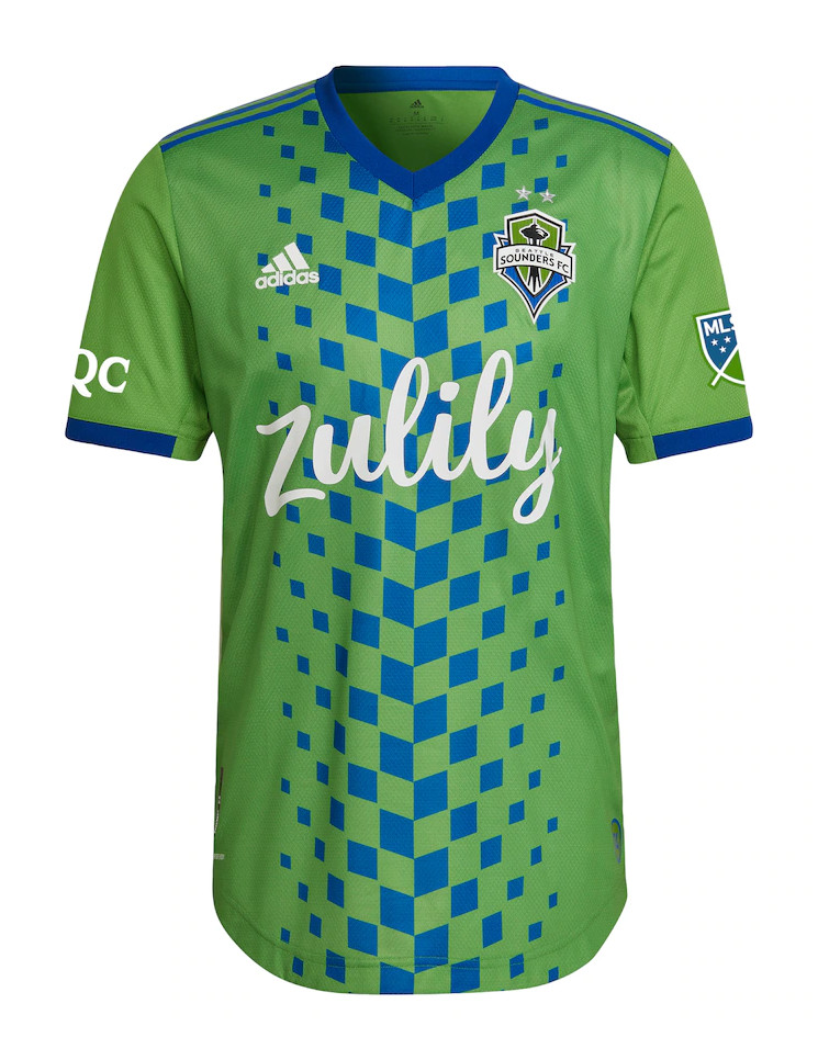
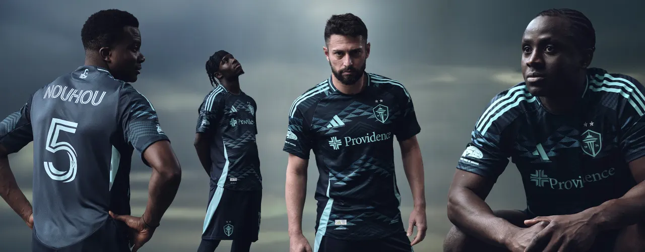
The Sounders have taken a different route — kinda. The first 15 years in MLS has produced a home jersey that rarely changes — green torso with blue highlights, sometimes blue sleeves. Whatever template adidas is using gets translated. Eternal blue, forever green; tried and true. The current home jersey is a bit different because it’s a throwback design as a part of the club’s 50th anniversary in 2024.
After this season, it will rotate out, presumably for something more traditional in a darker shade of green. To be honest, the Sounders home jerseys can be a bit boring, but they are hugely recognizable and that is important. A half-glance at the field or TV and you know it’s them. The lack of home kit variance isn’t unique to the Sounders either, as many of the world’s biggest clubs, like Real Madrid, Manchester United, and AC Milan often have traditional home shirts, which allows them to experiment and go a little wild with their away and third kits. The Sounders have done the same.
Seattle has produced some of the most memorable alternate jerseys in MLS history, thanks to the team’s willingness to mix things up and break away from the traditional green and blue. You can’t make a proper Jimi Hendrix or Bruce Lee kit if you’re confined to two colors. This year’s is the best yet — the Salish Sea kit is undeniably Seattle. Designed over the course of a few years with female artists from three local Native American tribes, the kit walks the walk as well as talks the talk.
But these three kits aren’t the only time the Sounders have broken the mold. Throughout their time in MLS, they’ve rarely missed with their away and third kits.
The Pre-Community Kit Era
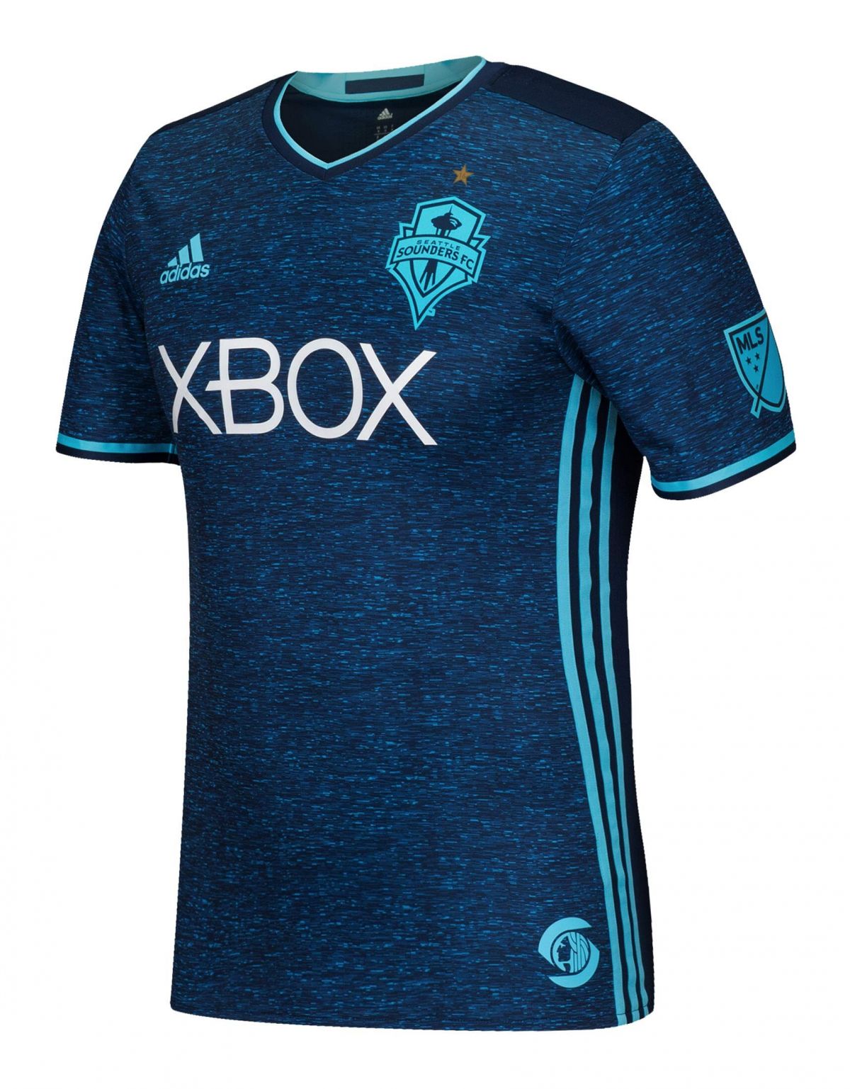
2012-13 Third: A Neon Craze
The first couple of seasons in MLS, the Sounders played it safe. The away jersey was pretty much an inverse of the home jersey — a blue base with green highlights. Their second season did showcase a third jersey that hints at a willingness to experiment. The highlighter yellow third kit only lasted a season, but it was a valiant effort and not their only crack at neon. The second take, neon blue and yellow, got the full two-year lifespan. It wasn’t for everyone, but as far as neon kits go, the blue and yellow is a clean design and absolutely wearable today.
2016 Third: Leaving Templates Behind
This is the first kit for the Sounders that truly left the template behind. No other team in the league used this design, nor could they. It’s not technically a community kit, but it still clearly is supposed to represent water, something the residents of Seattle and the greater Puget Sound are very familiar with. In many ways, this is also a precursor to the Salish Sea kit. I love this design and did not think it got the love it deserved. This was at peak template era for MLS, and the Sounders had a killer third kit. But maybe perhaps because it was a third shirt, it didn’t get enough spotlight to truly become popular.
2019: Story Time
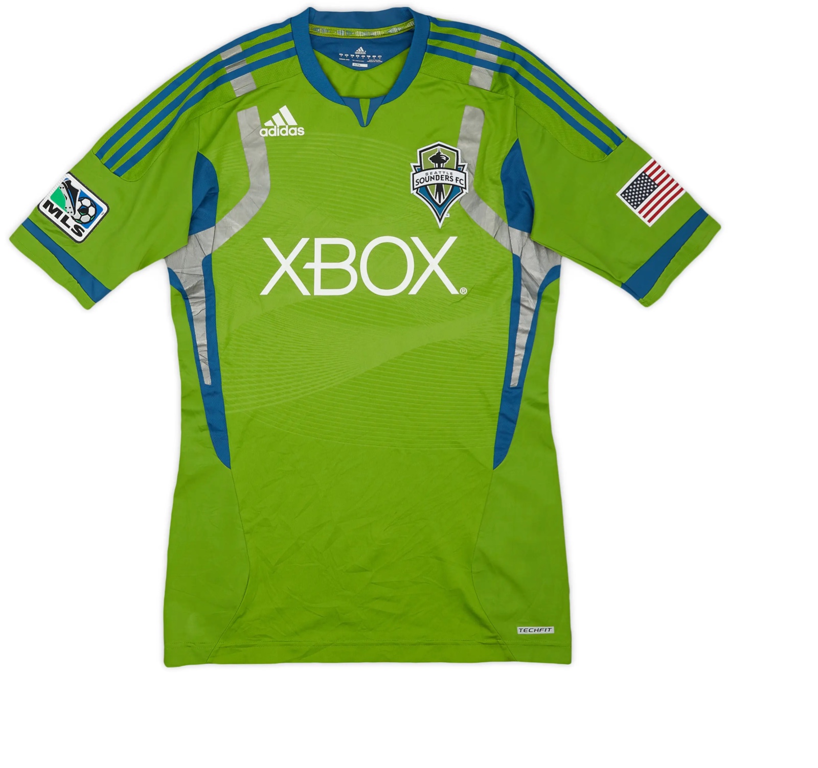
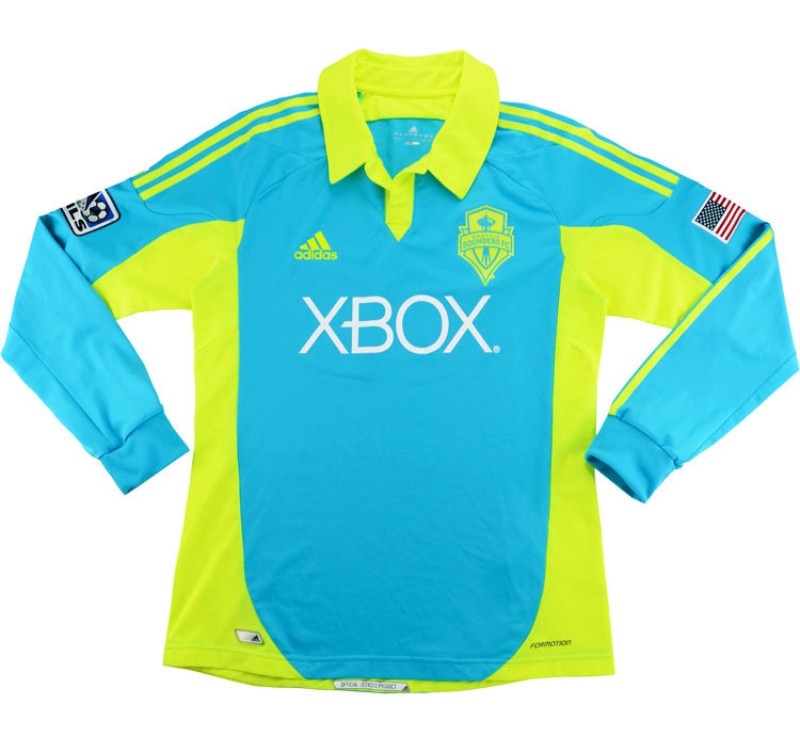
Not the first black kit for the Sounders, but the first one with a story. A late season home game against the Portland Timbers produced an epic sunset that inspired the pink highlights. While it’s not exactly the most in-depth story, it’s the start of trying to get more out of a jersey design.
Many fans remember that game, it was beautiful. Having a jersey tied to a specific moment like that is cool. It might not be a true neon kit but bright highlights like this work really well with a black base, and the Sounders’ first take on a black kit in 2014 was also very solid (also way better sponsor — XBOX was an all timer).
The Community Kit Era
Seattle isn’t the only club to make community kits, it’s a league wide thing. San Diego and Colorado released community kits this year to varying levels of success, and both LAFC and LA Galaxy did the same in 2021. However, it’s safe to say that the Sounders have done community kits the best over the past five years.
Community kits are essentially away shirts that have an additional element that connects them to a team’s, well, community. The “Purple Haze” kit from 2021 was the Sounders’ first foray into community kits, and they haven’t looked back since.
Making the effort to create a community kit falls in line with what the club has aligned itself with, as the Sounders have been clear that spending effort and resources for off-field initiatives are a priority for them.
2021: Jimi Hendrix
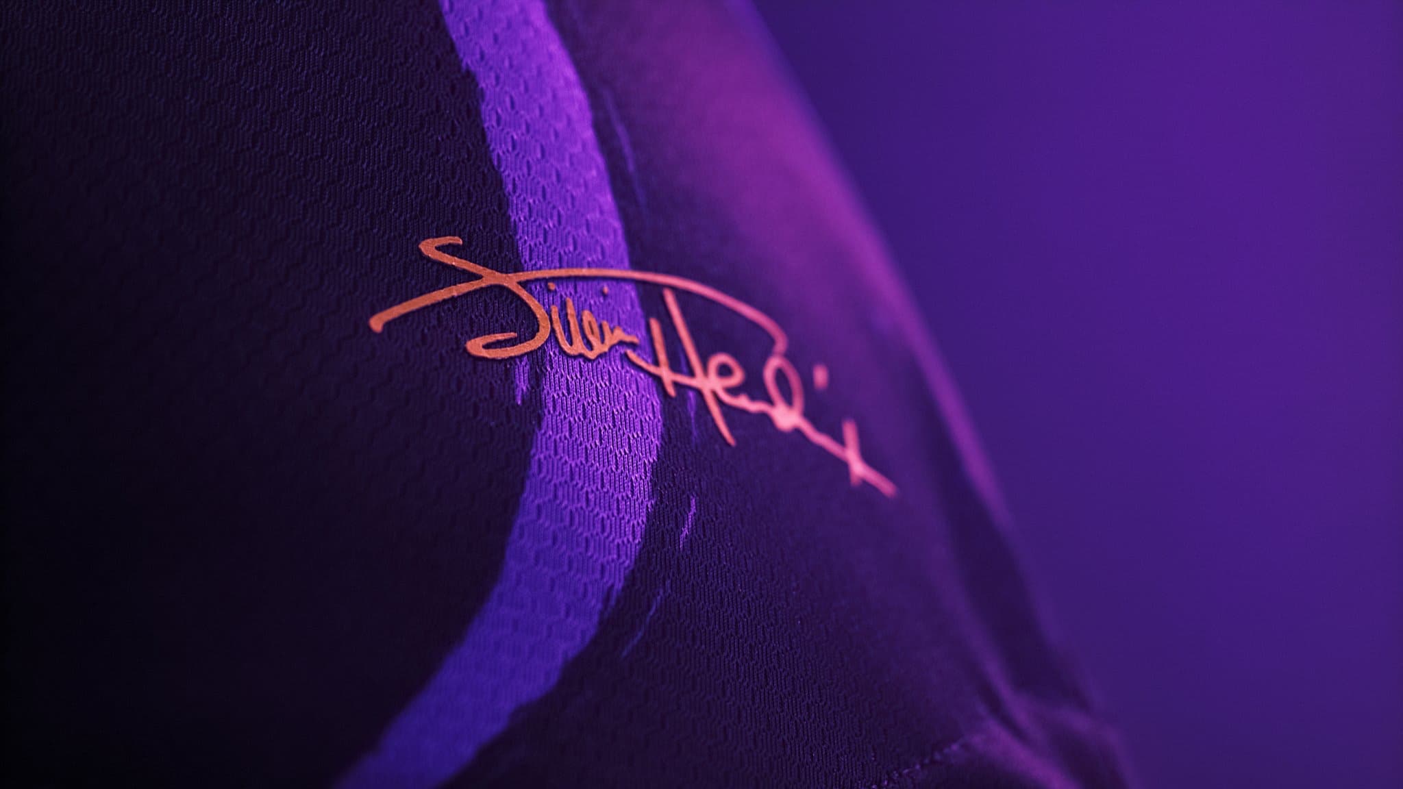
This is one of those jerseys that works at face value, but goes to another level when you know the story behind it. Plenty of kits will try and force a story, releasing explainers for each design element and how it somehow ties into said story. But this one, an homage to Seattle native and rock legend Jimi Hendrix, pretty much speaks for itself.
It’s why this kit made many top 10 lists worldwide, and it started the streak of all-timers from the Sounders. It also started the trend of partnering with a foundation as part of the kit design, with a percentage of proceeds from jersey sales going to the foundation, making the price a lot more palatable. Plus, it looks fantastic. The swirly design truly feels like Jimi’s music in jersey form.
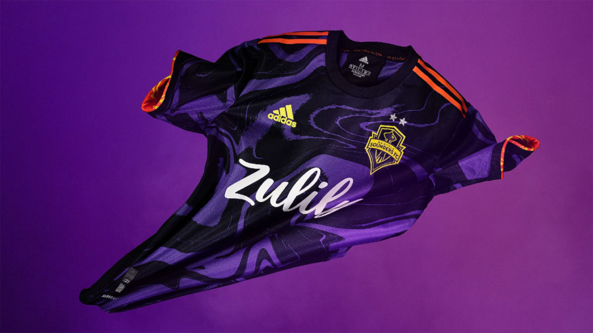
2023: Bruce Lee
This is the biggest break from the Sounders look, not only in completely different colors but also with a wild dragon pattern on it, a nod to 2023 being the Year of the Dragon on the Chinese Zodiac calendar.
For this design, the Sounders paid tribute to another Seattle icon, Bruce Lee. While the dragon is front and center, it’s subtle enough that it doesn’t override the design while the Ying Yang is Lee’s core imagery. Not that the Hendrix jersey didn’t look good on TV, but I think this kit looked particularly fantastic and was instantly recognizable as the Bruce Lee kit, not simply the Sounders.
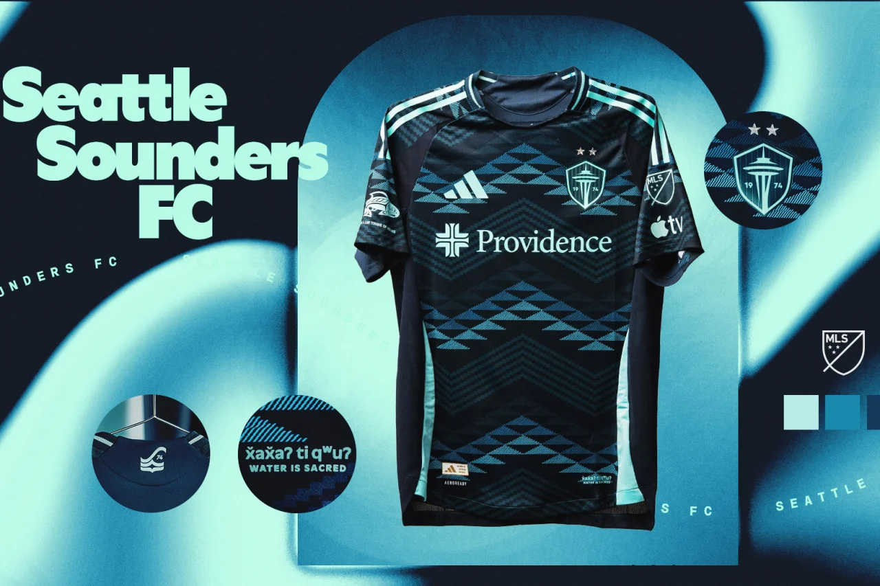
2025: Salish Sea
The latest and best in the community kit series. A design relevant to the entire region of Seattle and the greater Pacific Northwest. This kit is also designed by members of three local tribes giving it the authenticity everyone hopes for in cultural designs. I’ve praised the Sounders for changing their colors and being willing to try new stuff, but this kit being shades of blue is the cherry on top. A killer, unique design that works within the club’s established look. This will go down as one of if not the best kit in club history. It made its on pitch debut in last Saturday’s 5-2 win over LAFC, an auspicious start.
A Stellar Rebrand
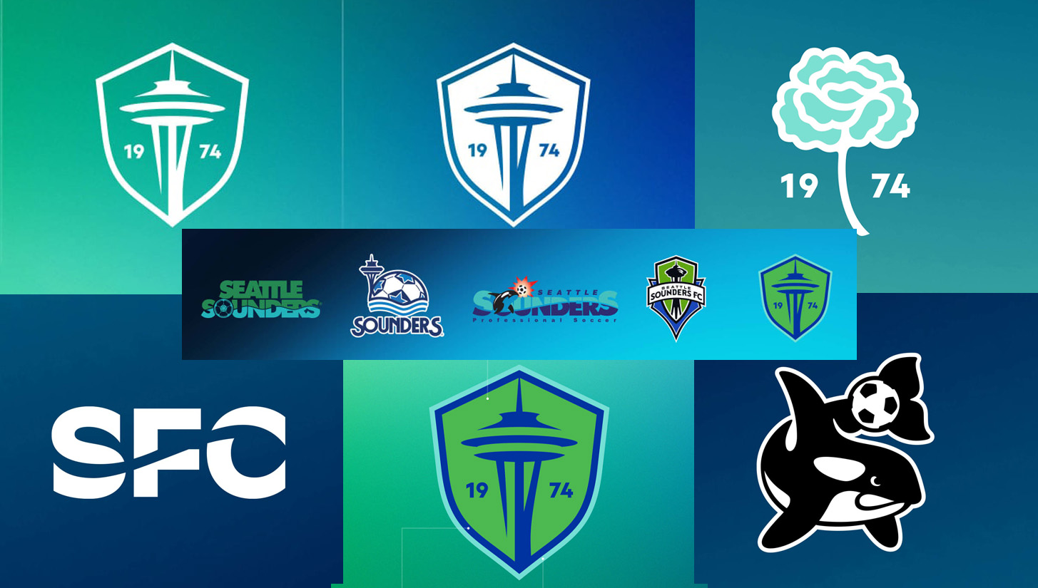
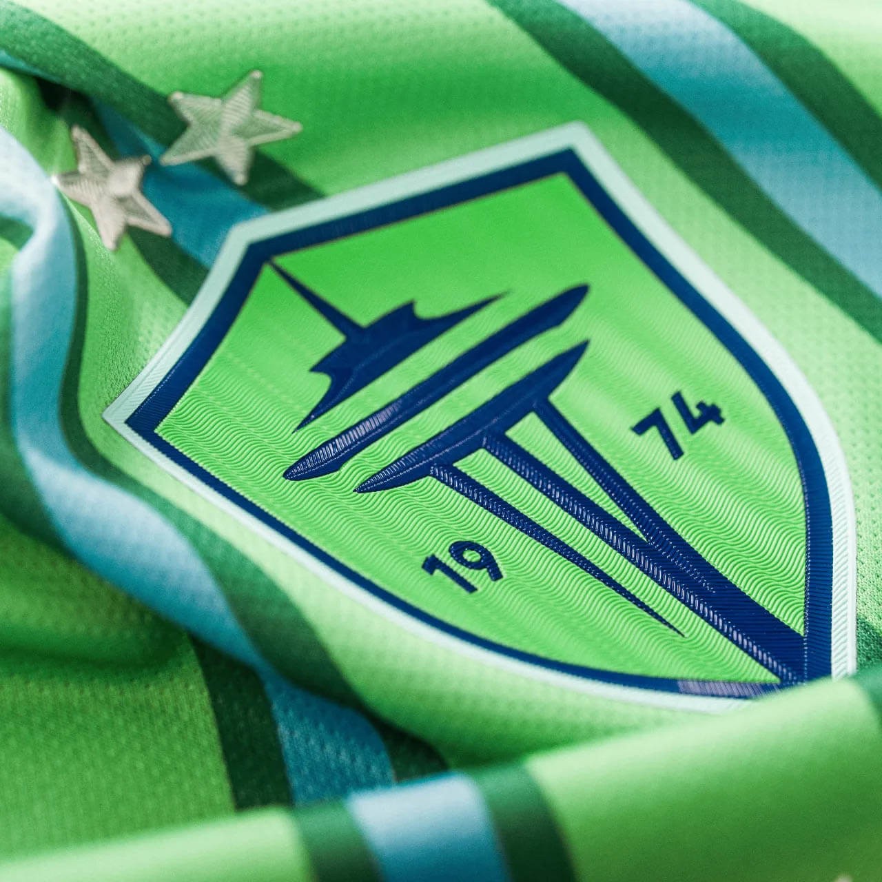
Let’s not forget that ahead of the 2024 season, the Sounders redesigned their crest. Rebranding is a task that many MLS clubs have failed at, most recently Chicago and Montreal, who both introduced new crests that failed miserably and had to be replaced a short while later.
Columbus and Houston also had redesigns that are mixed at best and arguably downgrades. I will die on the hill that the Crew should have kept the hard hat guys, but that’s besides the point. Expansion clubs that introduced new logos haven’t done much better either — Miami, Charlotte, and San Diego have uninspired crest designs, and Nashville’s is also quite bland.
While the Sounders’ redesign isn’t perfect, it is the best executed MLS club rebrand in recent memory. A retro name tag and two killer tertiary designs, both of which have ties to the club’s pre-MLS era, complement the new crest, which is a massive upgrade from the old logo that was designed in 2009 and felt dated in today’s landscape. It works really well on jerseys as a two tone crest, and isn’t cluttered.
Through the new rebrand, as well as the traditional home and experimental away kits (min/maxing at its finest), the Sounders have been able to create an identifiable look while still experimenting and having fun with their kits, something most of the league needs to figure out how to do.


