The special retro-inspired kits for MLS’ 25th season have been nothing if not polarizing. We parse through them all, championing the best and lambasting the worst.
With the MLS season rapidly approaching, the league held a fashion show last week to celebrate the new jersey releases. This season marks the league’s 25th anniversary, so MLS kit manufacturer adidas designed a special template for all teams featuring the brand’s iconic three stripes to commemorate their relationship. You know what that means — it’s time to lavish praise on some of the best kits that dropped, and pour one out for the worst.
The Good
New York Red Bulls Away

Far and away the best of the bunch, the New York Red Bulls got everything right with their away kit. The blacked-out shirt somehow pops like a vibrant color, probably because the almost neon red complements it so well. The red crest and red stripes over the shoulder make this wavy kit a must-add to any collection.
Minnesota United FC Home

Though not quite as stunning as the Red Bulls’, Minnesota United’s home kit is a strong effort. Paying homage to the club’s NASL roots, the gray kit features the wings of their mascot, the loon, superimposed to cover most of the torso. Powder blue stripes over the shoulder complete the look.
New England Revolution Home

This is a sneaky good kit, and perhaps one of the only ones which properly celebrates the league’s 25th anniversary. The aesthetics of the white bar mid torso match perfectly with the New England Revolution logo, which is one of the last OG crests in MLS. The white stripes over the shoulder fit well on blue here too.
Atlanta United Away

Since joining the league in 2017, Atlanta United has led the league on the pitch and off it. This kit is a continuation of that domination. At first glance it seems like just another bland white away kit, but what really defines it is the metallic gold accents. From the stripes over the shoulder to the club’s crest and kit sponsor, it’s regal.
The Bad
Inter Miami CF Away

Now just to be clear, this kit’s only in this category for one reason: expectations were sky high after David Beckham’s club dropped one of the sleekest crests in all of football. It’s not that this kit is bad, it’s just a bit underwhelming given what they had to work with in terms of color scheme. Call us when they get creative a la Forward Madison FC.
San Jose Earthquakes Away
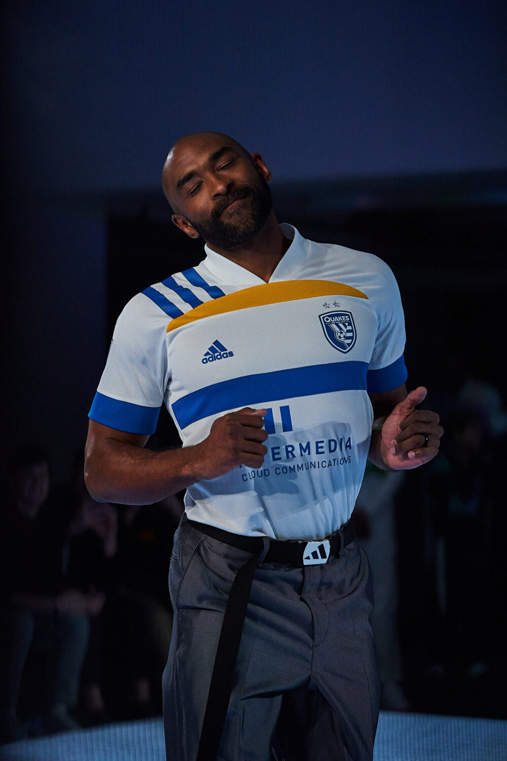
The San Jose Earthquakes had a flawless concept with this away kit, but the eyesore of a kit sponsor doomed the execution. In a nod to San Jose’s flag, the upper half of the white torso features yellow and blue horizontal bars. A unique and intriguing kit, until they slapped the sponsor on it. At least they don’t have to wear it at home?
Columbus Crew Away
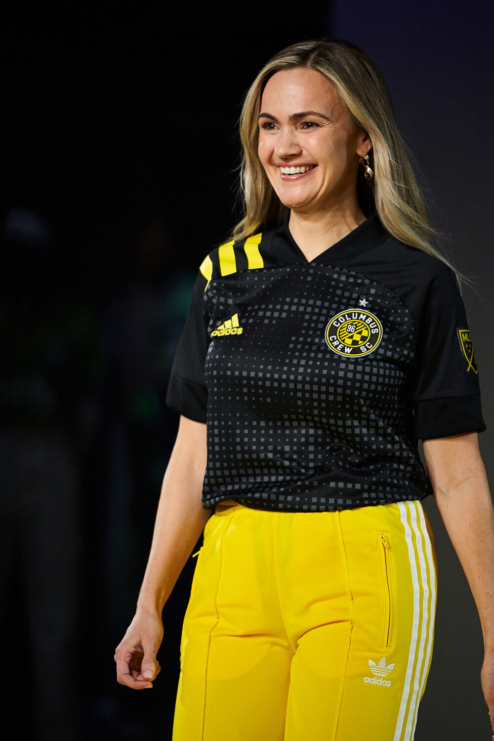
Similar to San Jose, the Columbus Crew had a fantastic concept with this one, however the execution leaves a lot to be desired. The torso features a cool design reminiscent of pin art, but it doesn’t mesh well with the yellow stripes over the shoulder.
The Ugly
FC Cincinnati Home
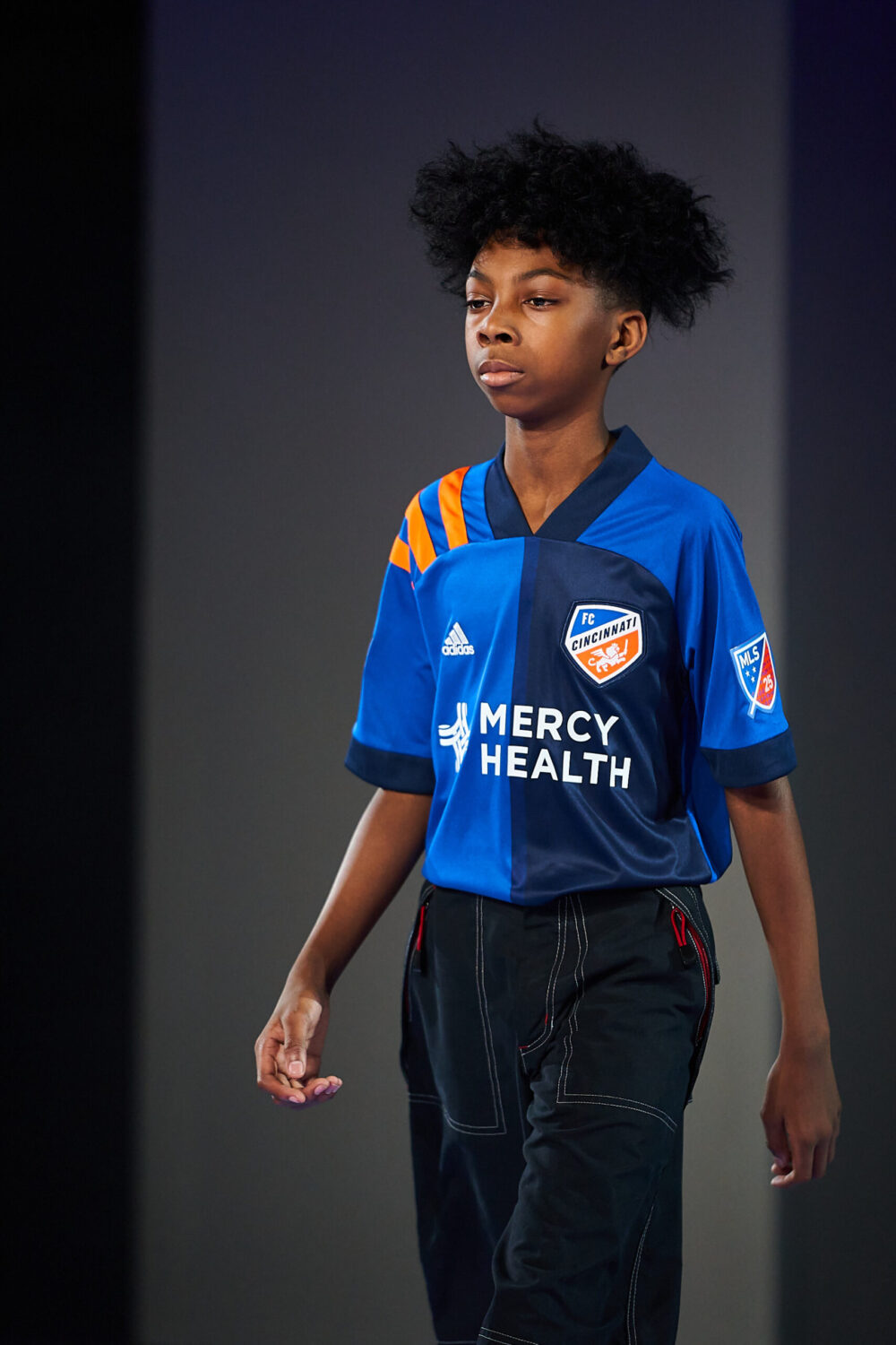
Woof, this kit is an atrocity. While it appears FC Cincinnati went for a Blackburn Rovers concept, they didn’t even come close to pulling it off. The torso is split into two different shades of blue, with burnt orange stripes over the shoulder. And then the collar and sleeve cuffs appear to be a third shade of blue. Because why not.
FC Dallas Home
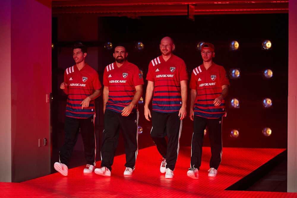
FC Dallas whiffed completely on the concept for this kit. The top half of the torso is a classic red, which goes well with the white stripes over the shoulder. But then, blue stripes begin to inexplicably form and increase in size as you go down the shirt. The design feels incomplete, kind of like Everton’s home kits last season.
Real Salt Lake Home
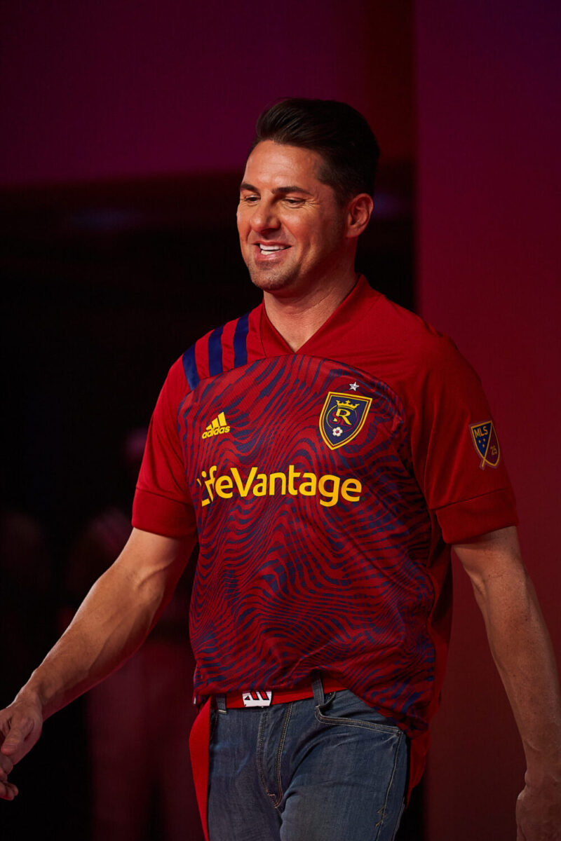
Like FC Dallas, Real Salt Lake got this completely wrong from the jump. The design pattern on the torso looks like something that belongs on a generic adidas shirt. Template on template is a crime. Also, this design never had a shot at meshing with the EQT template, as the blank red shoulders clash with the all-over print.
Photography by Sebastian Ramirez for Urban Pitch.


