Much like the city of Portland itself, the Avery Dennison Toffee League is delightfully unique, focused on community and creativity rather than winning and losing. Perhaps the most obvious example of this is the eye-catching collection of jerseys designed by each team. We got a chance to take a closer look at the process behind each jersey’s creation from several Toffee League teams.
The Avery Dennison Toffee League in Portland, Oregon is known for its creative style and rambunctious players. Though the league is still relatively new, they’ve fostered a strong tradition of staying weird and use their creativity to come up with some of the most colorful and eclectic soccer wear out there.
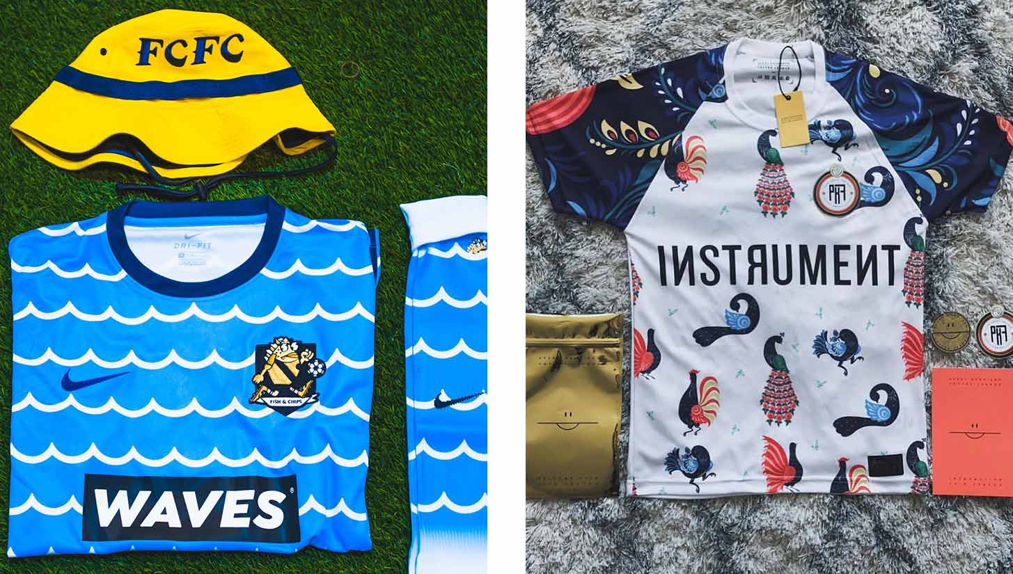
Every season, each team designs a new jersey for their team to don. After the league’s season is over, the kits go on sale online and teams start drafting new designs for the next season. This past season the Toffee League was filled with colorful designs and crests that took inspiration from the love of the game, with some celebrating football’s biggest event, the World Cup. We caught up with a few Toffee League players to get their thoughts on the league and their kit designs for the past season.
Outsiders FC
Urban Pitch: How long have you been involved with the Toffee League?
Emma Deppa, Outsiders FC co-captain: This is the second season for Outsiders FC, aka “the Black Sheep,” so we’re one of the six teams from the inaugural season. Season two is comprised of half new and half old teams, so it’s been really cool to see the league grow and bring in all kinds of new teams, talent, and ways of making football weird!
How are your new kits representative of the league’s creative ethos?
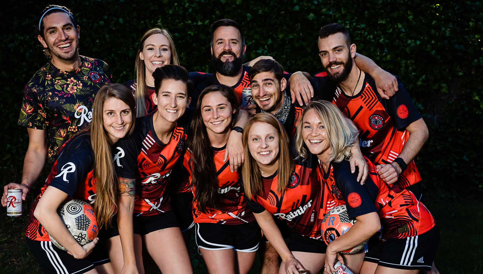
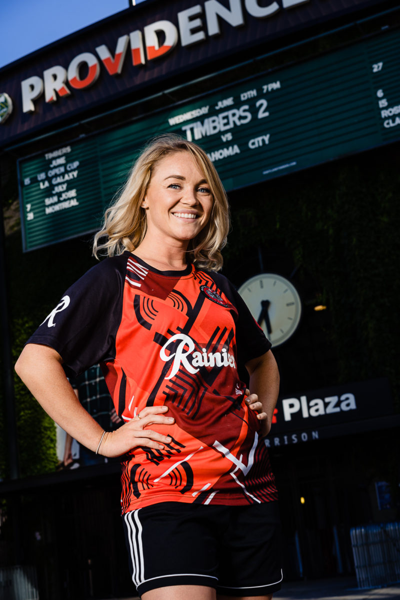
For kit inspiration, we played off the league theme “From Portland With Love” — a nod to the 2018 World Cup hosts. The pattern screams Russian Constructivism, though many Portlanders have noted its resemblance to the infamous PDX Carpet. Our kits fit the personality of our team: loud, proud, and a little off-beat.
What is the inspiration behind the color and design of your kit?
Our colors remain the same as last year: black, red, and white. Conveniently, they are the same colors used in many of the classic Russian Constructivist designs, so it was a great fit. We wanted to evolve our kit design from last year, but stay true to our overall team look and ethos, and our design team really nailed this one on the head.
What is your favorite thing about the Toffee League?
Forget Christmas, Toffee League is the most wonderful time of the year! The opportunity to flex our creative muscles in designing unique kits, logos, and a team story is just the beginning. Once the season kicks off, the league becomes more of a community than anything, which is why we all often refer to it as the “Toffee Family.” While the competition is fierce on the pitch, the bonds forged throughout the season are just as beautiful as the game — not just within your own team, but across teams as well.
This year the community building really ramped up. Toffee League had every club host a game day, and it paid off. We saw a New Orleans-style jazz band and a slew of DJs, champagne bottles, cold beers, and jello shots in addition to World Cup viewing stations, barbecues, and lawn games. All of these activities encouraged teams to stick around after their games, meet other players, and engage with the wider community, building new friendships and alliances no matter the kit you sported.
What is more important to you in kit design: Color or logo/crest?
Neither. Our football club prides itself on being different than the rest — and given our logo of “black sheep” (or in Russian, “white crow”) — we know that no matter what colors we wear or how our logo evolves, our herd of miscreants will stay true to ourselves and each other, and that is what makes us so strong on the pitch. We compete in our first playoff championship this weekend though, so if there’s anything we want to see on our kits next year it’s a star above our crest!
High Five SC
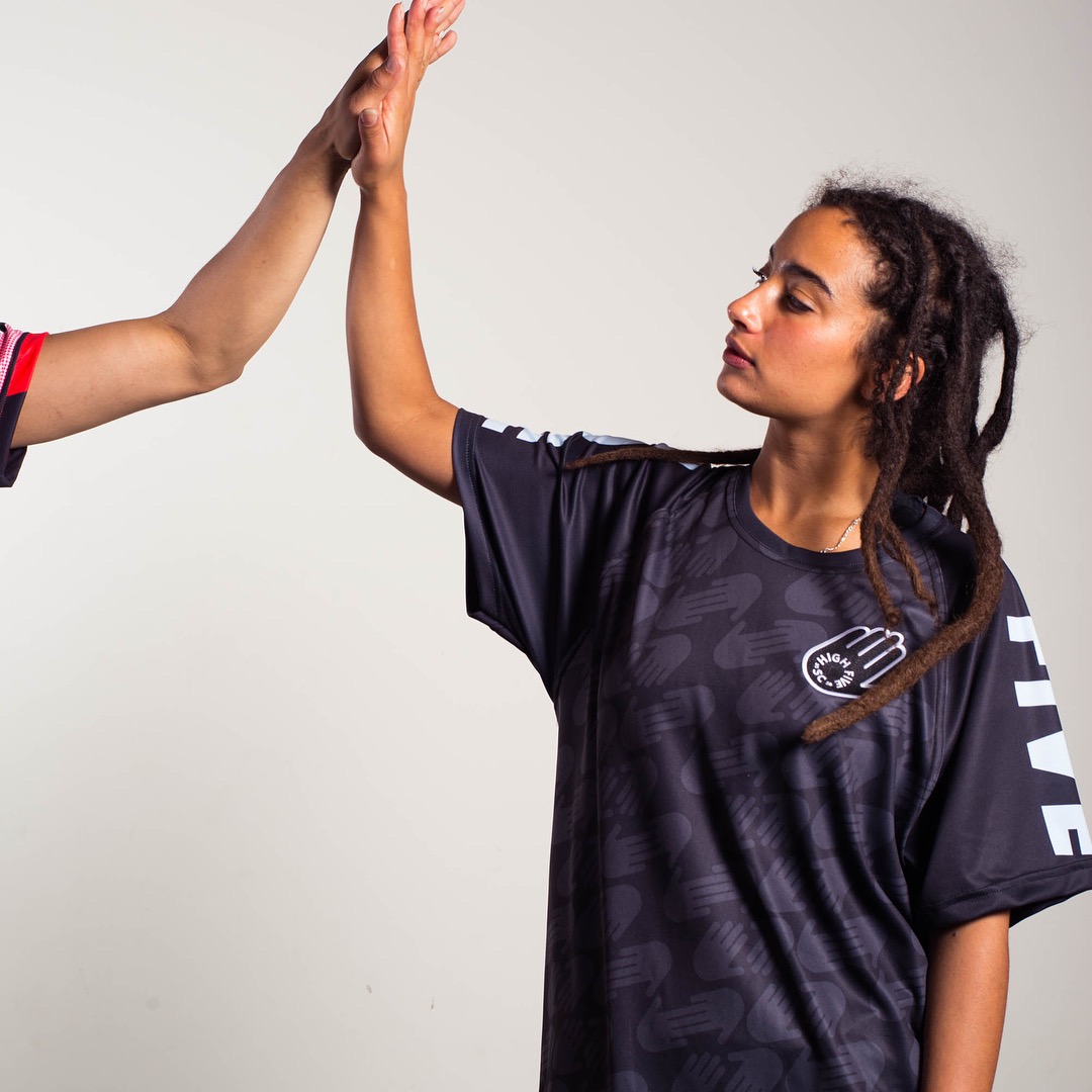
How long have you been involved with the Toffee League?
Tom Crow, High Five SC player: I followed the league last year, and then this year they approached my agency, Cinco Design, to bring a team to the league, so this year was our first season.
How are your new kits representative of the league’s creative ethos?
Most of us on this team, with the exception of me, don’t really know too much about football. It was great to introduce it to the company, and we have complete beginners. We’ve trained up, and it’s been a process. And you know the Toffee League is all about fun. It’s all about celebration, keeping football weird. It’s about the fun involved with football. And a High Five is a common celebration.
What is the inspiration behind the color and design of your kit?
The name High Five came from the idea cinco, as in five, so High Five just made perfect sense.
What is your favorite thing about Toffee League?
It’s a great social experience. There’s a lot of camaraderie, there’s no animosity after the games. People stay, have a beer and watch other teams play. I came from London and football was a way of life. The team I played with there was like my family. They become your best mates and you go to pubs and have barbecues together. And then there’s the banter. It’s really important, the banter is the fun you have, the jokes you share. When I first came to Portland I played for an 11-a-side league and it wasn’t that social. People would show up for the game 15 minutes before, play and then leave. It was like they were treating it just as exercise. So what I like about the Toffee League is the culture. It’s fun, social and that’s the most important thing about a football league for me. You know, I’m not very good, but I play football for fun.
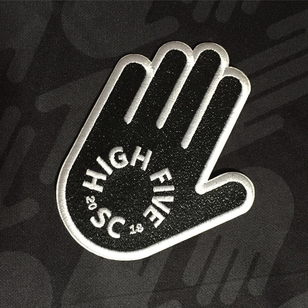
What is more important to you in kit design: Color or logo/crest?
For me it’s the crest because I’m a brand designer. I create identities as a living. My job is designing logos, so I’ve designed logos for a few small teams in the past, so I always check out new logos on shirts. I love the history behind logos and crests, the story of how they were designed. Some go into such detail, they’re describing a story — there can be all these hidden easter eggs in them. And then there are the ones that are simple. The Juventus logo is so simple, and that’s caused a bit of uproar. Some people hate it, but I think it’s great. Color is important, but for me it’s the logo. Maybe one day I’ll get to design a MLS team.
KaltFC
How long have you been involved with the Toffee League?
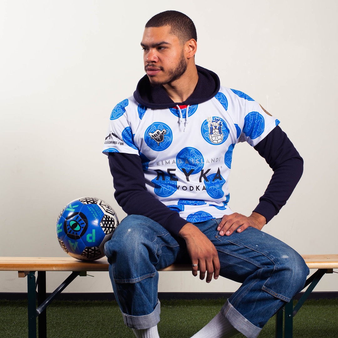
Blakely Dadson, KaltFC player: I’ve been involved since the beginning. I didn’t have a team the first season. I’m an artist, and I was brought in as a guest artist so I made a whole bunch of kits. The next season, the organizers were like, “Yo, you should have your own team,” so I got a team together, Kalt FC, and designed our kit for season two.
How are your new kits representative of the league’s creative ethos?
It’s where design meets sport. We embody the league, which is like 70 percent creativity and 30 perfect football. Our kits are just fun, and that’s what the league is about.
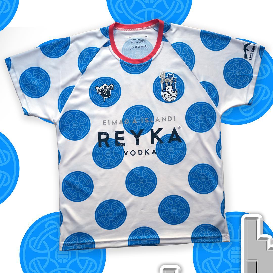
What is the inspiration behind the color and design of your kit?
I’m Icelandic by heritage and kalt means cold in Icelandic. It was the first time Iceland had made it to the World Cup, the smallest nation ever. Even though I’m the only one on our team with Icelandic heritage, the team just dove into it. I made these large blue polka dots with viking knots, so it’s very Nordic-inspired. Our kits are like what would happen if the Toffee created an Icelandic national team jersey, which would be crazy and fun.
What is your favorite thing about Toffee League?
Hands down it’s the community. What’s amazing is the league and the Toffee Club pub bring people together who would normally never ever know each other otherwise. It has become a magnet for super interesting and intelligent people. The community aspect for me is the best part. You get to have some beers for rad people and kick the ball around.
What is more important to you in kit design: Color or logo/crest?
I would have to say color is more important only in that it’s how you’re seen on the pitch against the opposing team. I think the crest is so small on the jersey, it’s sometimes hard to see. You could have a whack crest, but if your colors are dope then you’re dope.
A number of Toffee League kits are available for purchase, check out the Toffee League Instagram page to see how you can pick one up. You can also buy jerseys from last season at the Toffee Club shop.


