
Continuing our 2023 MLS kit coverage, we take a look at the away jerseys from the Colorado Rapids and the New York Red Bulls, which feature artistic designs in partnership with creative minds.
“Art has a voice – let it speak.” – Rochelle Carr
Major League Soccer and adidas have dropped a new wave of kits for the 2023 season that are as cool as they are symbolic. They breathe revolution as MLS begins its blockbuster media rights deal with Apple TV.
Each club’s kit has its own personal touch, one that is intertwined with its locale and its people. It’s a masterstroke of storytelling, and one that fuels distinctiveness throughout club allegiances and rivalries.
Two kits in particular stood out to us here at Urban Pitch – one for its blend of urban culture and innovation in representing New York City, and the other that confronts social stigma while also embracing the natural beauty of Colorado.

First, let’s look at the New York Red Bulls’ away kit, which was created in collaboration with luxury sportswear designer Daniel Patrick. The Australian born, Los Angeles based artist blends his love of all sports with themes of transit and movement.
“It’s not just a kit. It’s a fit,” is what Red Bull will tell you, but we’d go even further and say it’s a lifestyle. A looser fit reminiscent of the distinctive modern New York City fashion scene, and one that plays on the artist’s love of hip-hop. In other words, a perfect New York fit for catching the cameras at a match, or styling on the PATH train through the Big Apple. We caught up with Patrick to talk about the kit.

Urban Pitch: How’d it start between you and Red Bull?
Daniel Patrick: I’ve got a partnership with adidas and it came through because they’re doing all the kits for MLS. We’re big in basketball, so we had a partnership that started there and our first collaboration with adidas was with James Harden. We’ve been with them for six years now, and it was shown in the 2020 All-Star Game, and then we transitioned into soccer, and we’re doing baseball stuff as well.
How do you differentiate your design between the sports?
It depends. When we started working on the Red Bulls jersey I was working on the baseball stuff at the same time, so there was a bit of synergy when I crossed over into the Red Bulls stuff. So there’s some tie dye that I did which will be coming out. We’d done tie dye in the James Harden collection and our own collection before that, so it has been an evolution from our own brand. I came about using that with Harden because I was wearing our own stuff in our first meeting and he liked it, so then I said, “We should do something like this for our collaboration,” and it stuck from there.
How did you approach the Red Bulls design by incorporating that style?
With the tie dye for Red Bulls I was trying to do it with a bit of motion to it, and New York has a lot of activity and motion. It’s a busy city, so that was my thought process on that — motion in the city and motion on the field, like how when you take a picture and someone is in motion and it has that blurred effect. That was my idea with that, and then there’s a repeating pattern of “NY” and a monogram that’s repeating underneath that, which you can see up close.
What went into the release video?
It was in Newark. We shot that about 10 days before the event. There was one guy on the Red Bulls team who had mentioned the location before and that he wanted to shoot there when we had the chance. I think they had shot a J Balvin video there, and he was big into J Balvin. But it’s a really good space regardless, and we made use of the rooftop in which you get the backdrop of Manhattan, and the interior was also really cool.
Are you a Red Bulls fan now?
Of course! Anytime you have some connection or relationship with the team and you’re embedded into their culture. Selfishly I watch the game to see the jersey, I can’t wait to see how they look on the field. I went to the arena for the first time in January, it was really cool.
It’s crazy to think of what the area used to be, and now to see it completely revitalized.
Across the street from it there is a whole new set of apartments, and I think with the stadium then comes a lot more revitalization. I hadn’t really spent much time in New Jersey, so it was cool to spend time outside of the city. If I was going to live in New York, I’d probably live in New Jersey.

We now head west for another artistic shirt with a meaningful message behind it.
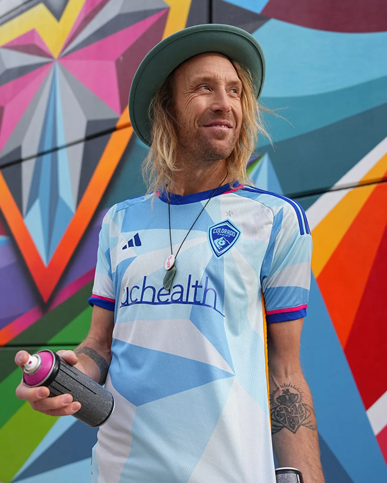
In Colorado, the Rapids’ “New Day” is a kit designed by Denver street artist Pat Milbery. It draws from the sunrises and sunsets that are ubiquitous in Colorado. But moreso, the promise and potential of what each new day brings, as the Rapids partnered with Mental Health Colorado to raise awareness to the state’s mental health crisis.
“We want to connect the kits to Colorado in a meaningful way,” said Rapids communications director Omar Gonzalez. “With this one we had that motif of a new day and the possibilities that come with it, as well as a new season. It was a possibility to highlight a potential issue and something we care about.
“We looked at the data and it reaffirmed our belief — one in five people in Colorado had some mental health problem. Anyone can be affected, not just pro athletes, and we see that with the youth as suicide is the leading cause of death for people between 15 and 24 years old. We are hoping to reduce the stigma about seeking help and utilizing resources available to the public.”
Milbery’s style is portrayed in this colorful collage with a unique western color palette matched with abstract figures and geometric shapes. Easter eggs include a mountain graphic on the back collar, portraying the Rocky Mountains as well as the artist’s background in professional snowboarding.
Just like with Patrick, we were able to catch up with Milbery to discuss the process behind the stunning jersey.
Urban Pitch: How did the relationship begin, who reached out to who?
Pat Milbery: They reached out in 2018 to launch a non-traditional press release approach with a couple different players who are still with the club, to welcome them into the city. They wanted to do it in front of one of my murals in the city. They did a flash-mob style inviting their fans, and I welcomed the opportunity to utilize the art that had been painted on this wall to service a cool community gathering backdrop.
They thought about doing more fun, non-traditional and different approaches to projects, and after we met they got us tickets to matches so I had been going out quite a bit to the stadium and just enjoying the matches. Then they really wanted to switch up the temperature for this kit and do something different that would involve the local culture and tie it back more into the DNA and feeling of everything in the city and its landscape.
So they approached me to collaborate and asked if I was interested in developing it out with them and it was very unexpected, which was awesome. adidas was playing the middle role, and we developed it out because they had to be involved in the process and understand what we were trying to do. With it being the first specific artist-driven piece and with a different message of the kit, as far as mental health focus, they wanted to be involved in the design process and to see it through.
Given the mental health aspect, how did you approach this design compared to other pieces?
Whether a mental health focus is specifically identified or not, it’s there. As humans our mental health is our everyday of trying to do our best with life and trying to be as aware of how we are feeling but also how we are handling situations, treating each other, and treating ourselves.
So this project, with the mental health focus being at the helm, was to think how the elements of sport and life coexist, and how art can merge those together. But also being out in nature and being outside and playing is so good for us as humans and so good for our mental health. So we wanted to utilize, and think about as far as design is concerned, to have a Colorado nature-scape focus.
Some of the colors behind it are for encouraging people to be outside more, play more, be out in nature more. Also, highlighting a lot of our landscape as we are really lucky to have what we have here, and everything that’s around us.
As you’re mentioning these different elements of nature and more of an emotion-based approach, does that influence your unique color palette?
I would certainly say so. For this kit there were actually restrictions placed on color so I couldn’t go too wild with it. There were certain applications with the adidas team, and using certain colors. Also you have to really think about how the players are going to feel on the field with this, how will they feel collectively playing with this kit over the next two seasons, so there was a lot of psychology of trying to harmonize that relationship with players, and while they’re on field and all the little things that go with that.
But as far as my personal palette and how I enjoy painting, I really enjoy doing so with a lot of color and bringing energy to space, to life, to vibrancy, and really trying to break apart the mundane greys and often-times really boring and dull landscape that we find ourselves occupying here on earth and in America, that could use a little more taste, imagination, and whatnot. Add a little bit more joy into your everyday life with unexpected color paths and vibrancy.
It’s an away jersey right, so it hopefully paints that picture of Colorado for people and can also be representative of the club for their away matches. We’re extremely lucky to live here, it’s driven by nature outside and there’s a lot of those elements that are super special to our landscape. The kits in the past have definitely been cool but, the reason why I have the golden yellow-ish burnt orange tone and the magenta, well, we’re called the colorful state for a reason. The natural blue skies are super vivid, filled with energy, and electric blues.
We have really beautiful sunsets here and they happen quite often. They’re special with the mountains, they’re pretty dreamy with the sense of different layers of altitude. They’re really shifty and can be so different, as compared to the east coast which is just one elevation. You have buildings and things that are formed from humans that shape the skyline and all these different perspectives. But here, nature is creating our perspective.


