Take a trip back throughout the year with us as we review some of the most incredible and disappointing football kits that released in 2023.
It’s no secret that we love football kits here at Urban Pitch. And while it may be impossible to sum up an entire year’s worth of releases in one article, we can certainly try our best. From the biggest splashes to the loudest duds, we take a look back at both the best and worst kits from the calendar year.
The Best
10. Dreams FC Home
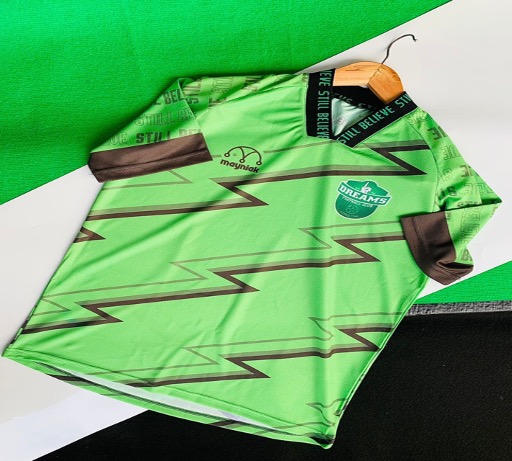
Kicking off our top 10 kits for the year is an obscure one from Africa, the home shirt of Dreams FC. A relatively new Ghanian side, the club’s home kit is draped in a bright neon green colorway with a lightning strike pattern throughout the body.
On the sleeve is the club’s motto, “still believe,” which also appears at the back neck of the shirt. The kit is made by Mayniak Sportswear, a Ghana-based manufacturer that has grown popular across the African continent.
9. FC Massalia
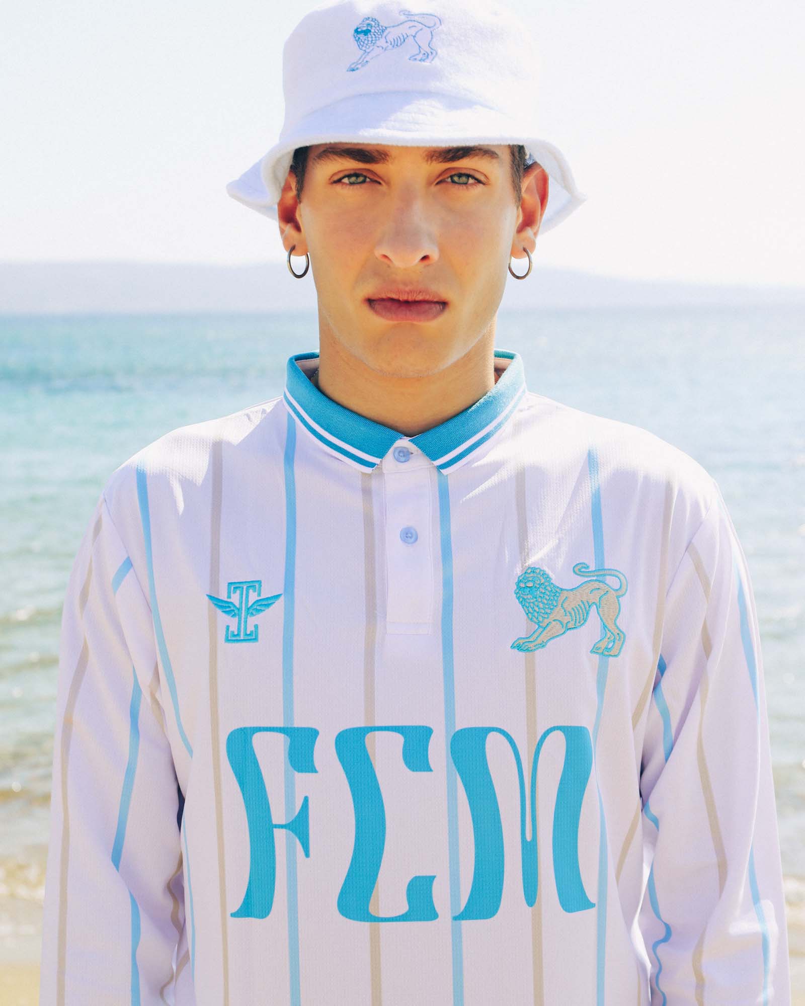
This kit may not have seen action on a professional pitch, but that doesn’t take away from its beauty in the slightest. Part of Icarus FC’s latest historical project, The Hellenic League of Champions, the FC Massalia kit features an incredibly elegant design that instantly transports us to the idyllic Mediterranean coast.
If it evokes specific images of Marseille, it’s not by accident. Massalia was a colony of ancient Greece that existed in what is present day Marseille. It’s a beautiful shirt that pays tribute to a beautiful city with a rich history.
8. Union Berlin European
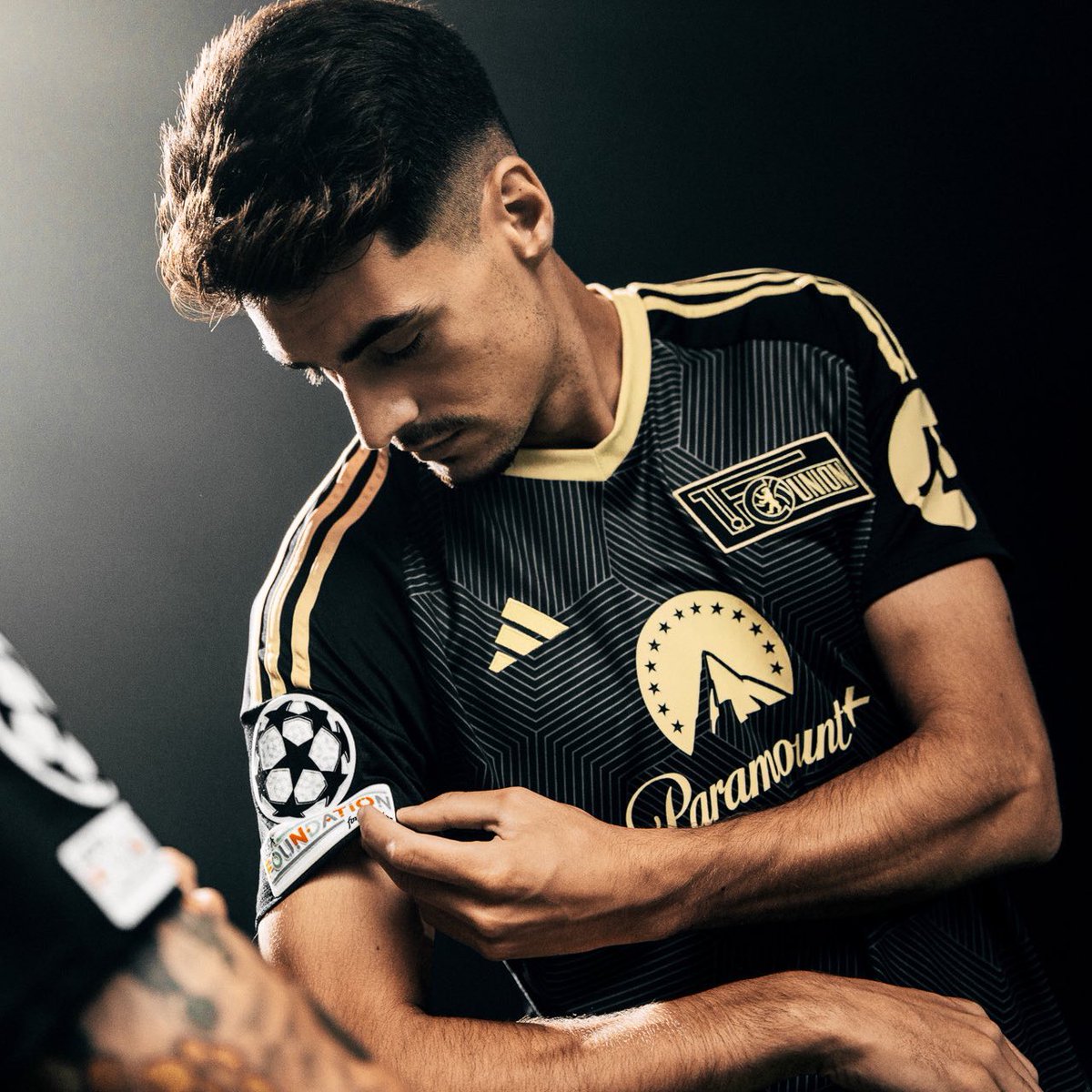
After a successful comeback to the Champions League this season, adidas and Union Berlin dropped this kit specifically for the German side’s European campaign this season. Primarily adorned with black and gold hues, the design is inspired by the t-shirt the club wore upon qualifying for the Champions League last season.
The golden badge and sponsor logos seamlessly merge with the overall design, enhancing its allure.
7. AS Roma Away
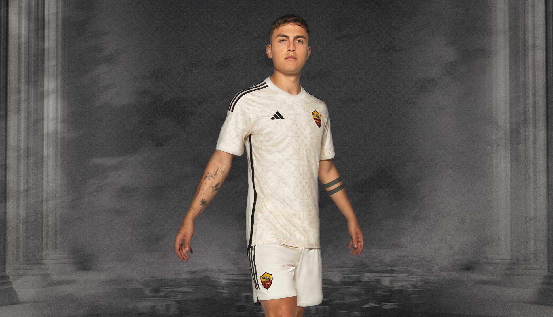
AS Roma were blessed with a lineup of absolute belters from adidas in their first year with the German brand. The away kit was the standout of the bunch, and it gets bonus points for paying homage to the Eternal City of Rome. Inspired by the earthy shades and intricate designs prevalent in ancient Roman architecture, the kit beautifully captures the essence of the city’s unparalleled character.
6. Ajax Home
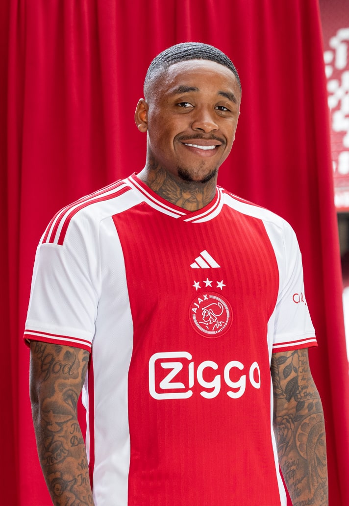
One of the most difficult projects to handle by sportswear manufacturers is the freshening of designs and style which can’t be altered greatly. A typical example is Ajax’s home kit. adidas nailed this design perfectly by enhancing the renowned vertical red stripe, adorned with a pinstripe pattern on a sleek and glossy foundation.
The Ajax emblem takes center stage on the jersey, accompanied by the sponsor and adidas logos, enhancing the overall linear aesthetic. Additionally, the presence of three small St. Andreas crosses on the back neck of the shirt serves as a symbol of local pride.
5. Club America Home
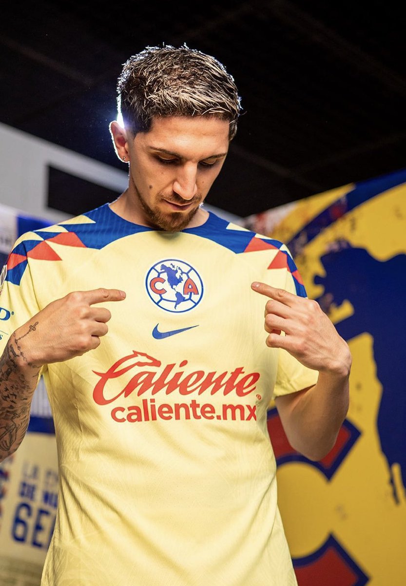
In a year that saw Nike release a lot of disappointing designs, the Club America home kit is an exception. Nike tends to hit pretty consistently with America’s kits, and the 2023 version is fit for a champion — literally. Recently hoisting the Liga MX Apertura trophy, America proved the “look good, play good” adage.
4. Arsenal Home
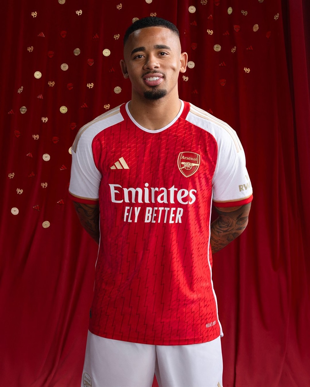
It is often said that lightning never strikes the same place twice. Surprisingly, even after two decades have elapsed, the Gunners stand alone as the sole club to have completed an English top-flight football season undefeated. In celebration of this exceptional milestone, the Arsenal 2023-24 home shirt pays homage to the team’s historic achievement in the 2003-04 season with the inclusion of lightning bolts and opulent gold details.
3. Crystal Palace Home
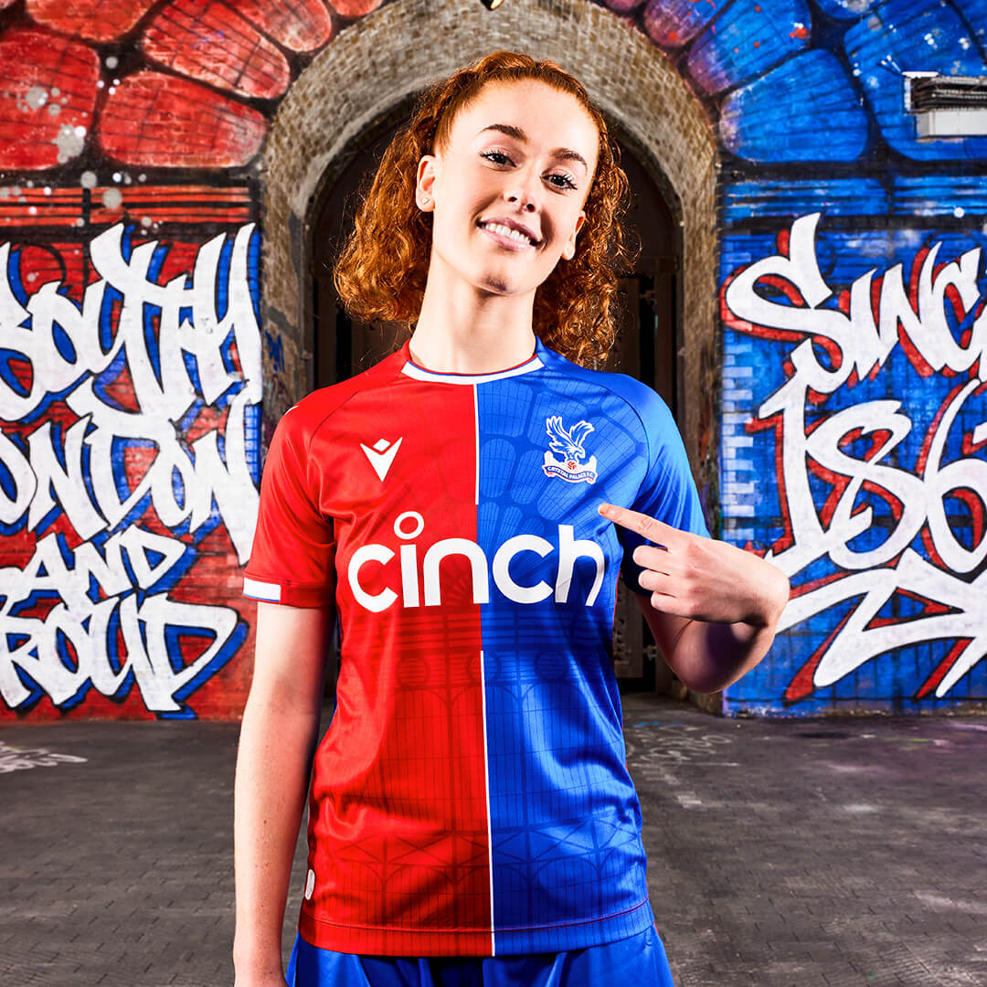
Italian brand Macron successfully united heritage and modernity in the Crystal Palace FC 2023-24 home shirt. The design pays homage to the original Crystal Palace in London, symbolizing the profound connection between the club and its city. The vibrant club colors take center stage throughout the kit, creating a striking visual display. Moreover, the unwavering passion of the Eagles fans is eloquently expressed through the stamped wording at the back neck too.
2. LA Galaxy Away
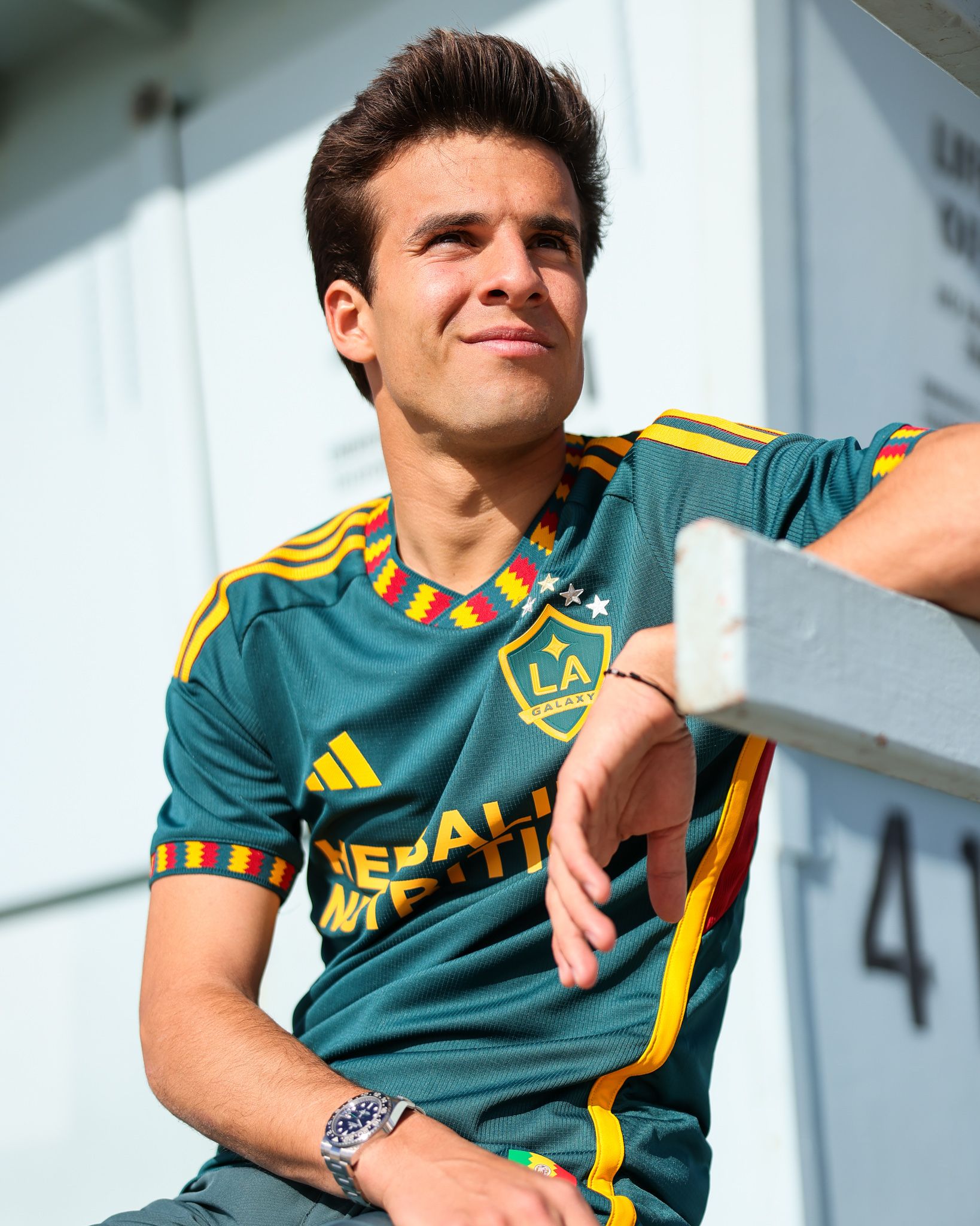
Showcasing the essence of Los Angeles, the 2023 LA Galaxy away shirt by adidas is a testament to the city’s vibrant identity. The green, gold, and red colors are proudly displayed, mimicking that of the flag of Los Angeles.
1. Monaco Home
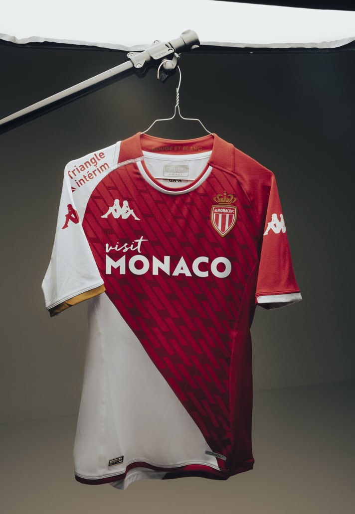
AS Monaco’s kit by Kappa has made a compelling case for being the best kit this year. It combines a classic sash-like half-and-half design with a contemporary touch. The shirt boasts a two-tone round collar, featuring the club’s motto “Daghe Munegu” inscribed on the back. Furthermore, the phrase “Red and White” is elegantly displayed in gold letters on the inside, creating a sophisticated contrast. It is worth noting that this kit is crafted entirely from recycled plastic, a promising trend that many kit manufacturers are hopping on.
The Worst
10. Arsenal Away
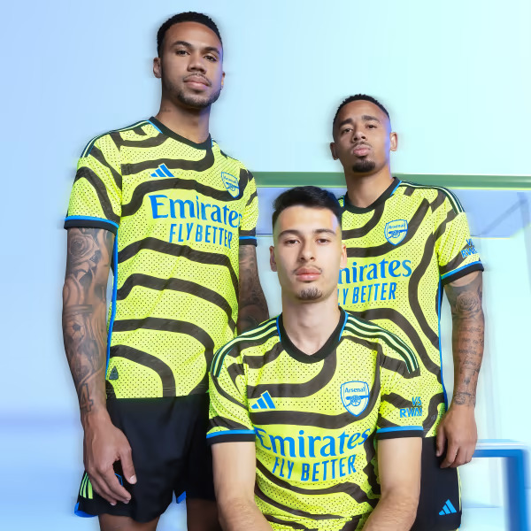
A very nice concept, but the execution gave it away. The inspiration behind the London club’s 2023-24 away shirt is a map of Islington, the locality in which the club is based. The winding stripes are meant to represent the paths that Arsenal fans use to commute to and fro to watch their team play. The highlighter colorway was certainly a risk, and one that didn’t quite pay off.
9. Borussia Dortmund Home
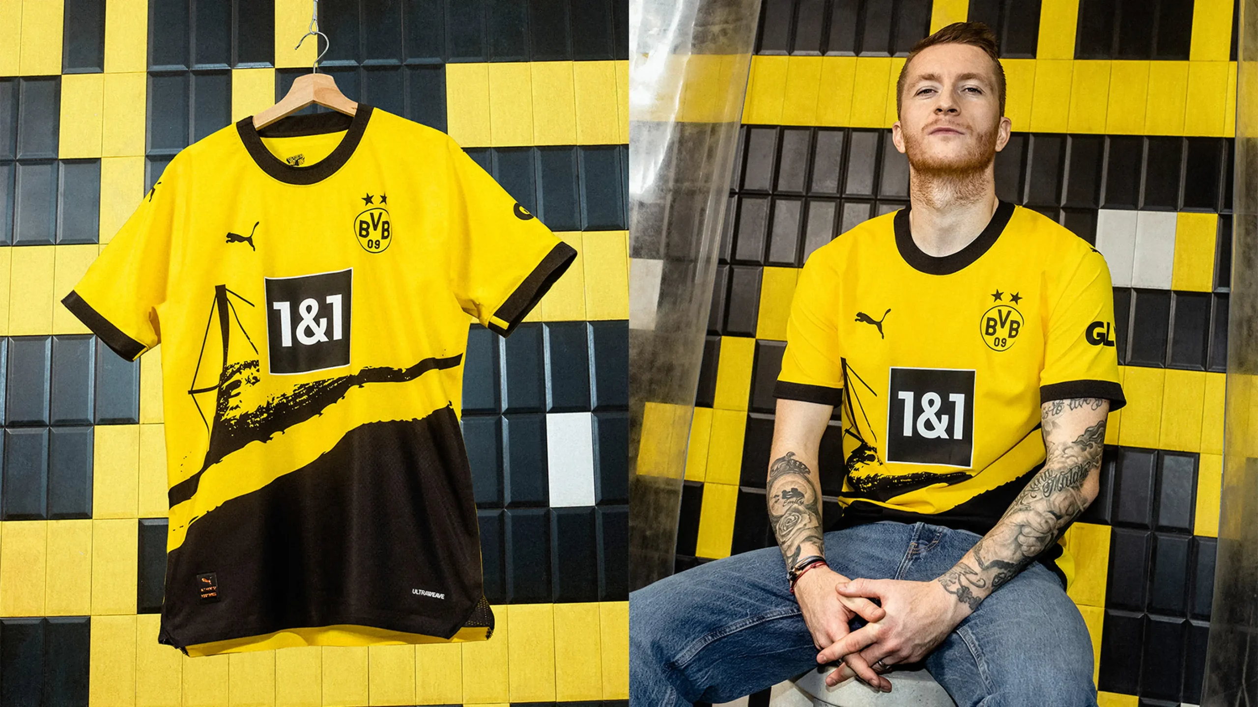
Made by long time Borussia Dortmund kit supplier PUMA, the BVB home shirt was the product of a design contest in which fans voted from 10 finalist kits. The phrase “Do not listen to those who say the voice of the people is the voice of God, since the tumult of the crowd is always close to madness,” applies here.
8. FC Basel Away
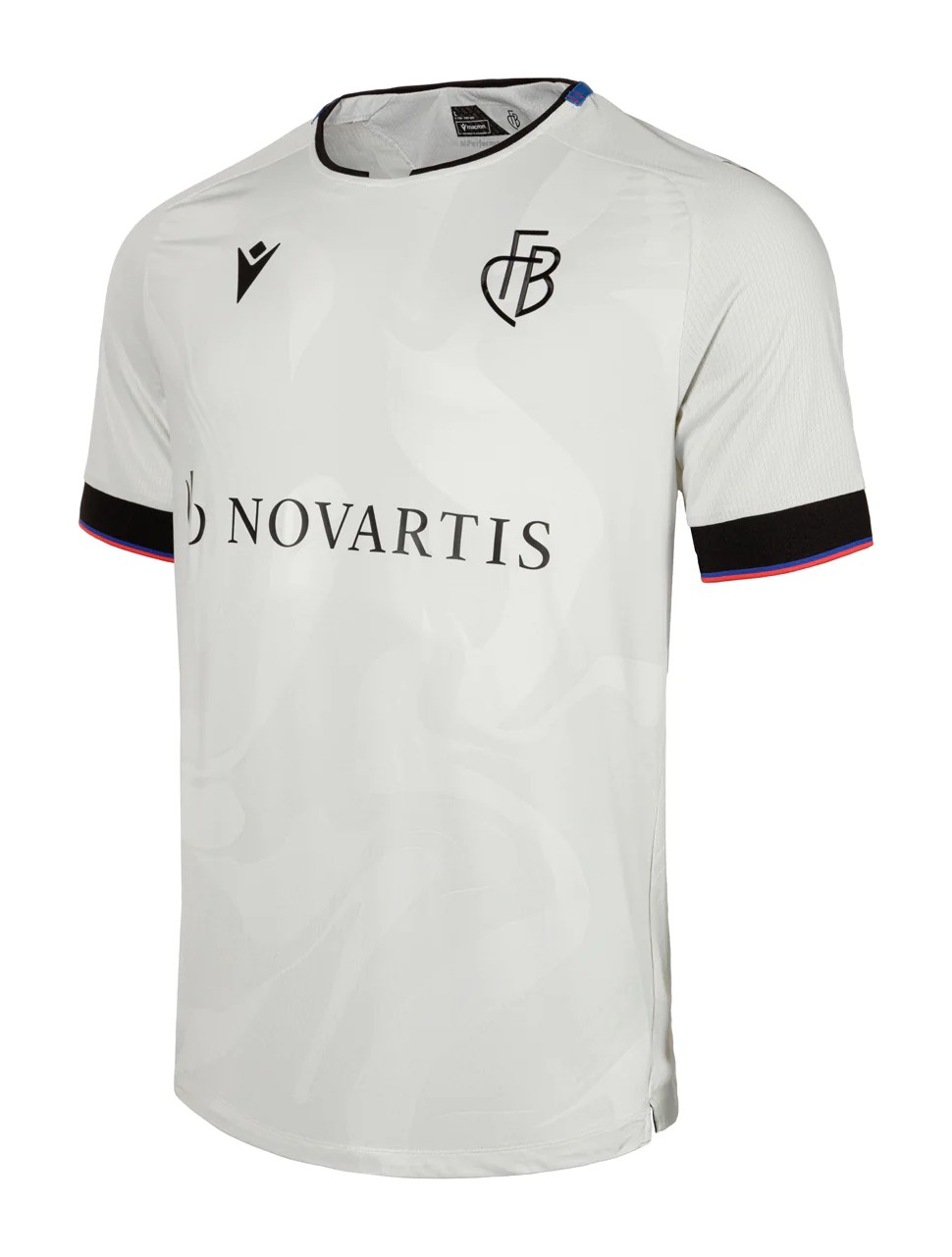
Meant to embody the unique characteristics of FC Basel, the design of this shirt ultimately fell flat in terms of visual appeal. Although it boasted an embossed pattern that showcased an interesting interplay of shapes on both the front and back, these embellishments failed to materialize into the desired outcome envisioned by Macron.
7. Juventus Home
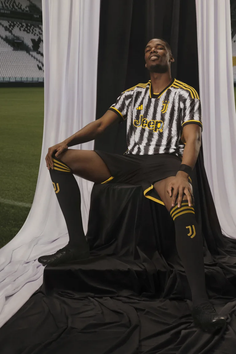
This could have turned out to be a great shirt had it not been for the busy nature of the stripes. When the visuals were released, it had a lot of kit lovers on its side, but the embellishments and the yellow strands on the shirt turned it into something dull.
6. Lask Away
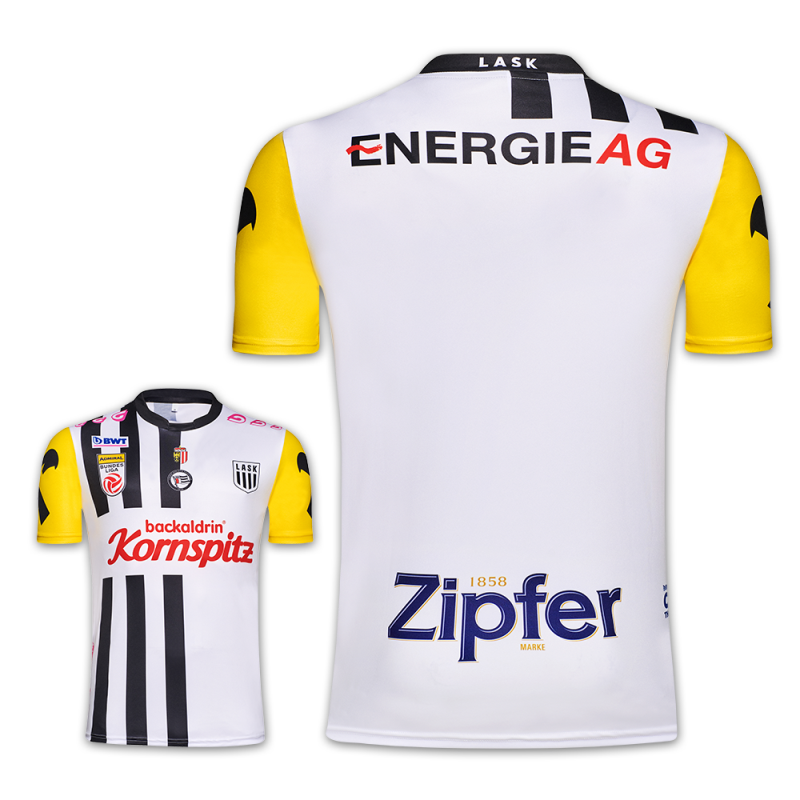
This could easily qualify as the worst shirt in Europe in 2023. Its inspiration takes from the club’s kit in the 1960s, but the execution failed to reinvent the shirt to suit modern taste (or any taste, for that matter).
5. Barnsley Home
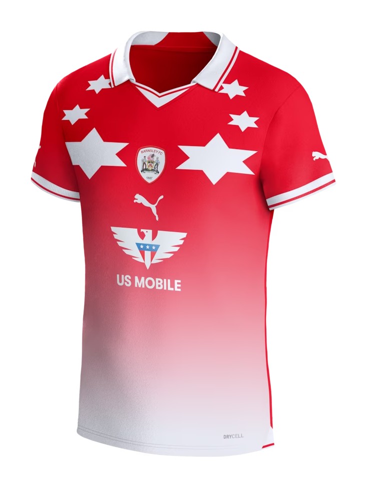
PUMA teamed up with KidSuper in a surprise collaboration for the Barnsley home kit, but it missed the mark by far. It’s a strange design that lacks connection with all brand elements and heritage of the club.
4. Watford Home
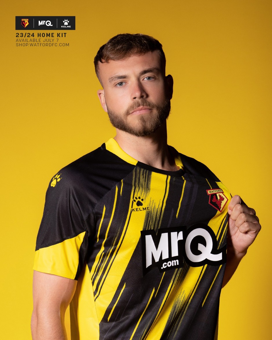
Watford’s yellow, red, and black color scheme can churn out a plethora of solid possibilities, provided a solid designer handles it. That was not the case here. A brushstroke-inspired design lacks any artistic value, and there’s really no signs of a decent shirt anywhere here.
3. Liverpool Away
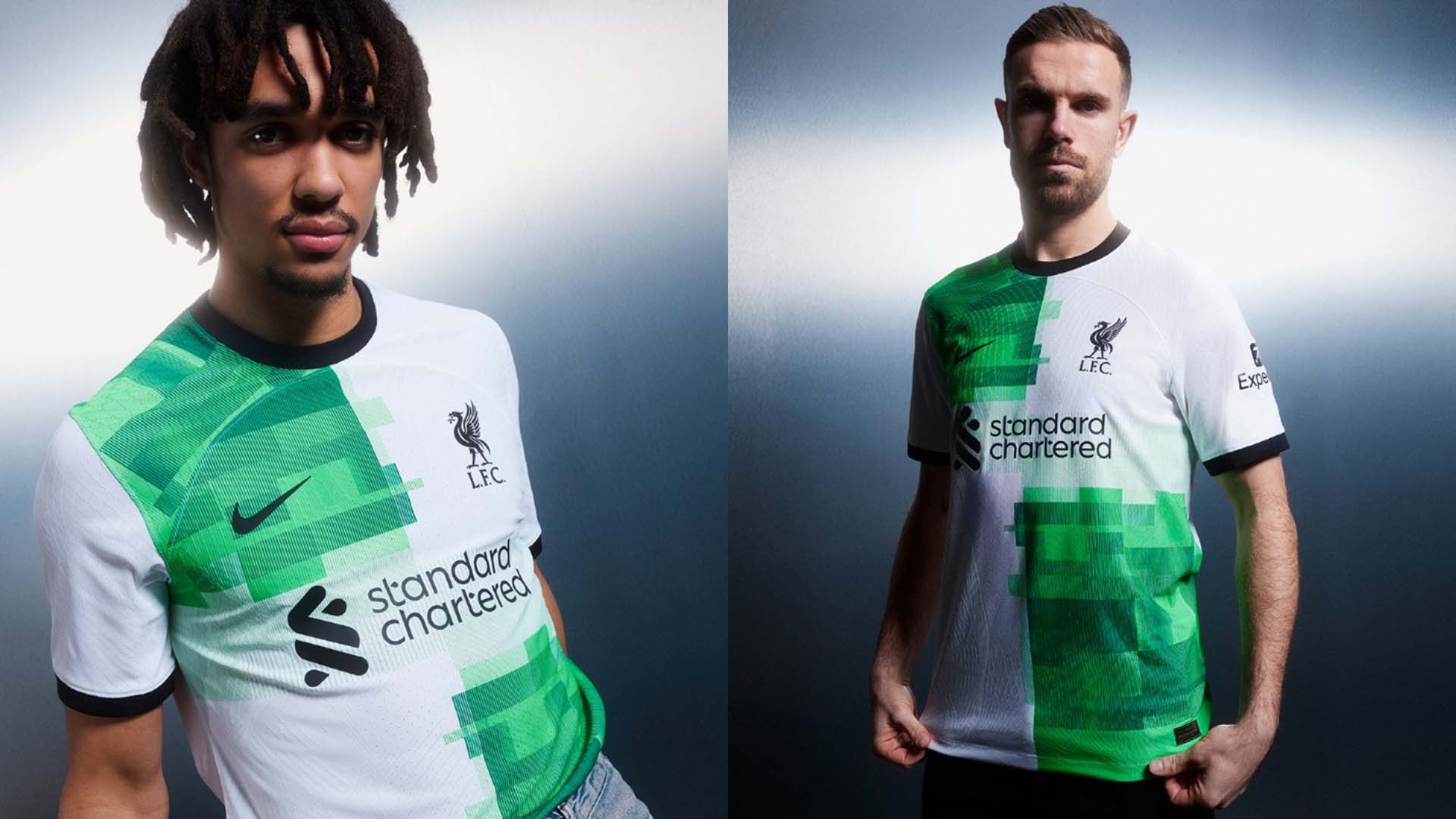
Inspired by the iconic Liverpool away strip of 1994-95 season, Nike could have done better than that retro, but they chose the easy way of arranging stacks of green shades on opposite halves of the kit.
2. Chelsea Home
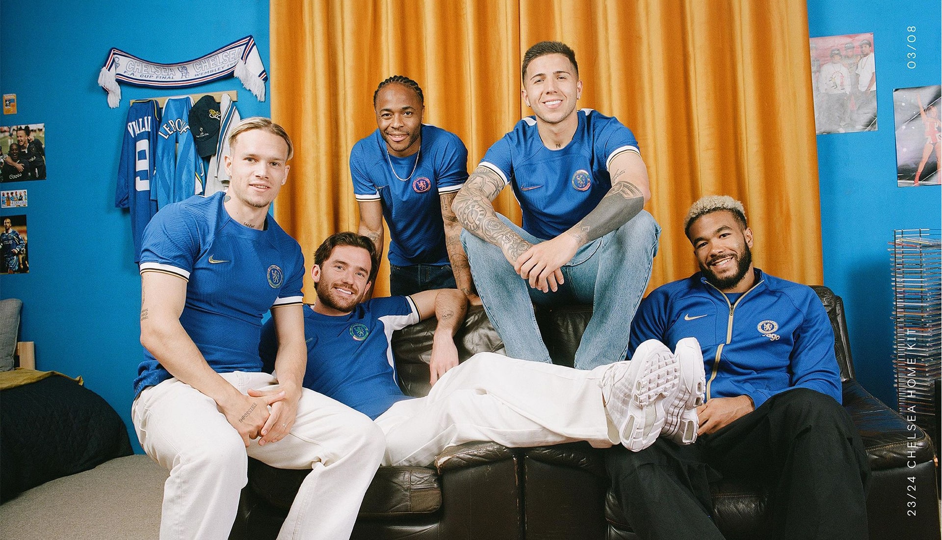
Chelsea tapped into that Dennis Wise-era kit of 1997, but it didn’t come off well. Coupled with a lack of sponsor at the beginning of the season, the shirt looked extra dull and boring. Not even an iridescent crest could save it.
1. Albion Rovers Away
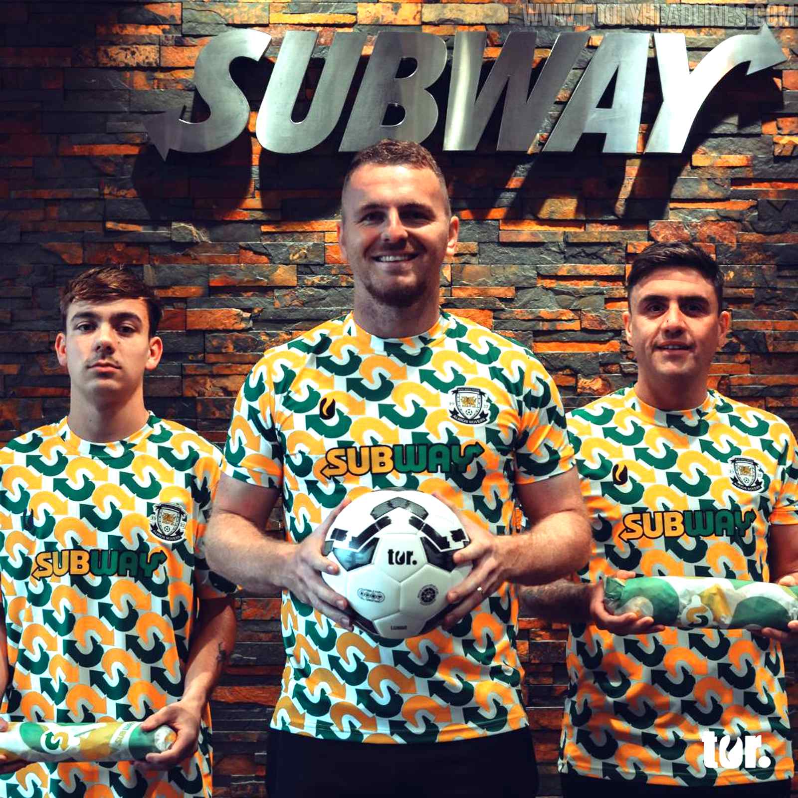
There’s really not much else to say about this kit except that it’s an abomination. I guess we wouldn’t be talking about Welsh side Albion Rovers otherwise, so they won — but at what cost?


