Despite often having striking and out-of-the-box designs, goalkeeper kits are an overlooked facet of football shirt culture. We take a look at the five best keeper strips in the history of the English Premier League.
Let’s face it — goalkeeper kits rarely ever get the shine they deserve. They’re usually an afterthought, even though they often have some incredibly daring patterns and colorways.
So we decided to give them their due props by picking the five greatest ever kits in the history of the most watched league in the world, the English Premier League. It’s time to stir a much-needed conversation.
Newcastle United 1996-97
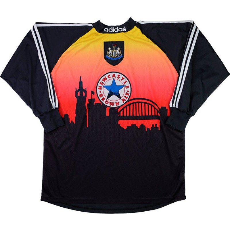
While it may not have the class of Arsenal’s 2005-06 Highbury kit or the all-time status of the 1990-92 Manchester United away, this shirt is a stark reminder of why vintage kits will never be topped. The sheer randomness on display here is well worthy of anyone’s appreciation.
It would be a natural assumption to make that the image on the shirt was the first draft of the Miami Vice poster, but it is in fact a backdrop of the city of Newcastle. Clubs always deserve brownie points for going out of their way to highlight their roots.
It’s safe to say that while a number of kits over the years have incorporated unique patterns and subtle designs to pay homage to the city, the approach seen here hasn’t quite made its way back.
On the topic of doing things your own way, notice how the legendary Newcastle Brown Ale star is at the center of this strip. Once again, the designers at adidas went the extra mile to make a statement as sponsor logos are rarely given such time of day.
The thick, round neck collar is easy on the eye and is further accentuated by the textual adidas logo that goes across it. All in all, a splendid and memorable kit for the ages.
Liverpool 2019-20
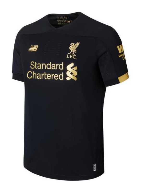
Instant classic? Yes. Recency bias? Absolutely not.
You’re unlikely to come across a slicker goalkeeper kit than Liverpool’s drop in the 2019-20 season. While a majority of the releases in this list exemplify the eccentricities of vintage drops, the Reds’ offering from four seasons ago is a reminder that you can still do a lot with a little.
In the history of the game, those that stand in between the sticks usually don strips that are known to be outlandish, as an extra step is taken to ensure the No. 1 is a separate entity from everyone else on the pitch.
Liverpool however decided to keep things simple and to their credit, released one of the rare goalkeeper kits that you can rock without drawing too much attention to yourself.
Coupled with the all-black base is the use of gold across this kit, which is a tried and tested color combination and an obvious win. The gold iteration of the Liverpool badge works wonders. Going through the club’s kit history, this version of the crest is an unexplored direction that was certainly worth heading in.
The Standard Chartered and New Balance sponsor logos have taken the same route at the heart of the shirt. It’s a challenge not to drool over this kit and ultimately, it is only right that Alisson Becker and Adrian became Premier League champions at the end of that season.
Manchester City 1997-98
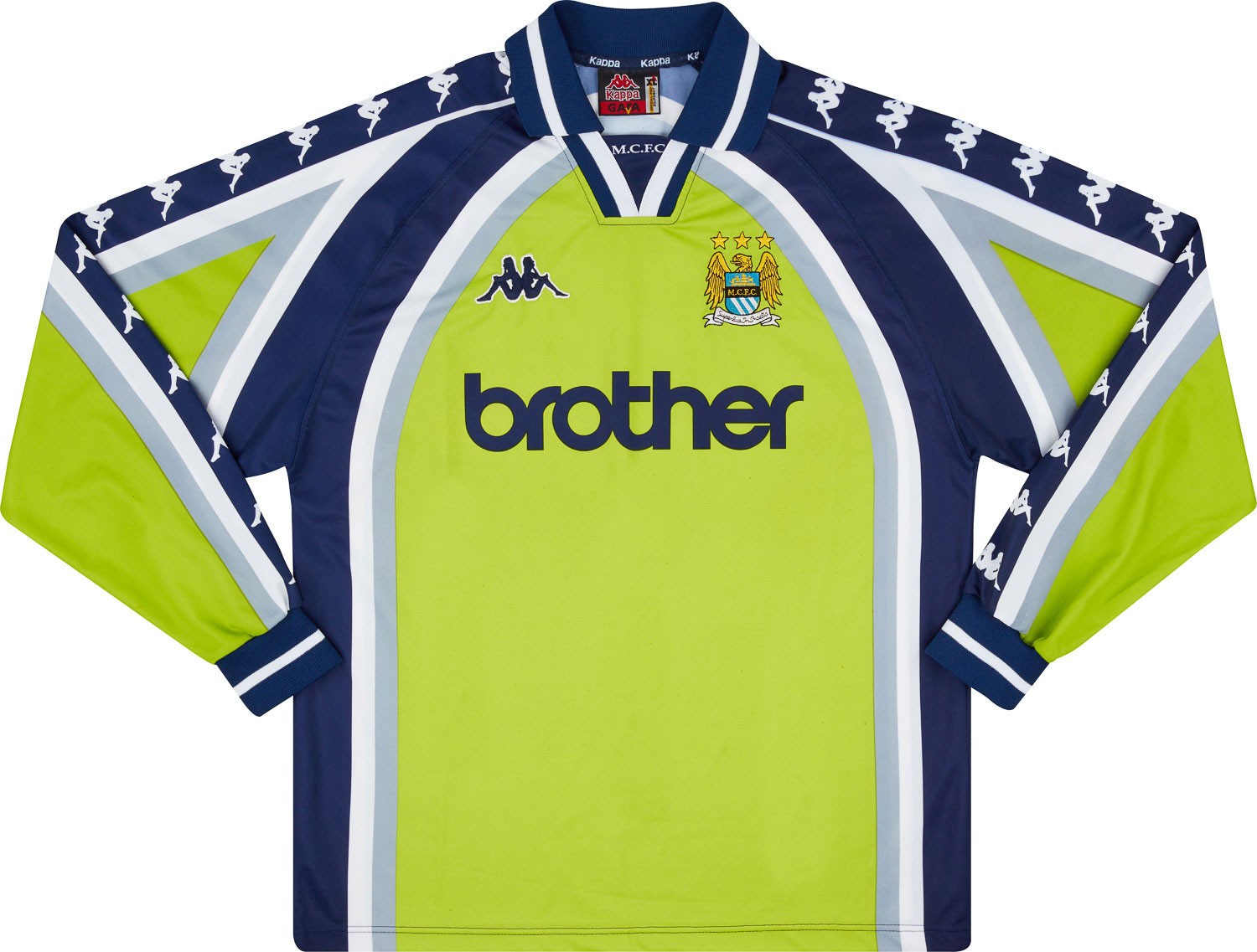
It’s clear to see that the Kappa era at Manchester City was different gravy.
And especially during the 1997-98 season, the Sky Blues’ home and away drops were flawless. However, as per usual, the goalkeeper kit failed to gain the appreciation of the masses.
Looking back two-and-a-half decades ago, serious questions need to be asked about why this strip was not celebrated, because it’s a tall task to spot a single flaw.
For starters, the decision to utilize a neon green base was an astute one as it catches the eye from the get-go. In goalkeeper kits especially that remain criminally underrated, throwing caution to the wind is key. However, doing so and keeping a kit easy on the eye is a much harder task to execute.
In addition to the sizzling neon green base, the other colors used in this strip elevate this drop to the next level. This is particularly in action when taking a look at the sleeves, with navy blue, grey, and white all put into action. The blue and white collar follows suit with the same color combination, which made Nicky Weaver look as dapper as one can in a goalkeeper shirt.
To match the dominant element of the sleeves and the collar, the Brother and Kappa sponsor logos are also in navy blue, which provides a darker contrast to the bright neon.
And to cap things off, there is simply no topping the older iteration of the Sky Blues’ crest. A stupendous goalkeeper kit that is getting its due praise as a part of our esteemed list.
Arsenal 1994-95
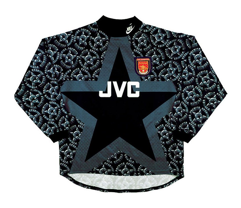
If there’s one thing you need to know about Arsenal Football Club, it is that they’ve always been the most stylish club in England. It’s not a debate now, and it has never really been one before.
Ask yourself — which club, possibly even in world football, would produce a goalkeeper kit that is such a banger? As you ponder that question, also think back to which goalkeeper kit could inspire a collection by Moschino two decades later?
The case makes itself, but let’s break it down anyway.
The geometric patterns feed into the age-old cliché that to be a goalkeeper, you have to be eccentric. Much like some of the greatest goalkeeper kits we have ever laid our eyes on, the wackiness of this feature is what ultimately stands the test of time.
Considering shotstoppers have to don a completely different strip to the rest of their teammates, it’s only right that the design team put their heads together to make this piece of clobber stand out as much as possible.
However, there is a method to the madness as the selection of grey for the patterns complement the black base to perfection. In the same vein, they match the unmissable star pattern on the shirt, which yet again, goes hand-in-hand with the geometric designs.
This may not be everyone’s cup of tea, but the last thing one wants designers to do is to play it safe, as fans wait with bated breath for their beloved side’s kits to release every season. To bring a bog-standard kit to the table that ceases to surprise is perhaps a bigger disappointment than when a club’s releases are rehashed versions of the previous year’s edition.
In some ways, the Gunners always had a vision of blending football kits and streetwear, because the collar is akin to those on a sweatshirt, which makes it acceptable to sport when you’re out and about.
The Nike Sportswear logo on the collar simply accentuates the unique creation and in some unexplainable way, works to a tee. The retro Arsenal badge is a thing of beauty, and its size provides a bright contrast that may have initially been missing during the making of this strip.
Chelsea 1998-99
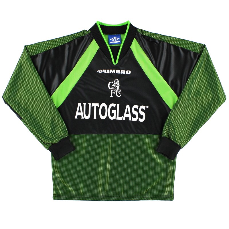
Hot Take: This is the most underrated kit in the history of the Blues.
For a club that isn’t necessarily associated with classic kits, Chelsea did their thing with this one. Admittedly, a factor that has led to this strip being criminally slept on is that it was sported during a time where the West Londoners were far from the global phenomenon that we know them as today.
However, there is never a good enough excuse not to appreciate greatness.
The blend of colors at play here is masterful, and a rare feature in goalkeeping kits in particular.
The pickle green base is a distinct choice to build the foundations for any strip, let alone one donned by a No. 1. While this decision may well have been a risk, as the color itself is slightly on the dull side, contrast not just saves the day but elevates this kit to another level.
Especially with the use of black, across the heart of the shirt and both sleeves, the darker shade joins forces with the pickle green in fine fashion. A slanted lime green design is seen in action across both sleeves, while a triangular pattern also features to accentuate both the color as well as the strip as a whole.
While colorful jerseys do not equate to reinventing the wheel, there is something to say to segment a variety of colors in accordance with different shapes as a one-of-a-kind approach.
With the designers realizing that two darker tones are at play, the addition of lime green is a gamechanger.
The Autoglass and Umbro logos and the old-school Chelsea badge in white just prove that the incorporation of an array of colors was always the idea here. And it was a smash success.


