A jam-packed summer of international soccer means we’re getting a slew of new kits. Two giants in the game, Nike and adidas, just released their lineup of national team shirts, so we take a look at some of the most notable designs and give them a rating out of 10.
Nike vs. adidas has been a long-standing debate that spans across and beyond the sports world. The two mega-brands have been cutthroat competitors for what seems like an eternity, always trying to one-up the other when it comes to everything from equipment to apparel.
The world of kits is no different. The last few years especially has seen Nike and adidas embroiled in a renewed design rivalry, one that has produced some absolutey stunning shirts, along with a few big misses.
With the upcoming summer international schedule approaching, the two brands have released their lineup of 2024 national team kits, and we take a look at nine of the most notable designs from the bunch.
United States: 6.5
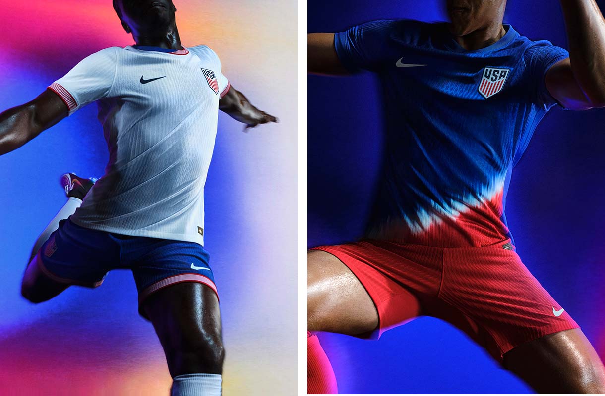
Nike has not been kind to United States men’s and women’s national team fans lately. Their kits seem to have lost creativity, especially with the good old red, white, and blue kits. These are a continuation of that. Although the red and blue on the collar attempts to create a splash of color on the home kit, it’s still just another plain, white USMNT jersey.
The tie-dye approach to the away shirt is a little more inspired, but still doesn’t meet the mark of the country’s stellar set of vibrant away kits from its past.
Mexico: 8
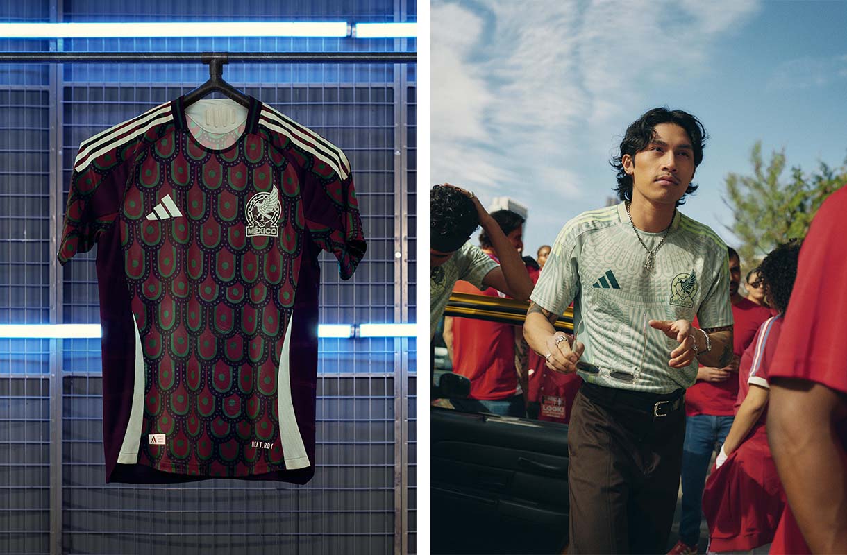
El Tricolor has been historically known for donning green home kits. Although those almost always never fail, adidas likes to be risky at times, making home kits black or even black and pink (that 2021 kit was cursed).
However, the mix of burgundy and turquoise on Mexico’s new home kit creates a nice blend. The peacock feather design looks a bit strange at first, but its combination of colors is reminiscent of the tropical side of Mexico.
Unlike when adidas gave Mexico alternate home jersey colors in years past, this year’s away kit opts for green, although it’s a bit lighter than what we’ve come to associate with Mexico. The folk-art pattern makes for a nice touch of detail as well, preventing things from getting too plain.
Canada: 5
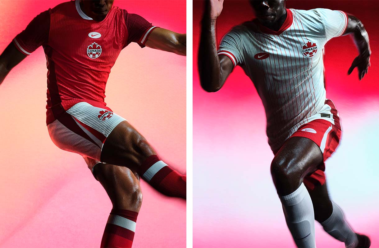
Canada has arguably one of the nicest color palettes in the game. The red and white combination has real potential to create some absolute banger kits. But that’s not the case here. The centralized logo fad has taken over kit design for a couple years now but again, this one does not work.
Given that Nike did not make Canada new kits for the Qatar World Cup, these certainly do not make up for that.
Argentina: 9
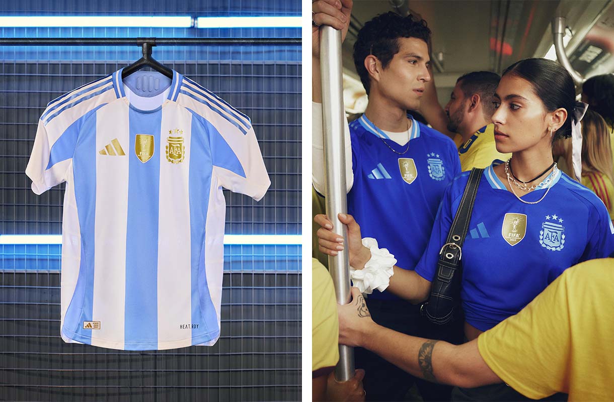
La Albiceleste is shown in full colors here. The light blue and white trade off perfectly with the gold adidas logo and Argentina crest, which complements the World Cup champions patch front and center. A kit for champions, indeed.
The away kit goes for a deeper hue of blue and a more simple look, but still hits the mark as well.
France: 2
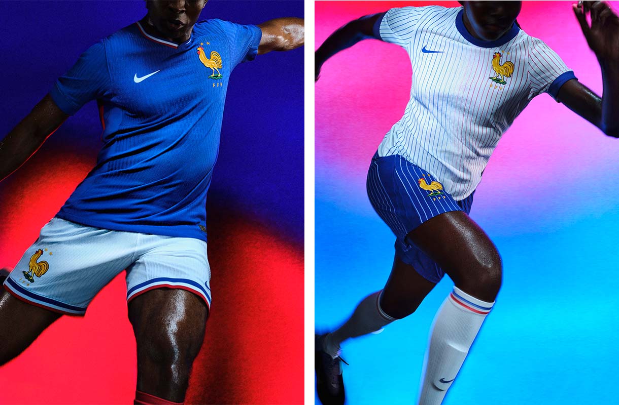
Les Bleus are too blue. One of the best things about France’s last kit was its combination of its deep blue base with gold accents. Seeing the side dominate Qatar in those kits truly made it feel like the team was football royalty. These on the other hand look like a Walmart version of France kits. The big retro federation rooster makes me feel like I’m going to a poultry shop rather than a stadium to watch France play.
The pinstripes on the white away kit make for a classy partner to the garish home shirt, but it’s still hard to get that blazing hue of blue out of your memory.
Brazil: 5
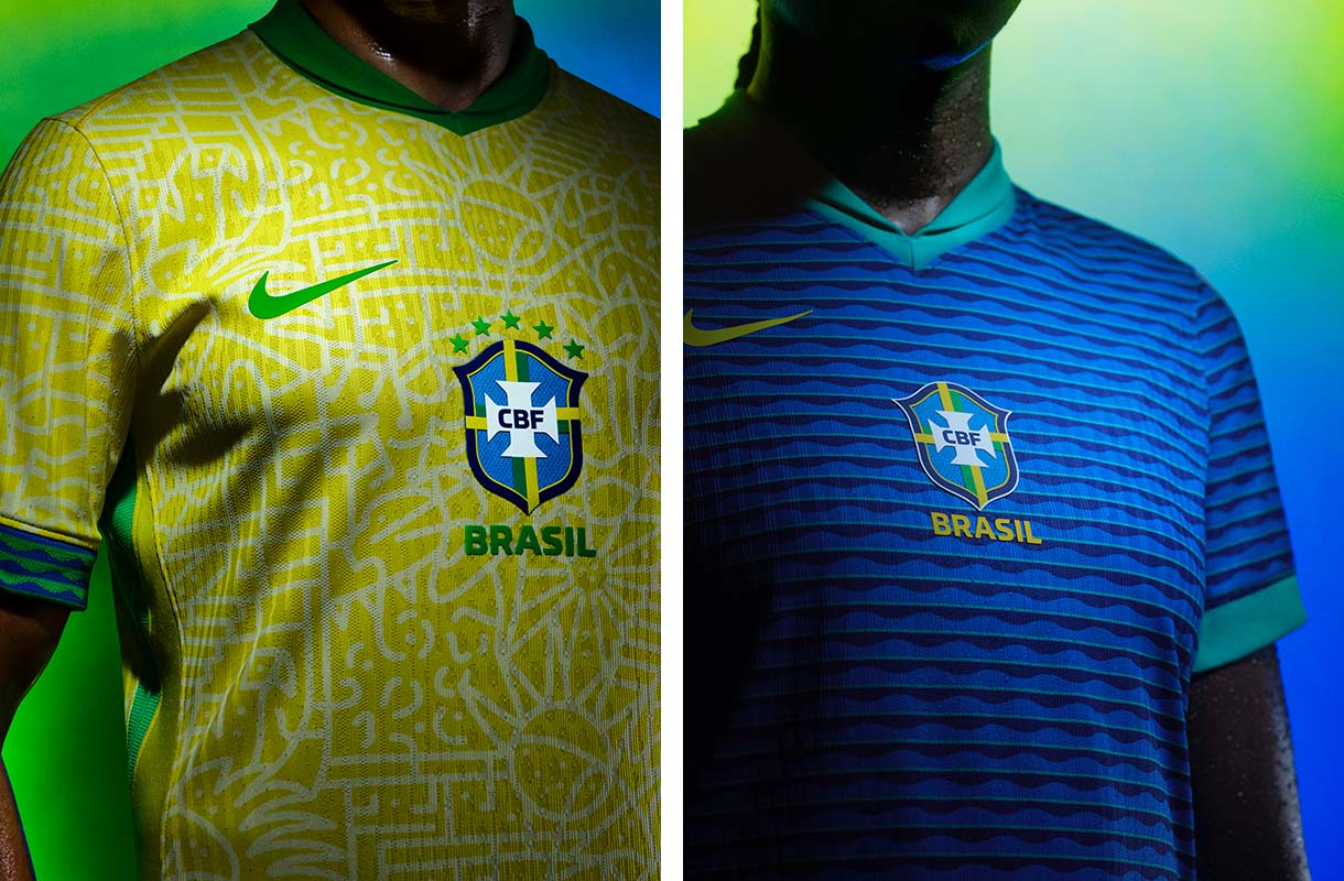
Nike has made some amazing kits for Brazil, but these aren’t among the elite. The centralized logo trend needs to go. The colors look great, and the wave pattern on the away kit is executed nicely, but it feels like a miss overall, especially on the home.
Germany: 8
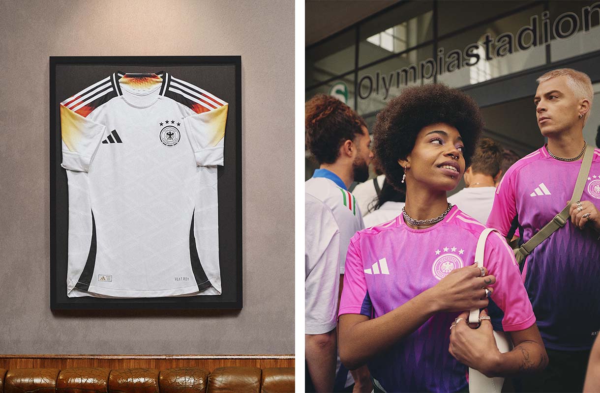
The mix of the flag colors on the sleeves makes for a stunning home kit and will probably be one of the best to look at during the 2024 EUROs. adidas also went for it with the away design, putting the Germans in a pink-to-purple ombre gradient that recalls images of Japan’s stunning 2023 World Cup shirt.
England: 7
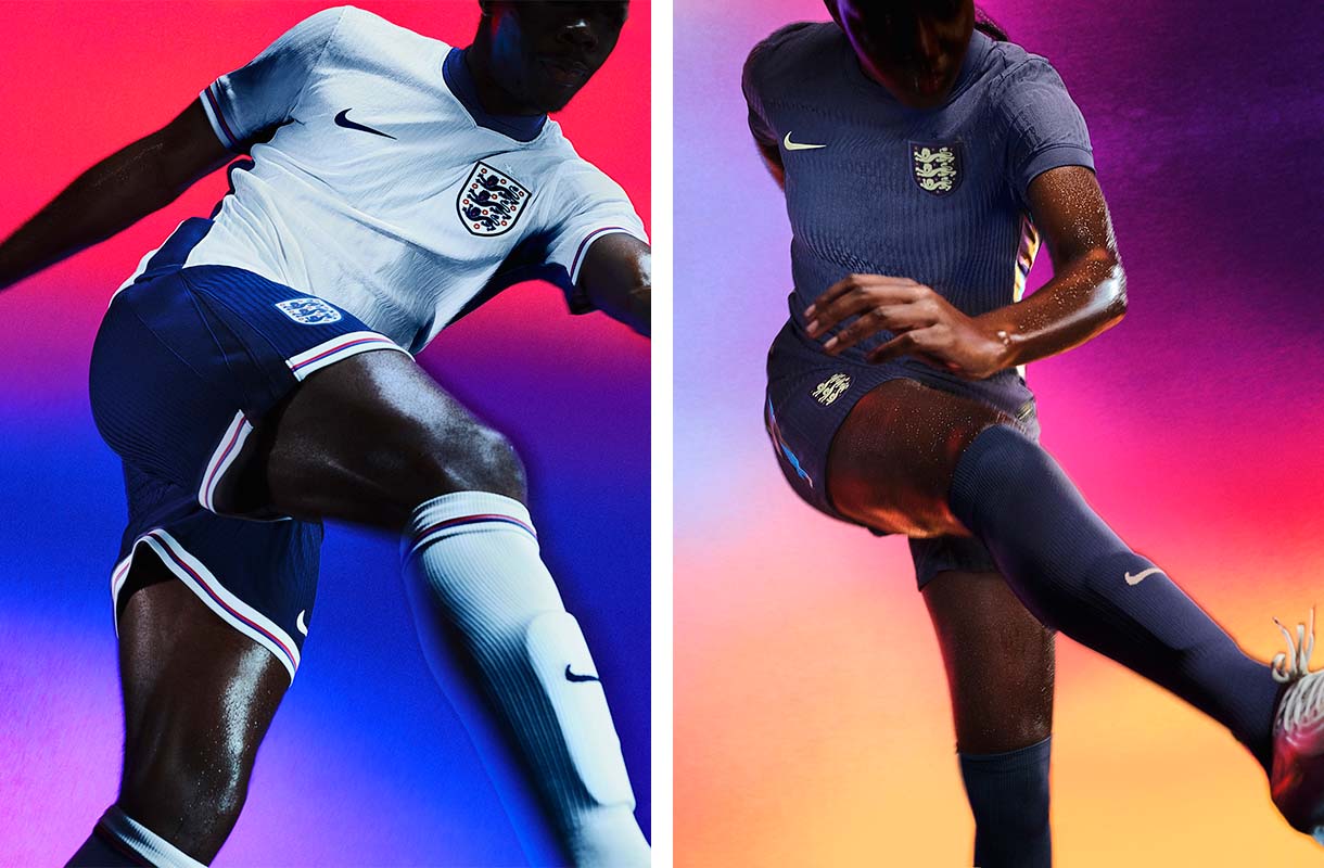
Keeping things simple with England, we get a classic white home kit with a deep and regal purple away. The away kit in particular is quite nice, and the accents of turquoise going down the sides makes for a pleasing contrast.
Nigeria: 10
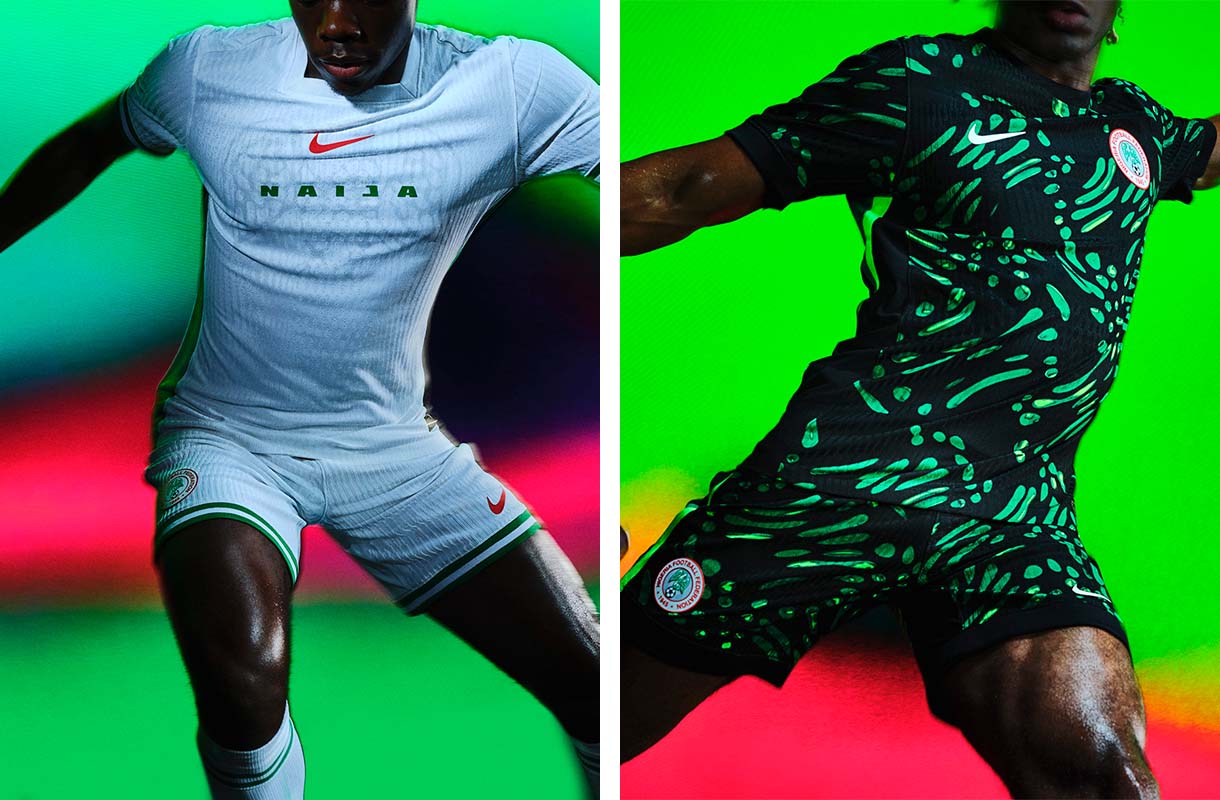
We won’t see these kits in the EUROs or Copa America (there’s a chance we get them at the Olympics if Nigeria’s women’s team qualifies), but this list wouldn’t be complete without yet another set of stunners from Nigeria.
Simple and complex at the same time, both the home and away designs are incredibly compelling. The subtle eagle design on the home shirt along with the electric green accents on the away are details we won’t be forgetting any time soon. If only Nike matched the effort it puts into the Nigeria kits to the rest of its designs. But then again, Nigeria’s designs wouldn’t be as special.
A General Consensus
In the battle between the two behemoths, it’s adidas that comes out on top. The Three Stripes has been winning the kit battle for years now, and the brand continues its upswing with its use of compelling color palettes and more inspired designs compared to its biggest competitor.


