Derby matches and the drama that surround them are some of the best parts of football. Know what else is? Kits. We combine the two and look back on some of the most iconic rivalry games and pick the best kits from each.
2017: Real Madrid 2-3 Barcelona
The Game
😂😂😂😂😂😂😂😂😂😂😂 pic.twitter.com/xINuRqBNCX
— AbzBusquets 🇶🇦 (@AbzBusquets) August 13, 2022
If we’re talking instant classics, there aren’t many better examples than this cinematic El Clasico clash.
Casemiro put Real Madrid into the lead in the 28th minute by scoring an uncharacteristic tap-in, that fell to him rather kindly. However, Lionel Messi took matters into his own hands and danced past the Madrid defense to fire home an equalizer just five minutes later.
Ivan Rakitic proceeded to score an outrageous strike with his weak foot to give Barcelona the advantage in the 73rd minute. Despite the fact that Sergio Ramos was sent off shortly after, James Rodriguez scored from close quarters to even the score in the 86th minute.
And do we even need to remind you about that Messi winner and the legendary celebration that followed in front of a stunned Bernabéu?
The Kits

In all honesty, Real Madrid’s 2016-17 home kit is one of their more tepid releases in recent memory.
While one can usually bank on Los Blancos to release a strip that emphasizes their princely aura in world football, this shirt fails to do so and is undeniably forgettable.
The use of navy blue across an all-white base is sleep-inducing. And with no standout features in this kit, there isn’t much more to break down when looking back at this underwhelming effort, much like their static defending for Messi’s dagger at the death.
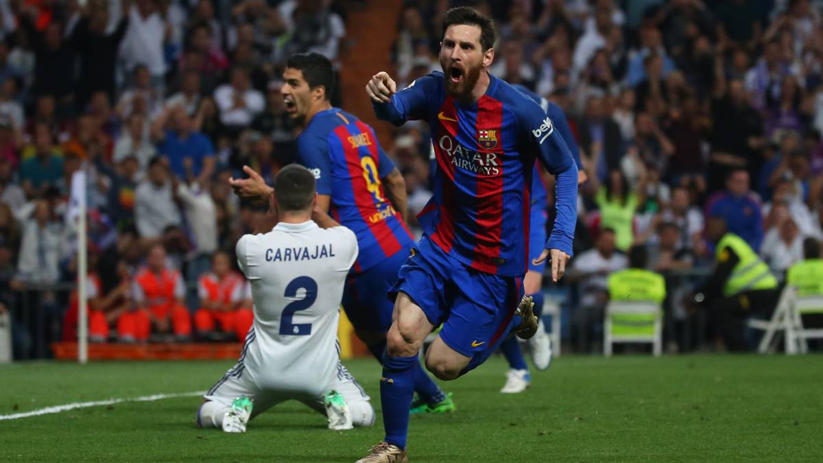
On the contrary, Nike smashed it out of the park with Barcelona’s home kit during the same campaign.
Firstly, the three sets of blue and red stripes on the center of the shirt tastefully remind the world of the club’s central colors. The bright yellow Swoosh is admittedly a staple in the Blaugrana’s home strips, but it does well in providing a contrast that accentuates a cracker of a kit.
Messi was certainly dressed to kill on that unforgettable night in Madrid.
Winner
While Barcelona had to fight til the end to emerge triumphant against Real Madrid in 2017, this is as routine a win as it can get for Catalonia’s finest.
2000: Boca Juniors 3-0 River Plate
The Game
Entering the second leg of the Copa Libertadores quarterfinal with a 2-1 lead to show for, River Plate were already sitting pretty. To add to that, the Argentine giants boasted of the likes of Pablo Aimar and Javier Saviola within their ranks, which made them instant favorites to get the job done in the Superclasico.
However, if there was one major takeaway from the events that ensued, it is that one should underestimate Boca Juniors at their own peril.
While things seemed to be heading towards a predictable outcome after a scoreless first half, Juan Roman Riquelme took center stage for Boca, as the unfancied outfit silenced all the doubters by annihilating their rivals 3-0 in the second 45.
The Kits
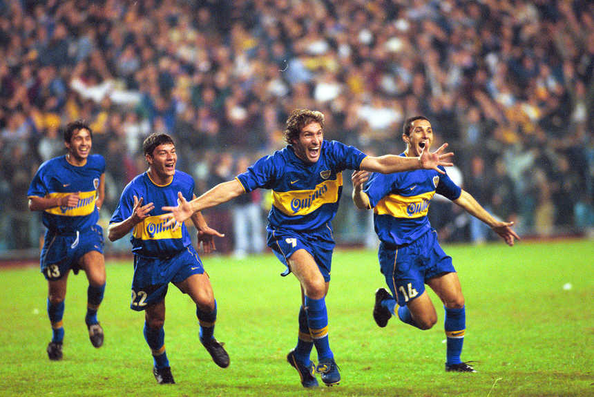
It isn’t a hot take to suggest that Boca Juniors’ 1999-2000 home strip is one of the most glorious kits of all time. The club’s primary blue and gold colors have arguably never caught the eye better than in this release, as they looked like they meant business even before taking River Plate to the cleaners.
The Quilmes sponsor logo is amongst those that became instant classics, and it has been given the perfect pedestal to shine with the presence of a thick gold stripe plastered across the shirt’s center.
While it’s safe to say that the Argentine juggernaut was trying to make a statement in the heart of the shirt, the other subtler features are what makes this kit one for the ages.
An example is in the blue and gold collar, which is an understated yet imperative addition. Similarly, the gold Swoosh is perfectly in sync with the same-colored elements on the badge, the stripe, and the piping on the shorts, which is another low-key, yet superb touch.
This kit is an absolute belter and it would’ve been an insult to a work of art such as this strip to taste defeat on derby day.
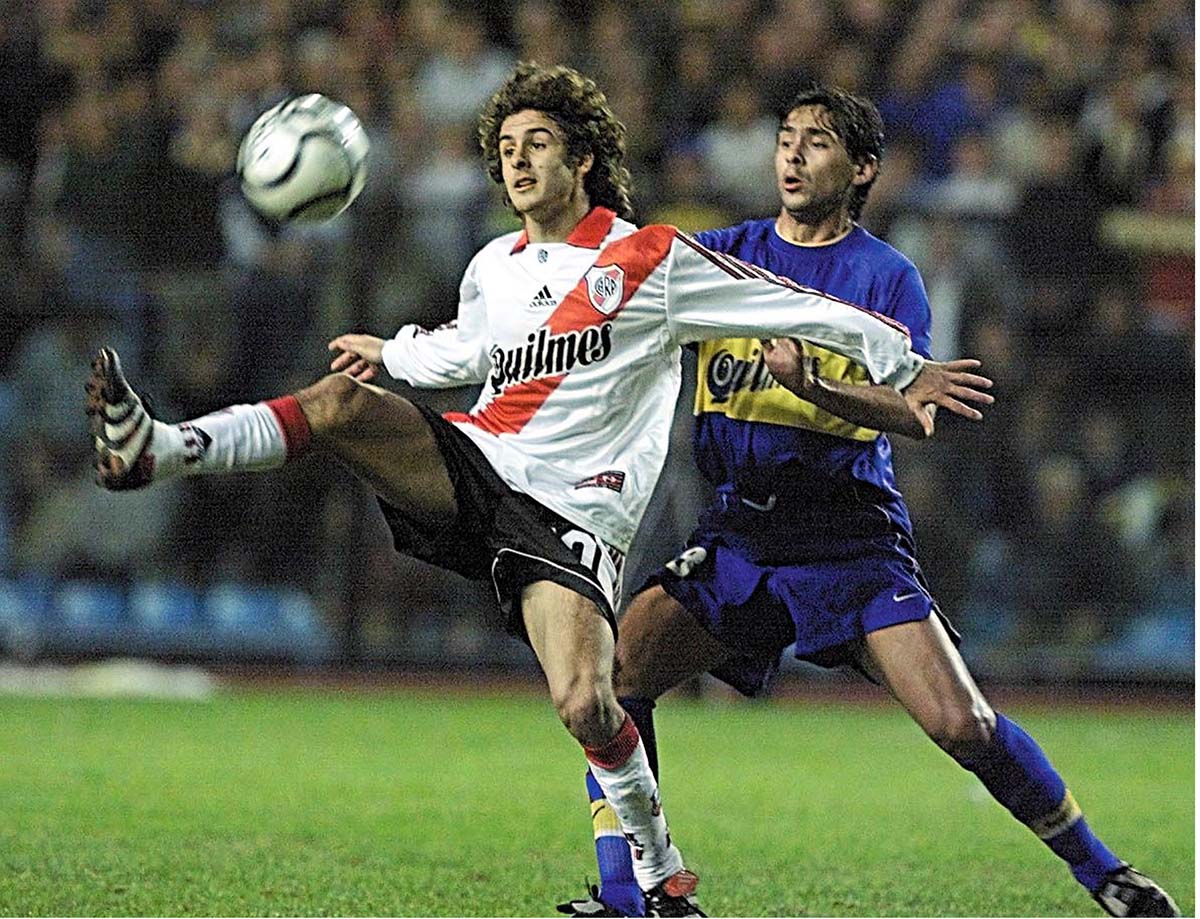
Unlike their performance on the day, River Plate’s home kit was certainly a match for Boca Juniors’ on that unforgettable night at La Bombonera.
The red sash across the shirt has featured on previous kits in River history and clearly, it has always been a risk worth taking.
The all-red collar is gloriously in sync with the sash, and accentuates what is a fabulously flamboyant strip.
adidas’ signature Three Stripes in red on both sleeves coupled with the black sponsor logo on the white base is a clever way of paying ode to the club’s three primary colors.
River Plate have smashed it out of the park with a sleek release that many will don for decades to come.
Winner
While this battle of kits has gone down to the wire unlike the clash 22 years ago, Boca Juniors reign supreme for releasing a shirt that is the near-perfect home kit.
2004: Tottenham 2-2 Arsenal
The Game
With Arsenal needing a mere point to become Premier League champions, fate had presented the Gunners the golden opportunity of rubbing it in the face of familiar foes, Tottenham Hotspur, at White Hart Lane.
Things seemed to be heading in a predictable direction for Arsene Wenger’s men, with Patrick Vieira and Robert Pires firing the visitors into a two-goal lead within 35 minutes.
However, North London derbies tend to spring a surprise, as Jamie Redknapp got on the scoresheet while Robbie Keane scored a 94th-minute equalizer.
While Spurs may have salvaged a bit of pride in what was a classic contest, it was Arsenal that made themselves feel at home by lifting the league title at their rivals’ gaff.
The Kits
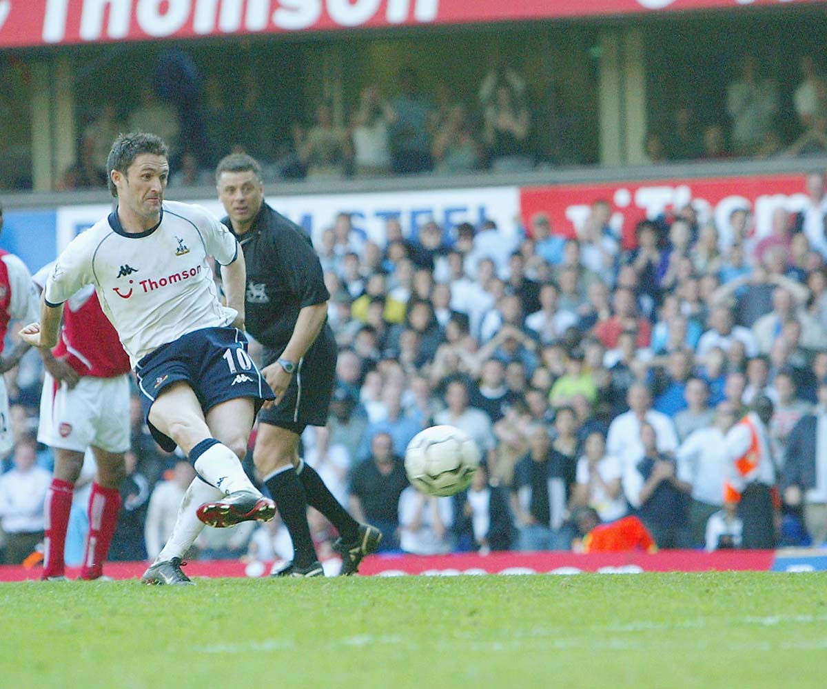
While it is widely acknowledged that Tottenham tend to produce uninspiring home kits, this release was one of the best of the lot during the 2000s. And unlike their drops in recent years that seem devoid of any imagination, the designers at Kappa ensured that the white half of North London looked sharp on matchday.
The navy blue details go a long way in making this kit worth one’s time. For starters, the round neck collar makes the shirt instantly stand out. Coupled with the same-colored shorts, this is already light years away from the insipid releases in recent memory.
Add to that the tasteful navy blue piping, which is a touch that needs to be integrated into kits nowadays once again because it’s an instant winner.
And of course, a glimpse at the color of the Kappa logo on the pristine white base emphasizes the sense of uniformity that makes this shirt a tidy drop.
Keeping the positives aside however, it has to be said that this Spurs kit does anything but stand the test of time. Ultimately, it is an admirable, yet largely forgettable release from an era in which Tottenham Hotspur fans themselves would not like to hark back to.
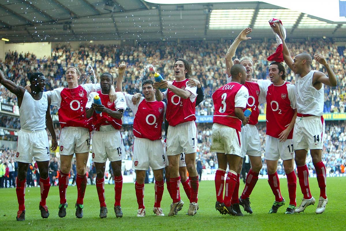
On the other hand, Arsenal’s kit from 2004 is a classic. An effortlessly sleek piece of clobber that did justice to the Invincibles.
There’s never been a Gunners home shirt that understands the assignment of repping the club’s red and white colors like this release. The thin round-neck collar, the Swoosh, the O2 sponsor logo, as well as the design at the bottom of the kit are all features that join forces to make this shirt pop.
While it’s safe to say that this shirt is extremely no-nonsense and rather simple, it is undeniably easy on the eye — much like Wenger’s greatest-ever ensemble.
And unlike the shirt donned by Tottenham Hotspur on derby day, the red half of North London’s home shirt will always be etched in history because it is forever associated with greatness.
Winner
From an aesthetic and historical point of view, there’s only one winner and that’s the mighty Arsenal.
1997: Paris Saint-Germain 1-2 Marseille
The Game
Earning promotion to Ligue 1 a season before in the aftermath of their involvement in the infamous French football bribery scandal, Marseille were far from the juggernaut they once were. However, Le Classique was seen as an opportunity for the French powerhouse to silence their critics.
Despite Paris Saint-Germain being expected to stroll to a victory at home, Marseille emerged as the victors in a fixture that remains controversial to this day.
The visitors enjoyed a dream start as Xavier Gravelaine put them into the lead. While the hosts equalized through Éric Rabésandratana’s strike, PSG supporters still hark back to Marseille’s Fabrizio Ravanelli simulating to win his side a spot kick, which was eventually converted by Laurent Blanc as the underdogs walked away with an infamous triumph.
The Kits
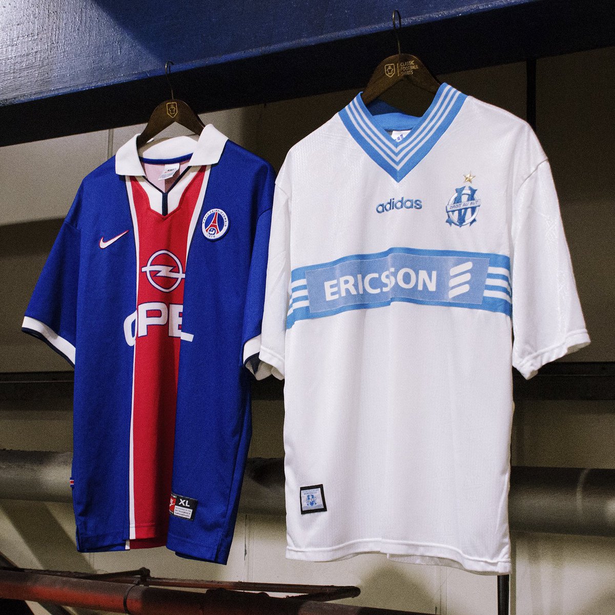
If you only like PSG kits since their much-publicized collaboration with Jordan, it’s safe to say that you have not done your due diligence on the club’s habit of producing classic kits.
Especially considering the “Opel Era” of jerseys can go toe-to-toe with any of the recent gems that don a Jumpman logo.
This beauty features the club’s signature Hechter Design, which has been in place since 1970. Coupled with a sleek collar that also incorporated a thin blue lining and the players choosing to take the perfect decision of wearing long sleeves, the design team at Nike deserve a round of applause.
The textual PSG logo finishes off a classic that was worthy of sporting in Le Classique.
While Marseille left the Parc des Princes as winners, it isn’t outlandish to claim that they were not dressed for the part on the day.
Some may be fans of this strip because it possesses all the eccentricities of retro kits, but to keep a spade a spade, adidas conjured up a horror show of a shirt.
For starters, that collar belongs strictly as a part of winter wear, and on a football kit in particular, it looks downright bizarre.
With an otherwise rather plain shirt, a hot mess of a collar is an even stranger addition that gives one the impression that the design team was not in sync.
Overall, there just isn’t a standout element of this shirt, and the feature which does ignite conversation does not do so for the right reasons.
Winner
It’s Paris Saint-Germain and it’s not even close.
2000: Celtic 6-2 Rangers
The Game
While the Old Firm has a habit of serving clashes that go down to the wire, Celtic were in no mood to create any sense of suspense on the day. Despite Dick Advokaat spending a pretty penny on his Rangers side in the summer, the hosts paid no mind to the hype and instead, went on to take a three-goal lead within 10 minutes of the clash.
While the likes of Claudio Reyna and Billy Rodds scored consolation goals at different points, a brace apiece from Henrik Larsson and Chris Sutton, with Paul Lambert and Stiliyan Petrov adding goals of their own, meant Martin O’Neill’s side reigned supreme.
To this day, the unforgettable clash between the two fierce rivals seems surreal.
The Kits
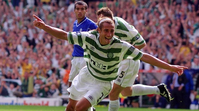
If there’s one thing that you should keep in mind about Celtic’s home kits, it’s that they tend to stick to a pattern. And yet, nothing about this shirt from one of the most iconic days in the club’s history is boring.
While a number of Celtic home strips have been guilty of going overboard with the hoop design, the brains at Umbro understood the power of keeping things simple.
That collar is fetching to say the least, with the white lines over the green base adding a contrast that works to a tee. The baggy fit is always a lovely sight, and a feature of retro kits that is in need of a comeback.
While Umbro have not reinvented the wheel here, it is worth acknowledging that Celtic rocked a crisp, home shirt while annihilating their rivals.
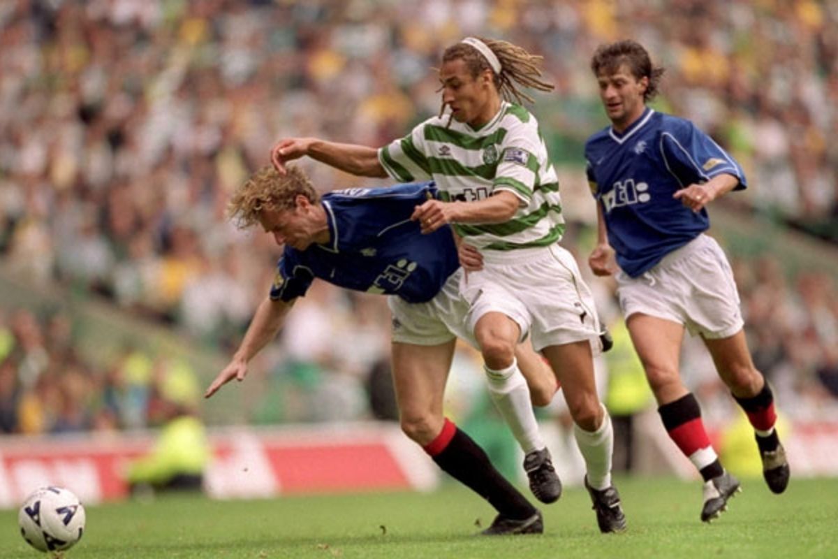
As far as Rangers’ kits are concerned, let’s get the positives out of the way first. The usage of white in this kit does a lot to elevate it.
For instance, the decision to utilize the color to showcase the V-neck is one that instantly draws any viewer’s eye. Combined with the piping across the sleeves on both sides, which is always a welcome addition, the Rangers home shirt has things going for it.
However, all in all, it isn’t criminal to suggest that this shirt borders on the blander side of things, unlike in the case of their rivals’ home kit.
Winner
While both kits have focused on the subtle details and played it safe, Celtic outdid Rangers once again, with their likeable home strip.


