
It’s that time of year. With most of Europe’s top clubs having dropped their latest kits for the 2024-25 season, we round up the best, worst, and ugliest of the bunch.
The season is underway and the kit releases are still coming, for some reason. But most clubs have theirs out there now with some working quite well and others needing a bit more work. Let’s dive into the pits of kits to find out which ones you should be showing your mates down at the bar and which ones you should keep your eyes away from to save them from spontaneously combusting.
The Good
Salernitana Home

One that has probably gone under your radar is the Salernitana home shirt made by Zeus. The team got relegated last year and their kits are made by a brand that not many people have heard of, but good design is good design. This home shirt for the Italian team is a beauty and should be right in the conversation when discussing the best kits of the season.
Genoa Away
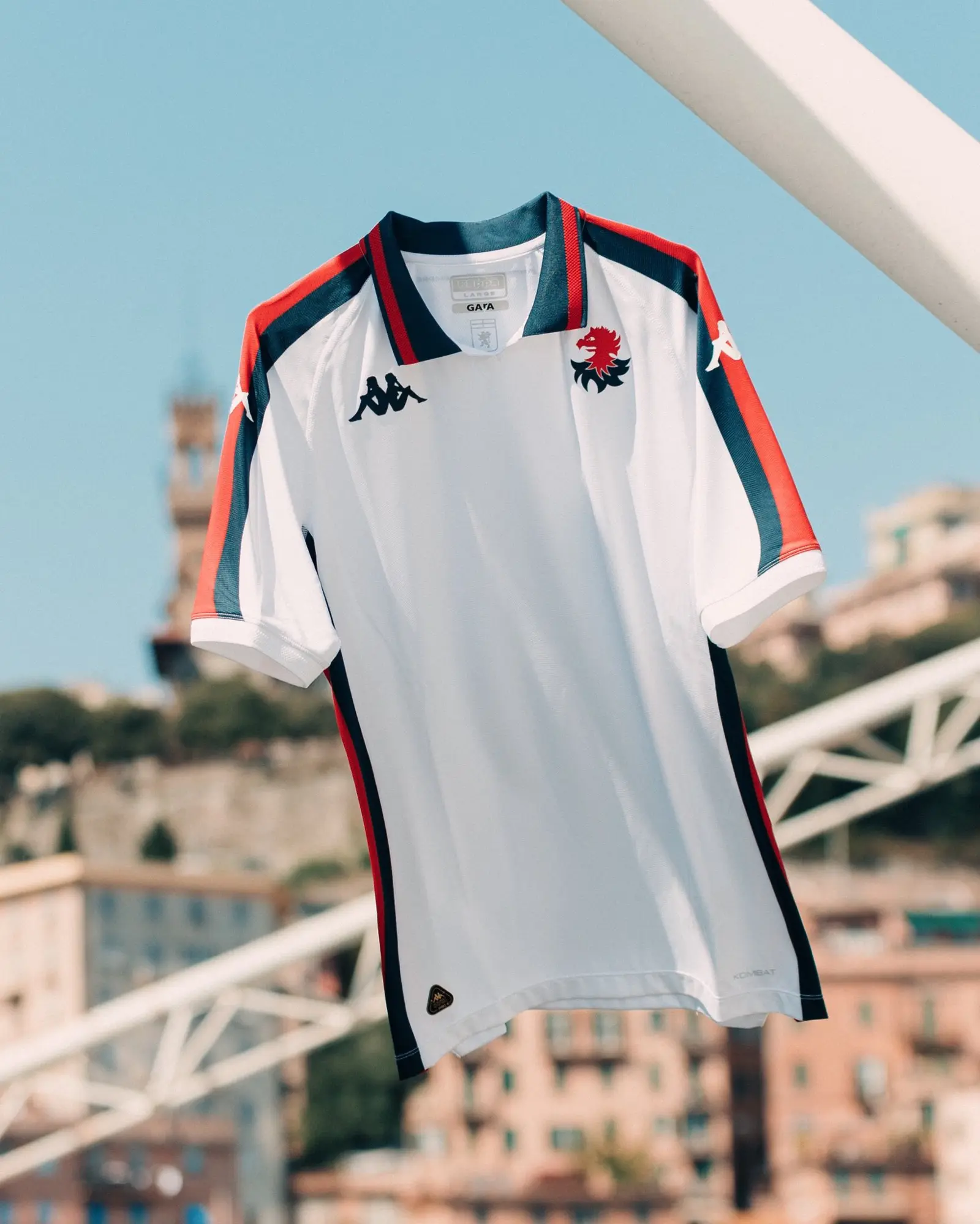
Kappa’s gonna Kappa, after all. The Italian brand has done it again with this Genoa away shirt, combining a crisp white base with accents of the iconic Genoa blue and red. The standout feature on the shirt, though, is the ‘Gallinaccio’ badge, which hasn’t been on a shirt for over 40 years. It’s the definition of ‘bellissimo.’
Newcastle Third
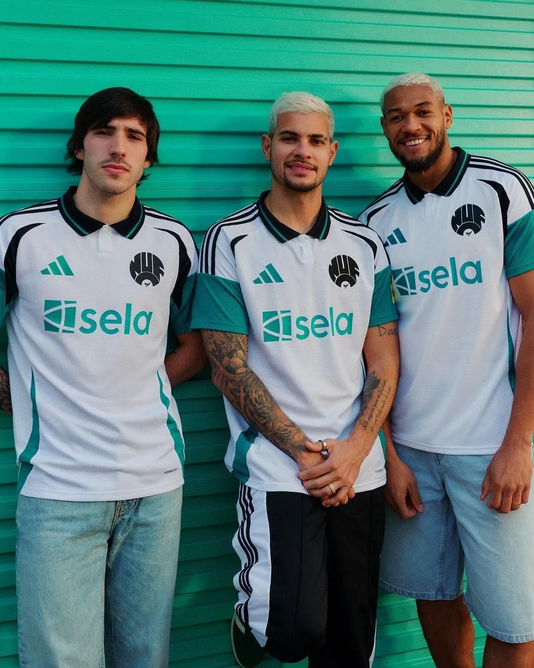
Newcastle’s shirts have left a lot to be desired in recent years as they bounced from longtime supplier PUMA to Castore, but adidas is back in town on Tyneside and has delivered. The home and away kits are beauties, but nothing tops this third kit, a remake of Newcastle’s 1999-00 shirt. Shame there isn’t a Newcastle Brown Ale sponsor, but they’ve brought back their old crest from the ’80s and it’s a stunner. adidas and Newcastle is a match made in heaven.
Versailles Home
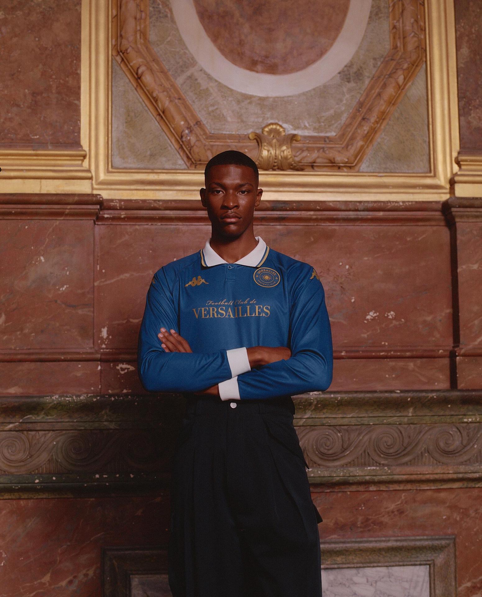
First it was Venezia, then it was Athens Kallithea, and now it seems to be FC Versailles who are getting the hipster kit treatment from Kappa. This one was all over my Instagram feed for days and you can totally see why. I’m not one for the ‘Hang it in the Louvre’ cliche that’s pedaled around the internet constantly, but when something is deserving of being in an art gallery…
Triestina Away

“Wait, not another Kappa shirt?!” I hear you sigh. But yes, there is another Kappa shirt and that’s because the brand is very good at what it does. This time it’s an away effort for Serie C side Triestina, who have gone under an impressive branding project and needed stylish kits to match their new direction. Kappa delivered, as usual.
Basel Home
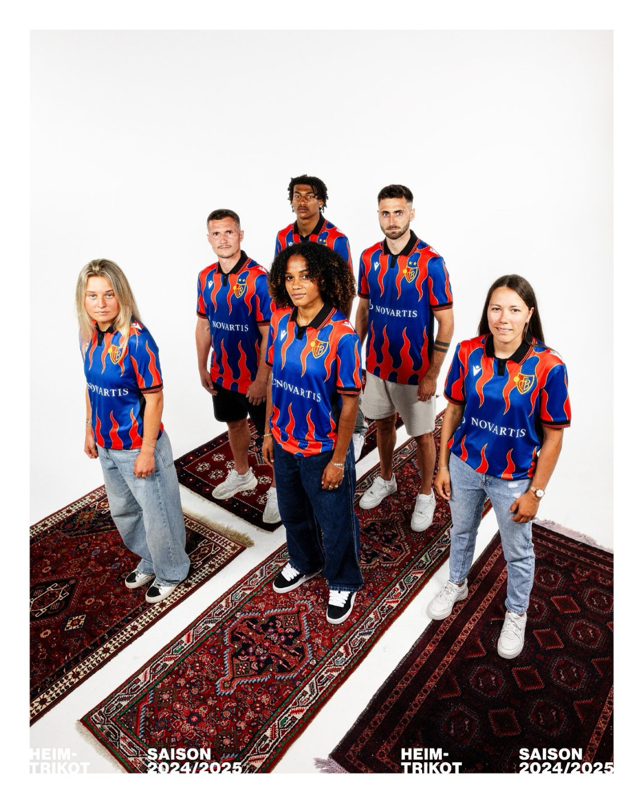
I can hear you now. “This kit belongs in the ugly pile” as you sharpen your pitchforks. But I am not listening and I am not getting involved in your games. This kit is WILD. And I like it. (Guy Fieri probably does too). Outlandish, loud and downright good. Bravo, Basel. Stick it to the man.
The Bad
PSG Away

Researching these kits, I saw a lot of people adding this to their favorites of the season. Not me. I don’t like it. I do see what PSG are going for, though, and while the effort is there, it just isn’t paying off. It looks like a t-shirt you’d get from a tourist trap shop near the Eiffel Tower and not a shirt of the Ligue 1 champions and home of Kyl…I mean, Kolo Muani.
Bayern Home

What on earth was Bayern thinking? Lose one Bundesliga title and everything goes awry it seems. The red isn’t the right red, and black accents? No, thanks. Regardless of what the inspiration is behind the kit, it’s not a good attempt. They say there are three tones of red to represent their successes of the past, but marketing spiel is marketing spiel and it cannot paper over the cracks of a bad shirt. While not ugly, this is a bad attempt.
Roma Home
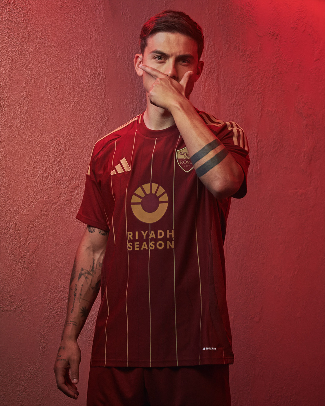
This shirt has split opinions like most kits do, but in an even more prominent way. A rogue link back to the old season ticket design of the club, this shirt alters the standard Roma colors we expect, going for a more maroon and gold combination. I like the attempt and the fact they tried to find links back to the club’s heritage that are a bit more niche, but the execution just doesn’t *feel* Roma.
Blackpool Away
Blackpool tried to be loud and different but instead created a kit that looks like a warm-up shirt for a non-league side whose manager bought from some guy on the street corner. The attempt to do something a bit quirky is there and I respect it. I just hate the outcome.
The Ugly
Roma Away
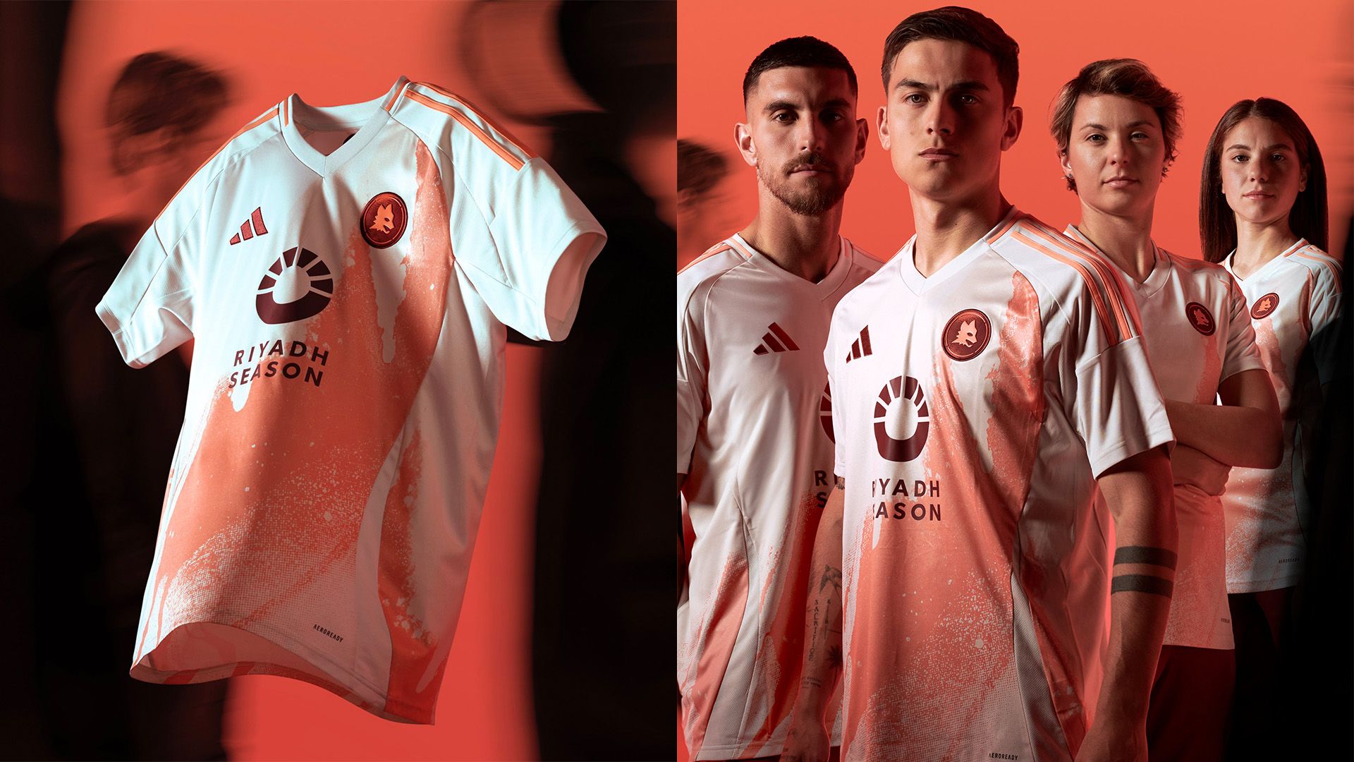
I don’t even know where to start. What is going on with this shirt? It looks like adidas took a nice white Roma shirt and accidentally spilled a tin of paint meant for a Juventus away kit over it, only for some director to end up loving it. Terrible. Roma don’t deserve this.
Barcelona Home
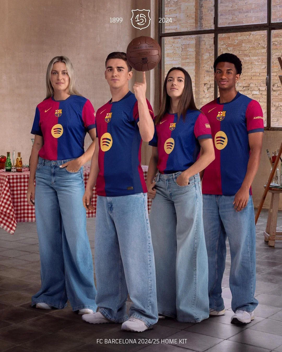
I don’t think I’ve witnessed a more clunky shirt. The collar is terrible. The placement of the Nike badge compared to the Barcelona crest makes me uncomfortable, and the fact they opted for the circular Spotify logo on its own is a terrible idea. I have no problem with the half-and-half colorway. The rest of it makes my skin crawl and I cannot stand to look at it.
Inter Home
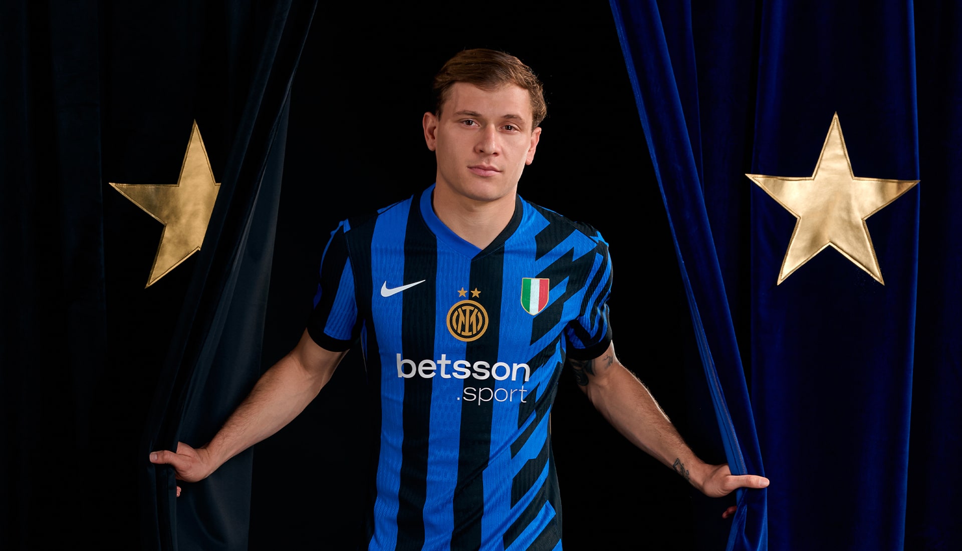
STOP. COMBINING. STRAIGHT. AND. DIAGONAL. STRIPES. ON. ONE. SHIRT.
Hartberg Home
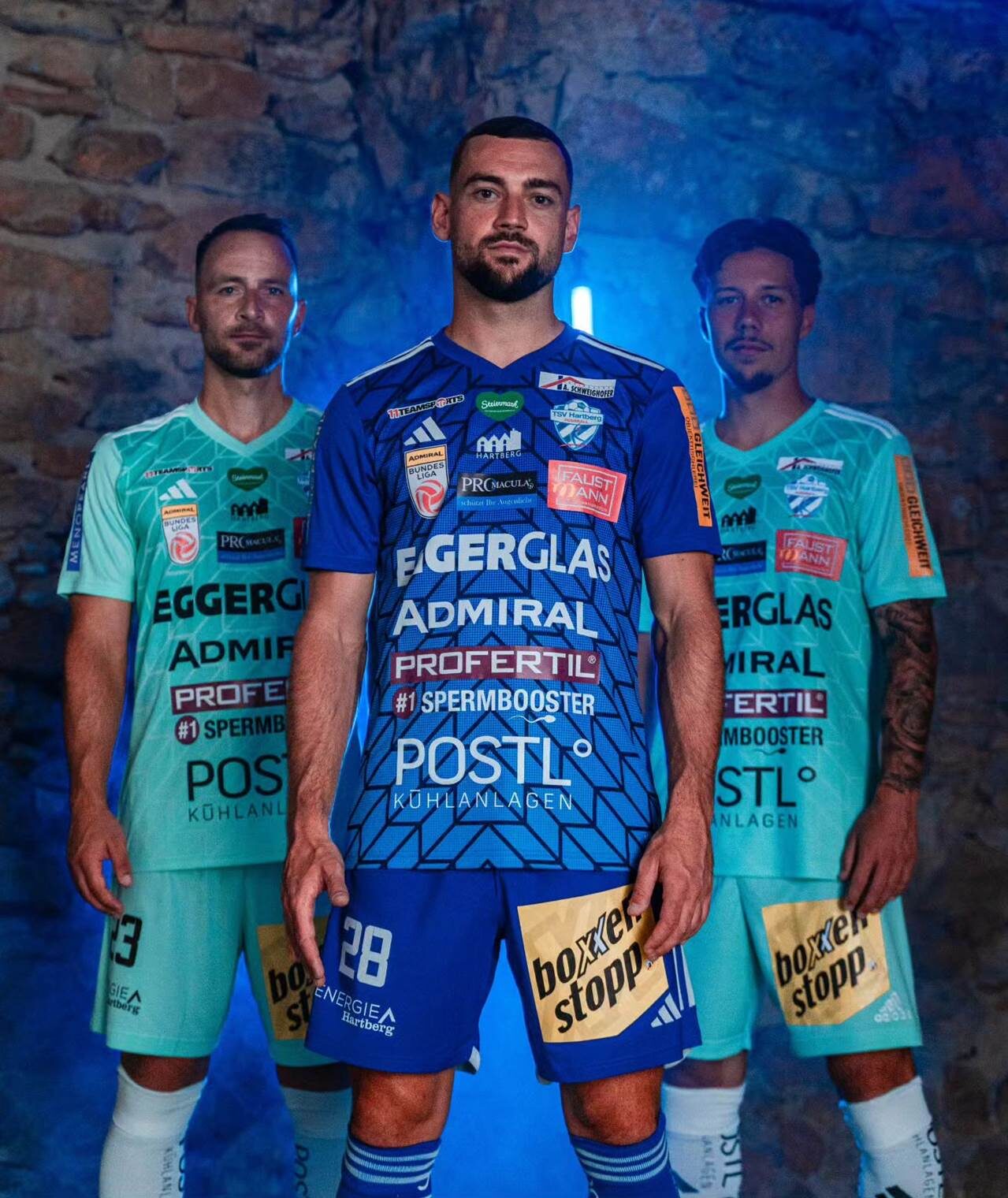
“#1 Spermbooster” is just one reason this shirt is terrible. And there are about 100 other sponsors to make up the rest of the reasons.


L MAns