From the certified hits to the head-scratching duds, we take a look at some of the best and worst 2023 Women’s World Cup kits.
The 2023 World Cup is in full swing, which means we’ve had a handful of unbelievable moments, shocking upsets, and perhaps most importantly, new kits.
Like we do with nearly every major competition in the soccer world, we break down the best, worst, and ugliest kits to grace the Women’s World Cup.
The Good
Germany Home
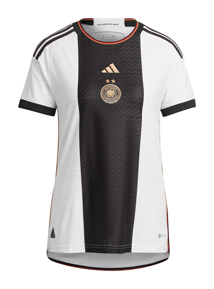
Easily a contender for the nation with the best kits in Australia and New Zealand, Germany’s home kit is the perfect mix of classic styling with modern details. The centered badge is executed properly, something which has been bungled a handful of times in other instances, and the tricolor neckline is a fantastic touch — it could be a little thicker, however.
Japan Away
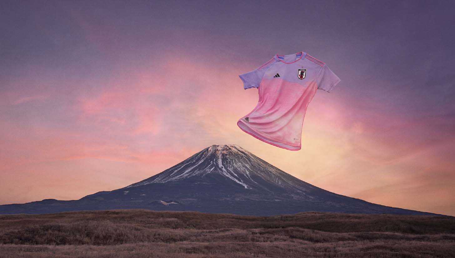
Quite possibly the kit of the year. adidas truly outdid themselves with almost all of their 2023 World Cup kits, but Japan’s away is by far the best. We get a mind-blowingly good gradient pattern with pink and purple hues that evoke sunset imagery. Even better is how this jersey looks with the entire uniform. It hasn’t made its debut on the World Cup stage yet, but when it does, it will be glorious.
Jamaica Home
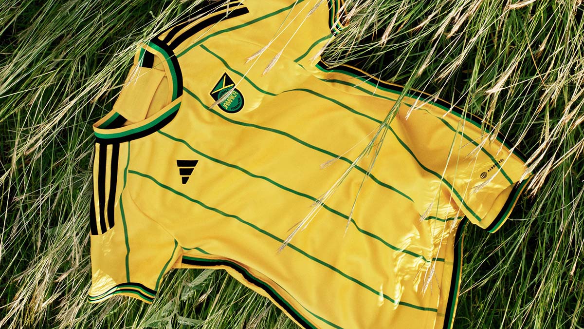
Another adidas hit. Teaming up with Wales Bonner, the Three Stripes’ Jamaica collection is absurdly good. The yellow home kit of the Reggae Girlz at the World Cup is particularly fantastic, but don’t sleep on the pre-match shirt, or even the more subtle yet still beautiful black away. Like Japan’s, the entire on-pitch ensemble is fantastic, down to the socks.
Switzerland Home
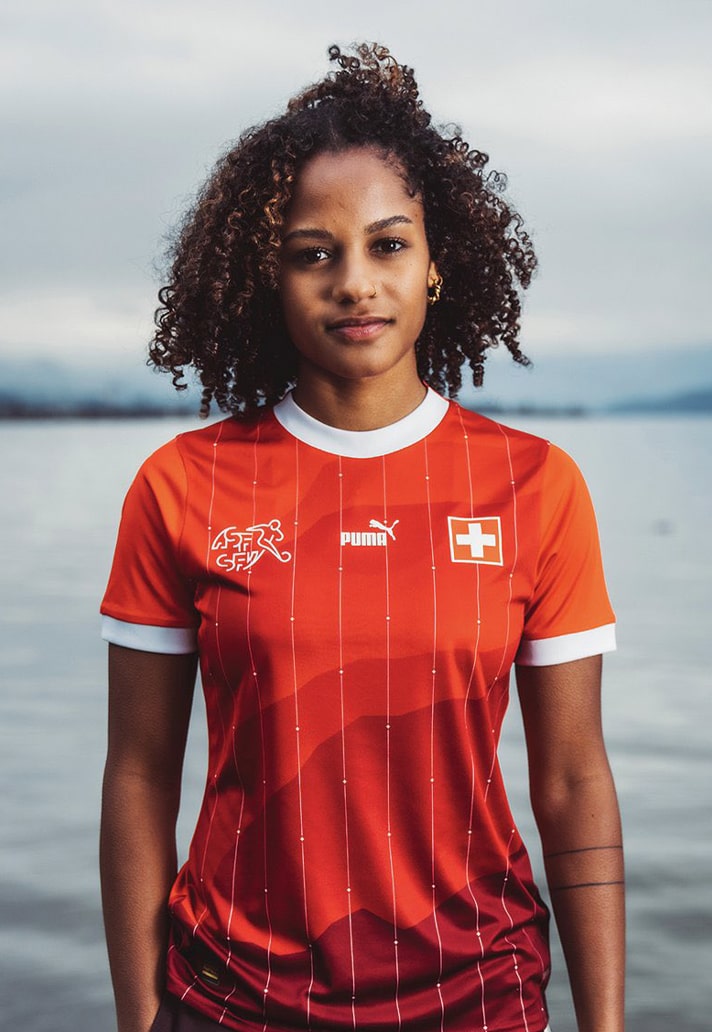
We already highlighted Switzerland’s home kit in our recent best 2023-24 kit releases (so far) story, but we had to revisit the stunning red shirt here. PUMA hasn’t had too many winners lately, but this one is a certified hit.
New Zealand Home
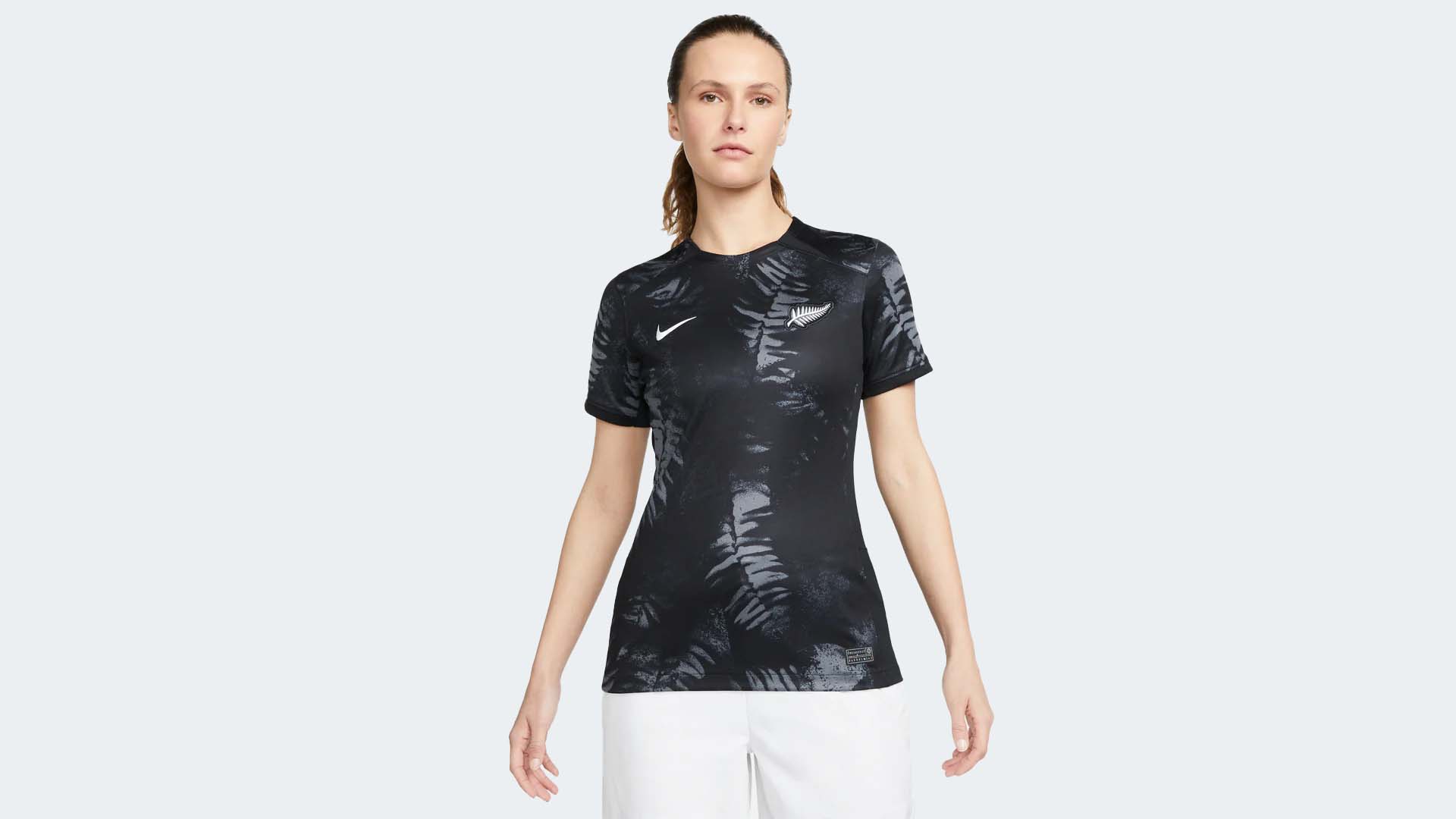
We’ll get to the majority of Nike’s 2023 World Cup offerings in a bit, but a bright spot from the Swoosh is the co-host’s home kit. Always one to have solid kits, the Football Ferns are decked out in a black shirt with a subtle fern leaf pattern throughout the body. It’s a look that really can’t go wrong.
Philippines Home
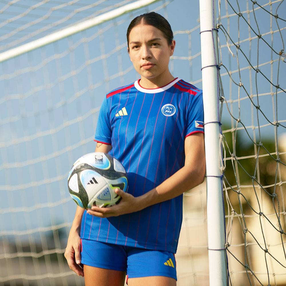
Making their World Cup debut, there are few better stories than the Philippines women’s national team’s journey to prominence in recent years. Their home kit is fitting for a footballing nation on the rise, and while there might be some personal bias here, these became an instant favorite upon release. Pinstripes are nearly always a good look, and the contrasting adidas logo makes for a nice detail.
South Africa Away
View this post on Instagram
Yet another nation with a fantastic storyline, Banyana Banyana are the benefactors of some pretty stellar home and away kits from Le Coq Sportif. A beautiful black and gold away ensemble highlights what is easily one of the shirts of the tournament.
The Bad
Nike Template

On their own, templates aren’t a bad thing. In fact, they’re actually pretty useful, economic, and efficient when done correctly. However, a poorly done template is an absolute abomination. Nike has themselves one of those in their 2023 World Cup lineup. The template itself isn’t horrible, but it runs the risk of looking way too plain when not in a bold color scheme. The United States, Nigeria, and Australia all have bright colors for their version of the template, and they all work pretty well.
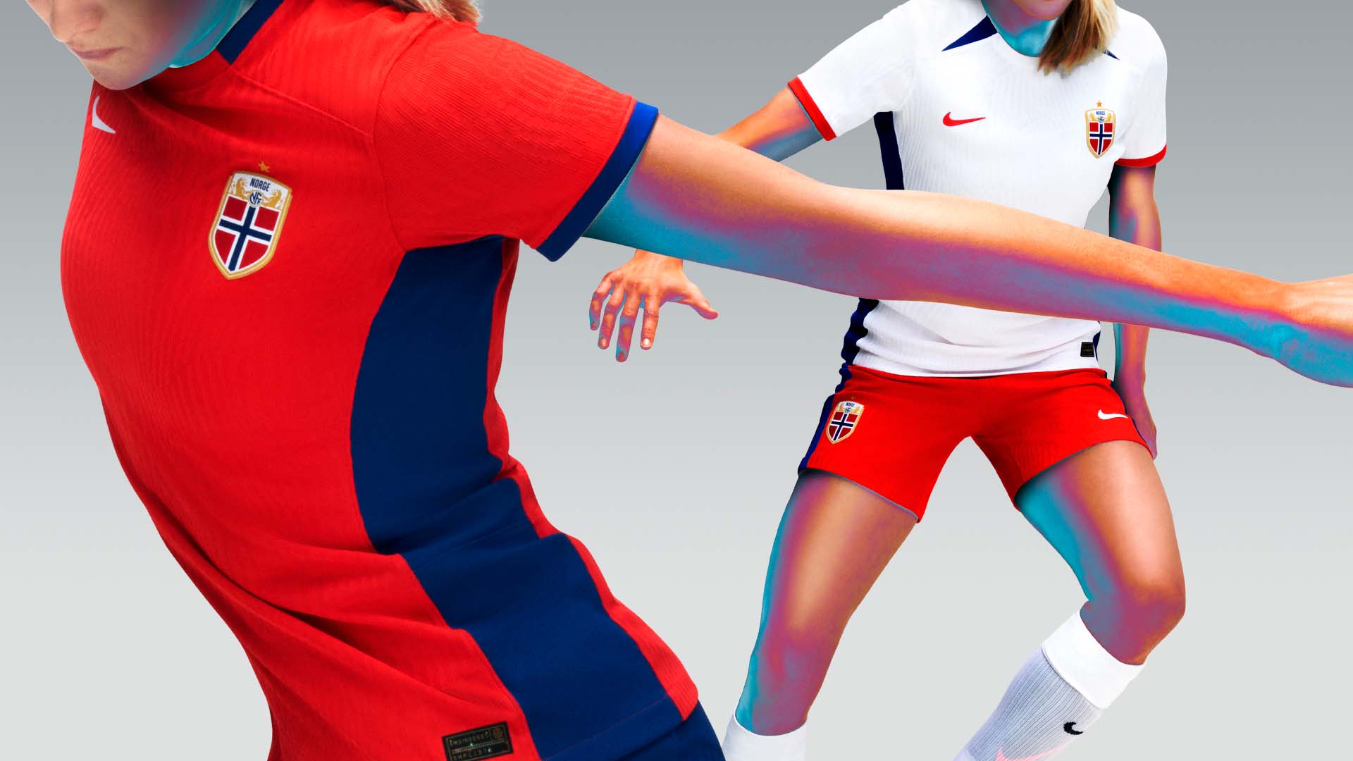
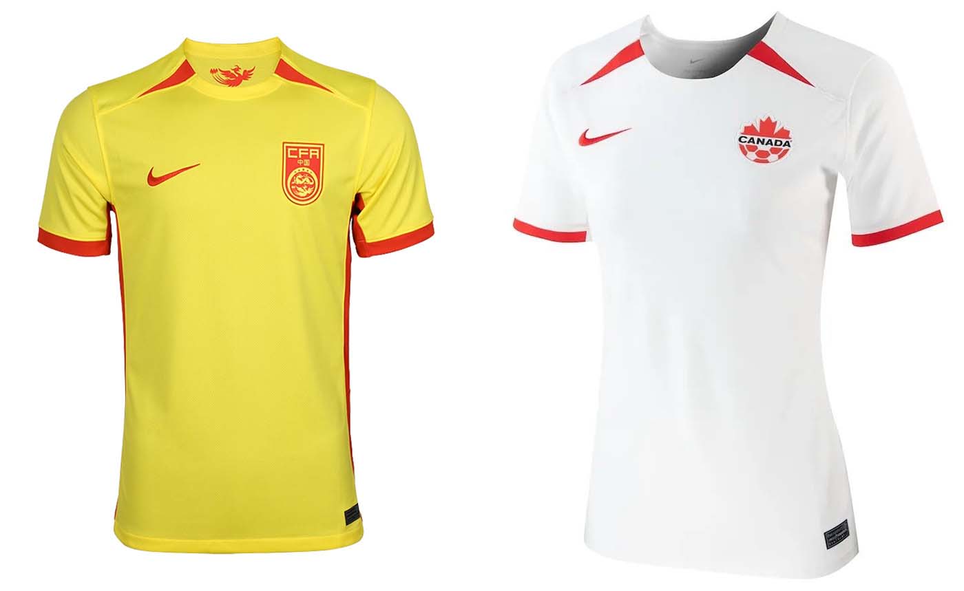
However, Canada’s away, England’s Home, China’s away, and Norway’s home and away are absurdly plain and boring to look at. For a brand with so many resources at its disposal, the Nike kits at the Women’s World Cup are massively disappointing.
Costa Rica Home
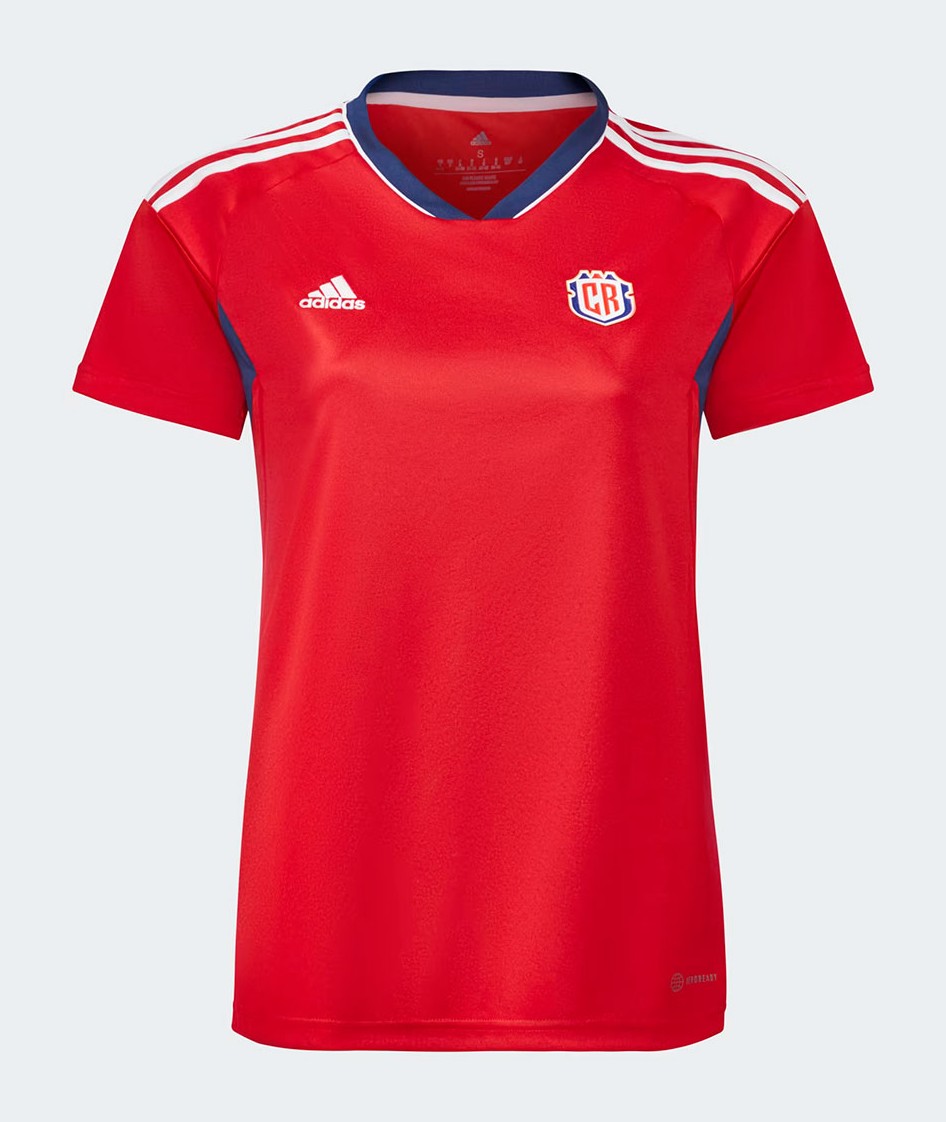
Another case of uninspired design. A plain red shirt with no real details and minor blue accents. An absolute snoozefest from the Costa Ricans, who recently switched to adidas from New Balance.
United States Home
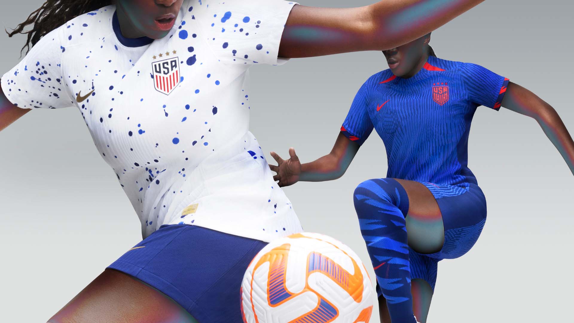
I’m not mad at this USWNT kit, especially compared to the men’s home kit at last year’s World Cup. But it seems like it was haphazardly constructed the night before the design deadline. There are no real interesting details here, just a white base with a paint splatter design that anyone with an Adobe Photoshop subscription could replicate in minutes.
The Ugly
Portugal Away
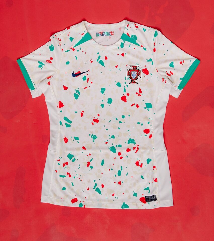
Nike said, “What if we took the USWNT home kit, but made it worse?” It looks like if you took a scoop of spumoni ice cream and threw it in sand. This shirt would be better off in the plain template category, which is saying a lot.
Brazil Away
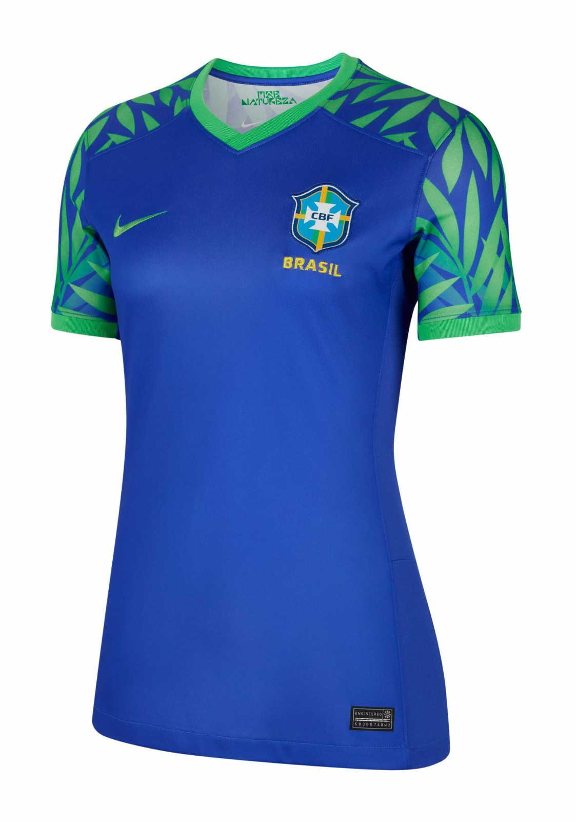
Brazil’s away kit isn’t 100% trash, but it has a certain unfinished quality to it. Like it’s still in its second draft waiting for notes. Match this with a pair of cargo shorts, neon Nike Elite socks, and some Roshe Runs and you’ve got yourself a certified 2013 middle schooler fit.
South Africa Third
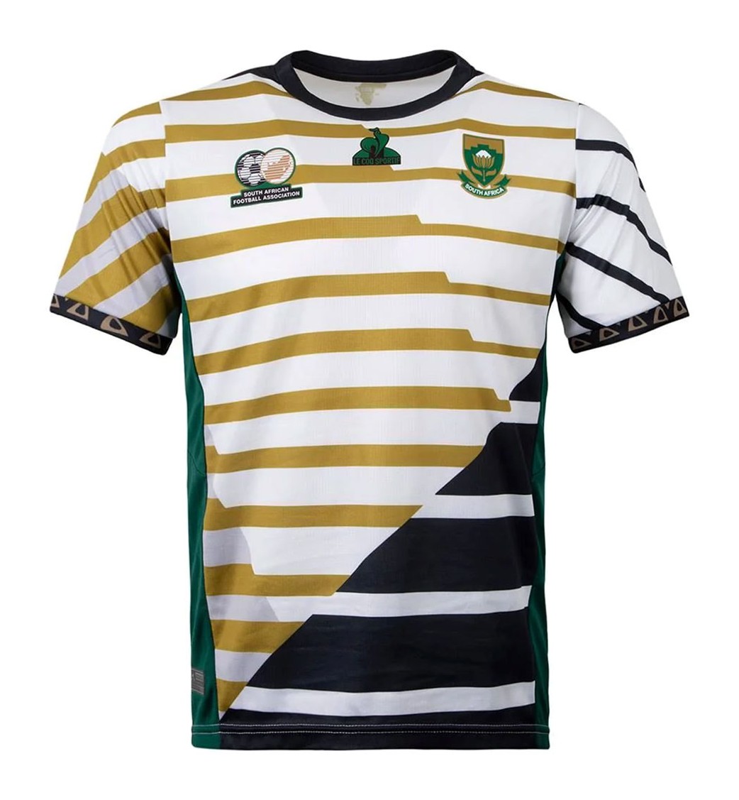
As good as the rest of South Africa’s kits are, their third kit is pretty bizarre. You have multiple patterns that don’t really go well together overlapping, and while I do like the color scheme, the design is much too busy and disorienting. It is pretty cool that Le Coq Sportif gave Banyana Banyana three kits though.


