A club with some of the most iconic shirts in football history, we take a look at the five best PSG kits to have ever been created.
Paris is the Mecca of fashion worldwide, and the same can be said for the city’s premier football club, Paris Saint-Germain, whose drops make headlines season after season.
We put two and two together and gave our two cents on the five best PSG kits of all time. It just had to be done.
5. 1993-94 Home
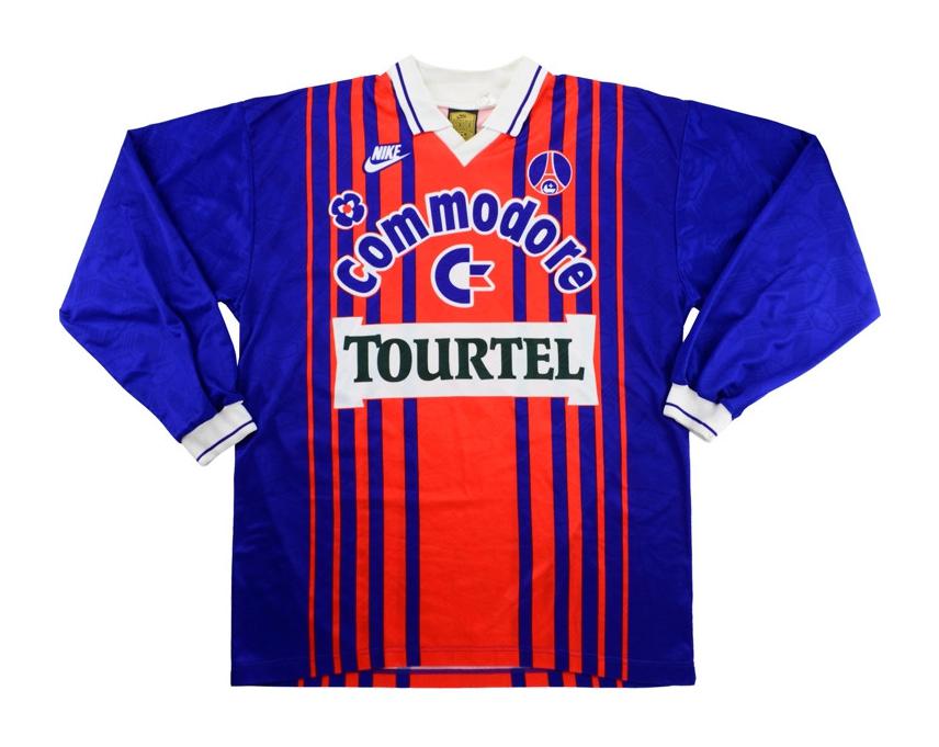
There aren’t many better examples that prove why retro kits will forever reign supreme.
Nike cooked up one of the most uninhibited iterations of a home kit you’re likely to lay your eyes on with this shirt — something Tottenham fans wish they could have said for the past couple of years. If you know, you know.
Unlike some of the more understated designs brought to the table by the French side in the early ’90s, the blue stripes across the shirt really have something to say here.
Additionally, this release doesn’t quite fit into the demands of the club’s valued Hechter Stripe design, which is typically a single, thick stripe going down the center of the shirt.
Aside from being a stunning design innovation that is easy on the eyes, the Hechter Stripe dates back to 1970 when it was first introduced by former club president and French-Belgian fashion designer Daniel Hechter, which makes it an individualistic fragment of PSG history. The omission of the design adds to the uniqueness of Nike’s creative process as it abandoned culture and tradition for making a statement.
And since we’re on the subject of making statements, having two shirt sponsors plastered on the shirt certainly makes this kit memorable to say the least.
It goes without saying that the Commodore (an American electronics manufacturer) and Tourtel (a French beverage brand) logos are irrationally loud in tandem. But what’s perhaps even more bizarre is what seemed to be a recipe for a tacky shirt actually led to one of the club’s most iconic ever releases.
Instead of finding ways to be subtle in promoting a pair of shirt sponsors, PSG went all in, and the result was as unreal as George Weah’s first touch.
4. 2000-01 Away
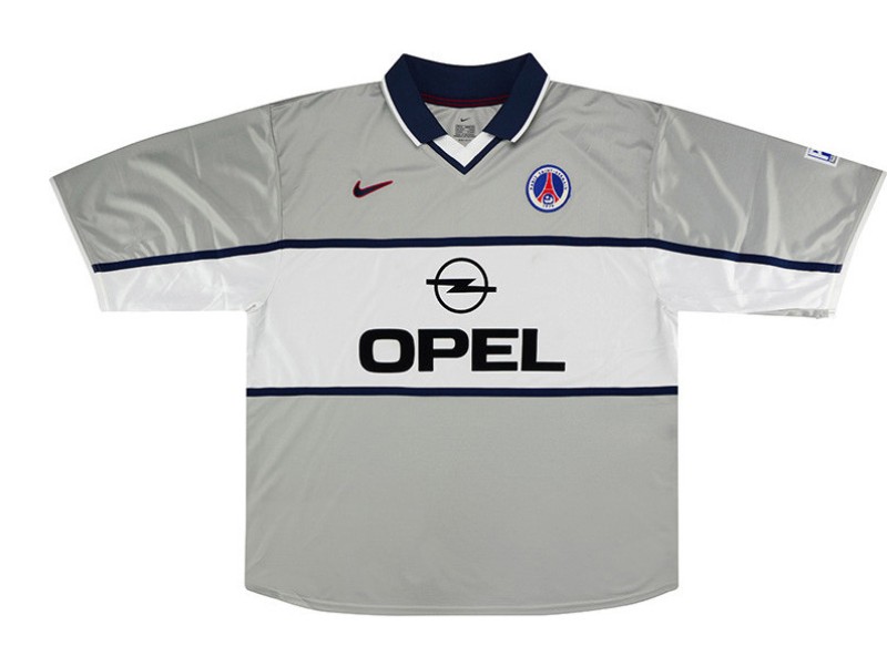
For how much of a belter this kit is, there is a case to make for it to be classed amongst one of the most under-appreciated shirts of all time.
Instantly, a major takeaway from this release is that considering away kits have a tendency to be quite outlandish, Nike’s approach to creating such a pristine shirt is one-of-a-kind in a sense.
As a result, the decision to base the kit around a criminally underused color in silver is a real winner here, because it instantly makes it one of the most niche, yet subtle approaches to designing an away kit you’re ever likely to come across.
The navy blue lines match excellently with the Opel front sponsor logo, while the horizontal white midsection makes an understated shirt pop without ever trying to be out there.
And perhaps one of the most standout elements that makes this kit so classy is that gorgeous navy blue collar, right above the white and blue v-neck, which is one of the few occasions where a v-neck actually works. For that alone, Nike deserves its flowers.
3. 2006-07 Away
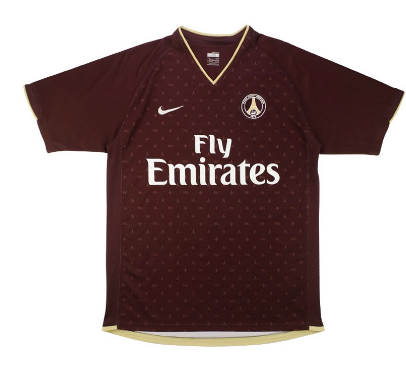
It wouldn’t be an unfair assumption to make if you thought someone rocking this kit was affiliated to Diddy in some way. This here is the type of lavish style choice you would have likely seen featured in the rap mogul’s daily rotation during the early 2000s, where shooting music videos on yachts was everyday living for him.
After all, PSG’s 2006-07 away kit was possibly the first-ever football jersey to be inspired by Louis Vuitton, which makes it anything but a surprise why PSG are unequivocally the most fashionable club in world football.
Using the iconic French brand’s trademark monogram logo as its dominant design template, the drop similarly adorns various club symbols across the shirt — including ‘PSG’ text, the Eiffel Tower, and the fleur-de-lis — to pay homage to one of the globe’s biggest fashion powerhouses.
The russet color palette is an absolute stunner, especially paired with the cream-colored v-neck, that is also featured in highlighting the Eiffel Tower and the bottom of the shirt to create one of the most tasteful away drops in the history of the game.
This was also PSG’s debut season with shirt sponsor Emirates Airlines, dawning the start of a fruitful era in which “Fly Emirates” was plastered on the front of some of the club’s finest shirts.
Additionally, it is key to point out how Nike went out of its way to use the kit to rep Paris to the fullest. The unabashed, yet tasteful approach of tying together the Eiffel Tower, the jewel in the city’s crown, and placing it adjacent to the club’s name all across the shirt exemplifies Parisian pride above all things else.
2. 1995-96 Home
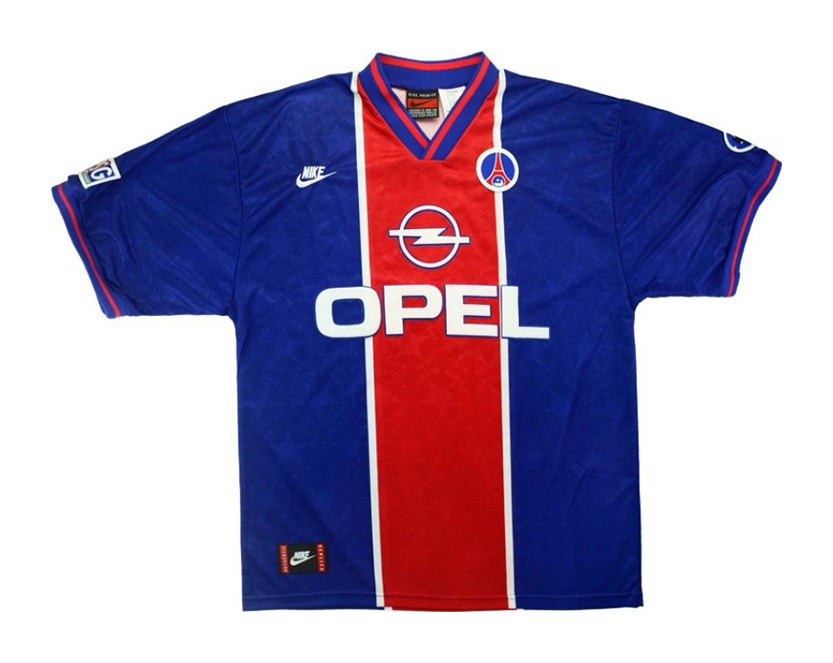
If Paris Saint-Germain’s 1995-96 home shirt isn’t one of the most glorious pieces of clobber you’ve seen on a football pitch, close this tab now and ponder over the fact that you can lie to yourself so easily. There’s almost too much to like here.
For starters, this strip is the start of the PSG x Opel era, which is one of, if not arguably the greatest joining of forces between a club and a shirt sponsor. And then there’s just the most ridiculously snazzy collar known to man.
A repeat of the innovative design choice put into place by Nike during the previous season, except for the fact that it has been taken to another level as it features the club’s two primary colors in sync instead of the blue and white color palette of its predecessor.
Similarly, the 1995-96 home kit also separates itself from the ’94-95 edition by sporting the lettered emblem on the sleeve, while donning a visual iteration badge as witnessed during the early ’90s, as this drop is anything but unimaginative.
Speaking of which, the embossed monogram of the club’s name brandished all over the shirt alongside an illustrative design element is yet another insight into the fact that Nike went out of its way to prove why Paris truly is the fashion capital of the world.
And for any fellow football kit geeks out there, to see the mid-’80s Nike logo in action on the right of the badge and in the jock tag are details that surely bring a smile to your face.
Also, this kit emphasizes why the Hechter Design is so valued by the Parc Des Princes faithful.
With the club’s supporters protesting in large numbers after witnessing the club walk away from the adored design after the launch of the current season’s kit, their fury is understandable to an extent after seeing how unreal it looked back in 1995.
1. 2018-19 Champions League Home
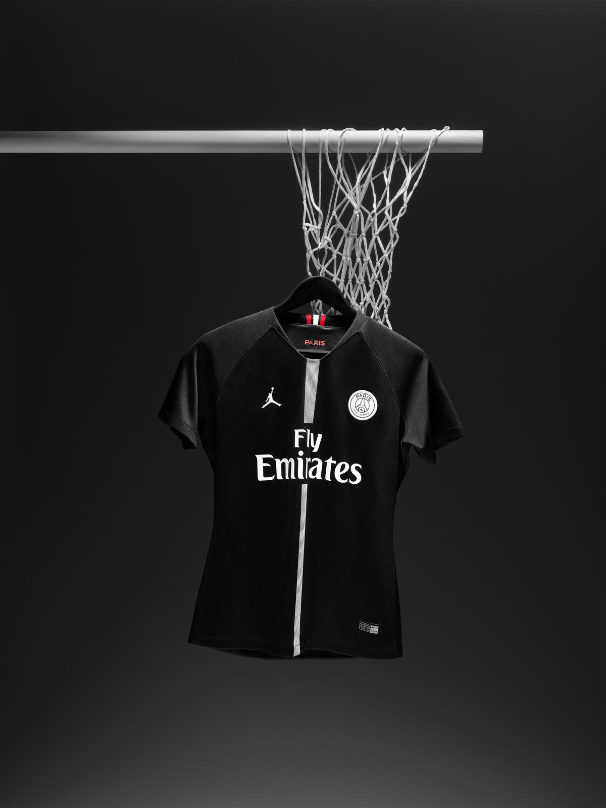
If this is a surprise, it shouldn’t be. For Air Jordan to join forces with a football club for the inception of a kit makes this PSG strip stand the test of time — even if it’s only been a few years since its release.
And one of the biggest and best reasons why this collaboration lived up to the billing was because the designers saw the chance to make history, and kept their composure by not going overboard with their final product just because the world waited with bated breath for what they had in store.
Instead, a sleek, minimalistic approach was enough to conjure a princely strip that was unsurprisingly the most sought-after kit in the market at the time.
The all-black and white color palate is effortlessly stylish, and considering it was dedicated towards the Champions League, the Parisians looked like they meant business every time they rocked up in a kit that is the closest thing to a three-piece suit.
The vertical black and white stripes ensure that this kit isn’t trying its hardest to be unnecessarily sleek, as it makes the shirt stand out and perhaps most pertinently, features a unique design element which is a common theme across each and every iconic PSG jersey.
Also, it is worth posing the question about whether the Parisians’ badge has ever stood out as much as it does in this particular strip.
Switching things up from incorporating the club’s classic blue and red color combination, the dominant shade of white makes the badge pop like no other, and the subtle injection of black to highlight the letters, ‘PARIS’ as well as the Eiffel Tower is worth giving a raise to the designers.
The golden jock tag logo is a nice touch that features the iconic Jumpman logo, alongside the letters PARIS to exude a sense of royalty. And does a Jumpman logo being a part of a football kit need any explanation of how much of a moment that is?
It’s going to be a tall order for any PSG kit to outdo this gem for an endless list of reasons.


