Welcome to Controversial Kits, a new series at Urban Pitch where we take a look at some of the most polarizing football shirt designs and argue both in favor for and against them. Up first, Urban Pitch contributors Ben Peres and Evan Taylor will be debating over the Liverpool Warrior kits, which have picked up a cult following due to their…let’s say distinctive look.
An Introduction
Between 2012 and 2015, Liverpool were in a state of transition. An eighth place finish in the 2011-12 season saw the club fire manager and team legend Kenny Dalglish in favor of Brendan Rogers. Luis Suarez had emerged as one of the top strikers in the world, yet the club had found little to no consistency, and the one chance it had of winning a Premier League title was foiled by a now infamous slip from another team legend, Steven Gerrard.
That three-year span also gave us some of the wildest kits in club history, courtesy of Warrior — a brand most known for its hockey and lacrosse apparel and equipment. Warrior’s time in the football world would prove to be short lived, with parent company New Balance taking over its duties in 2015. But the Warrior comet still burns brilliantly (or nightmarishly) in the minds of football fans across the world. We take a look at what would prove to be some of the most polarizing kit designs in the sport’s history, arguing both for and against them.
Pro Liverpool Warrior Kits
Proclaimed by: Evan Taylor
I know you think I’m insane. But I’m a man who believes in extremes. I love mid-January and July, baroque and non-representational art, and LeBronald Palmer and Whiskey (big shoutout to Deadstock Coffee). Extremism in kit design is where it’s at, and that is the epitome of Warrior’s Liverpool kits of the early 2010s.
Distinct, creative, batshit crazy: These are all positive words when it comes to designing a shirt. Warrior definitely took all of this to heart, especially in the 2013-14 season where this collaboration really shines. The home kit is a simple construction with toned piping and a two-striped cuff and collar combo. It screams early ’80s Liverpool. If you put an adidas logo on that, any Scouser would fall in love.

Now after the home kit is where it gets interesting because the away and third kits are on another level. Third shirts in particular are not bound by tradition and conservatism, therefore Liverpool’s 2013-14 third kit is even more experimental.
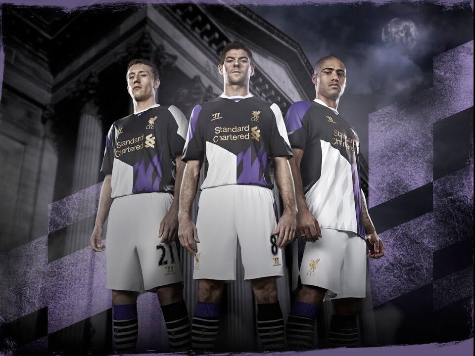
The mindset you need to have when designing a third shirt should be, “I’m going to create something that could get me fired.” And this is where the Warrior partnership really shines. I think that season’s LFC third shirt is probably in my top five favorite kits of all time. The black and purple is such a rad color scheme. The way it tapers off into a semi-color block shirt with the diamond pattern sublimated within pops like nothing seen before or after. It’s incredibly offensive to the eyes and I love it. So completely unique among top-flight European clubs. You will never see a design this unhinged again by anyone else (maybe other than Valencia). The sheer spit-into-the-wind mentality it took to design and produce this is mind-boggling. These designers deserve a plaque and statue outside Anfield for their work in advancing culture and art.

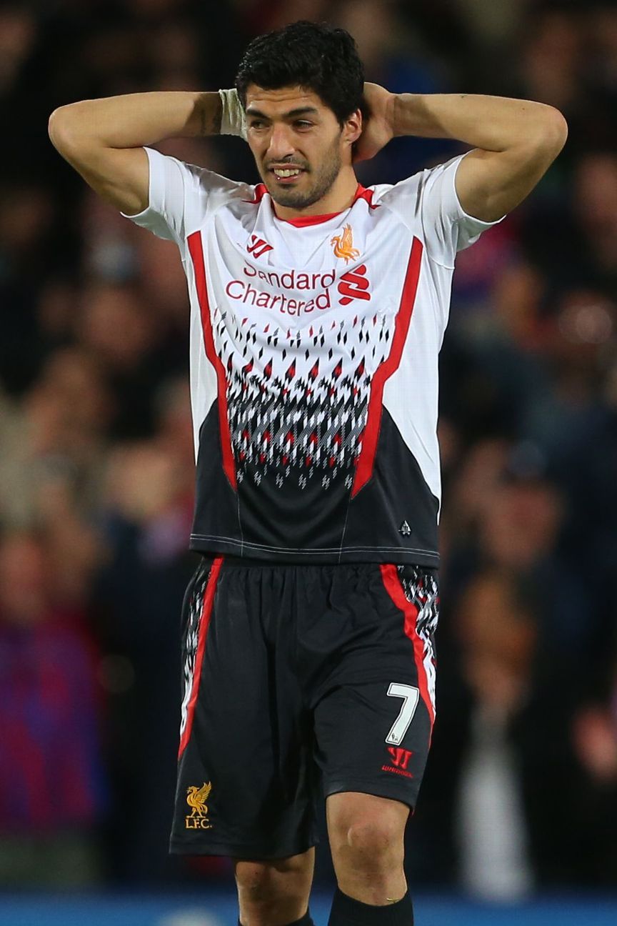
The white away shirt cannot be praised enough as well — almost 10 years ahead of its time with the ’90s retro print while keeping the early 2010s rigid panels on the shoulder blades and print border. It’s a collage and mishmash of so many different sportswear design philosophies, and I can see how it might come across as ugly for some viewers. However, I can’t help but appreciate the diversity of design that this shirt selection showcases.
These shirts are definitely not for everyone, but everyone should appreciate what they are: distinct, creative, and batshit crazy. They have all the characteristics of what makes a great football kit.
Anti Liverpool Warrior Kits
Proclaimed by: Ben Peres
Since Jurgen Klopp took over at the helm in 2015, Liverpool has experienced a major glow-up. Sure, the club has more or less always been incredibly historic with some of the world’s best fans, but pre-Klopp, the results were erratic, and there was a 30-year Premier League title drought that only ended in 2020.
That drought included plenty of heartbreak, perhaps none bigger than the infamous Stevie G slip that cost the club the 2013-14 league title. But that wasn’t even the worst part of that season. The third kit that Evan gushes in praise over hurts my eyes more than any other kit in the club’s history.
Of all the offensive designs Warrior brought upon Liverpool, the 2013-14 third kit is the worst of the bunch, with a tri-color mashup that not even satirical fashion designers would be proud of. The execution of the kit is the issue, not so much the design. The team at Warrior tried to recreate the eccentric exuberance of the ’80s and ’90s, but instead of creating a fit or texture that mirrored those years, they kept a modern, technical fit that seemed to almost glue to Liverpool players’ skin. Throw in a boxier fit or an oversized collar, and the kit is completely revamped, with vintage energy that would remind fans of the creativity and success that flourished in the ’80s.

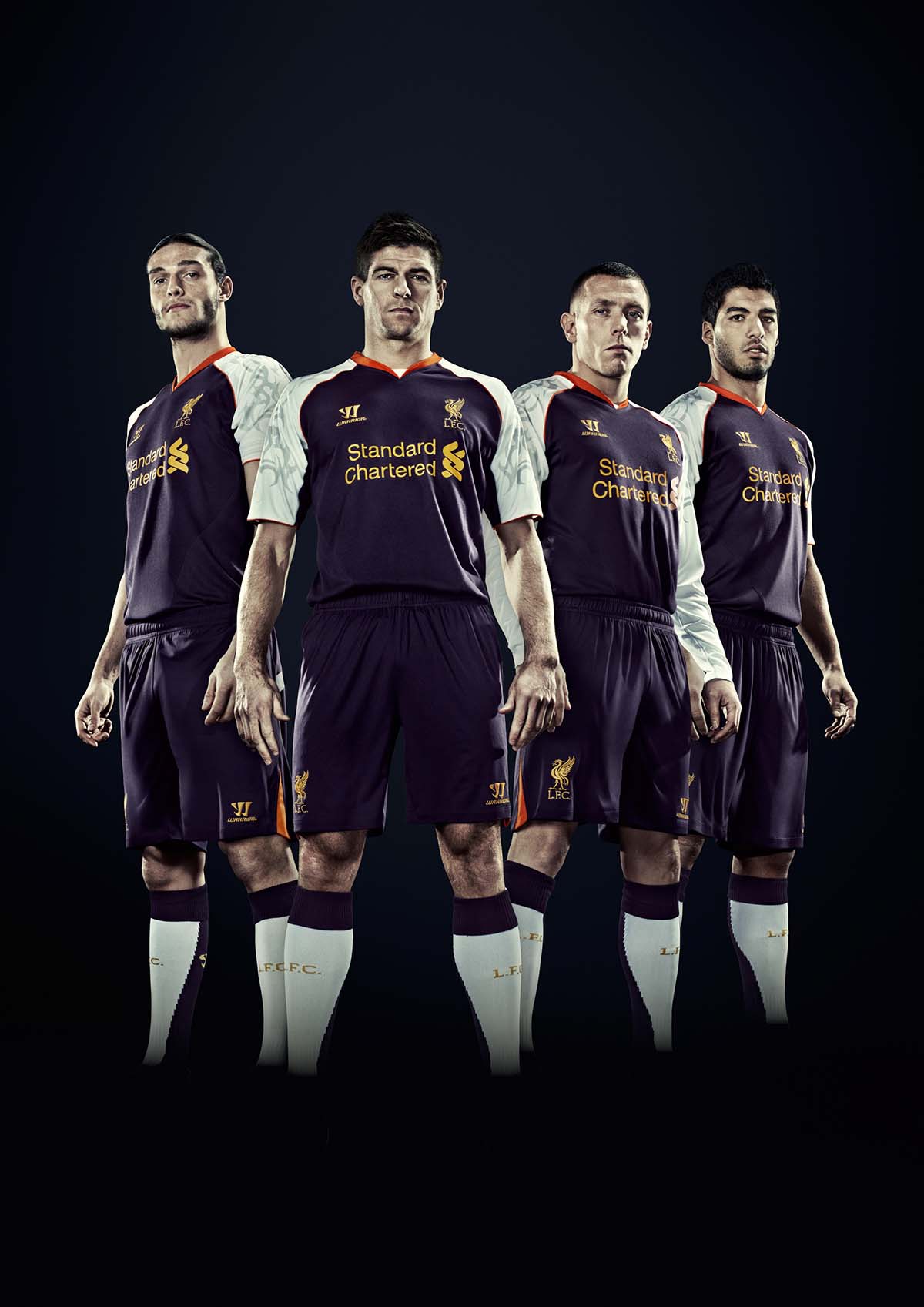
There are basically no other kits in the range that I would classify as “good” in the classical sense. For example, the 2012-2013 third kit looks like a knock-off jersey that you would find at a flea market. Even in the promotional photos, the jersey looks heavy and low quality. Add a tribal tattoo-inspired sleeve pattern, and you are left wondering what this has to do with Liverpool FC.
While many people love how terrible these kits are, as discerning fans of the beautiful game, we must demand better. Hopefully, these jerseys don’t become considered “fashionable” in a vintage sense, like long-sleeved goalie kits from the early ’90s. Us kit nerds don’t want to be connected with such questionable design decisions.


