
With the MLS season set to kick off this weekend, we take a look at the best and worst of the new kit drops over the last few weeks.
A new season brings in a wave of hope and expectations amongst fans every year, but one thing that particularly excites us are the new kits. While many have been critical of MLS kits in recent years (oftentimes rightfully so), there have been a few gems littered in with the cookie-cutter jerseys of the top flight of American soccer.
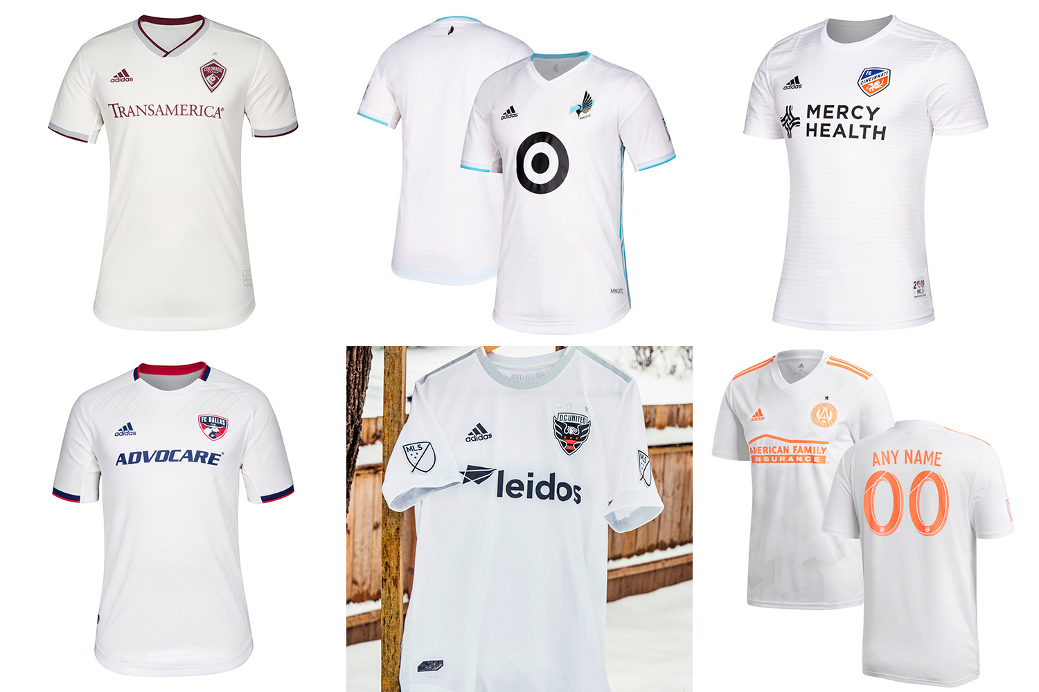
We’ve closely followed the unveiling of kits from each MLS team as we roll into the 2019 season, and for the most part, it’s been more of the same. While there are a few applause-worthy efforts to break away from the largely templated kits of years past, if you were to look at most teams’ away kits from afar, they’d be indistinguishable. It doesn’t get more uninspired than a plain white shirt with a sponsor and crest.
That doesn’t mean that it was all bad though. We’ve rounded up the good, the bad, and the downright ugly 2019 MLS kits for your viewing pleasure.
The Good
New York City FC – Primary
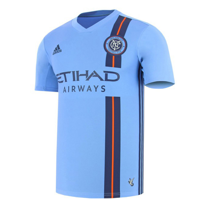
New York City FC’s new home kits are the cleanest out, with a vertical pinstripe paying homage to the New York state flag. The pigeon, the city’s unofficial bird, also makes an appearance on the bottom of the jersey, which is a nice little touch.
Portland Timbers – Primary
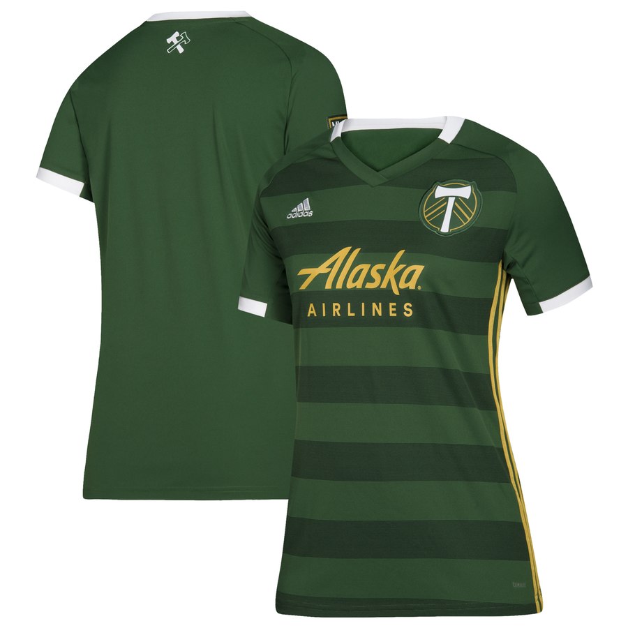
The Portland Timbers always have some of the classiest kits in the league, and this year is no different. Evoking images of Sporting Lisbon’s famous jerseys, the Timbers go with alternating light and dark green horizontal stripes for a clean and bold look.
Vancouver Whitecaps – Primary
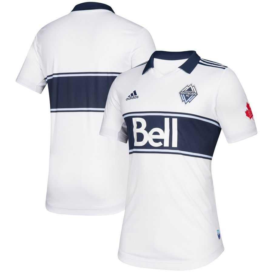
While the new Vancouver Whitecaps home kit may not be as pleasing on the eyes as the NYCFC or PTFC kits, they get credit for going retro. The kit is based on the one worn during the 1979 season when Vancouver won the NASL Soccer Bowl. American soccer doesn’t have a long history, so you have to rep it when you can.
The Bad
Minnesota United – Secondary
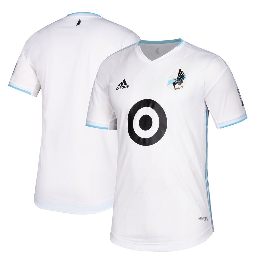
Their inaugural season kits were solid, but we were a little disappointed when Minnesota United unveiled their 2019 edition, entitled “Drift.” Supposedly the texture of this kit evokes the drifting and accumulation of snow, which is a thing in Minnesota, but the real question is how close do you have to get before it doesn’t look like just a plain white shirt?
Colorado Rapids – Secondary
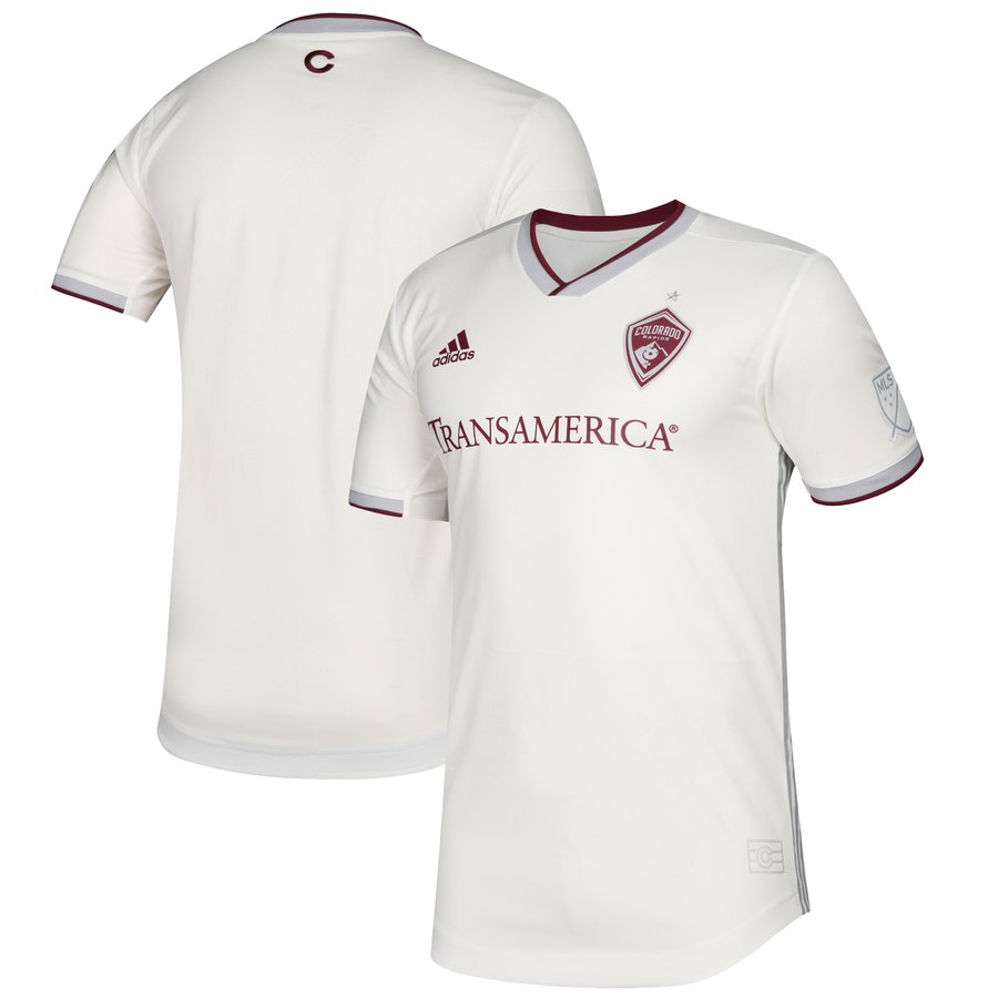
The Colorado Rapids’ newest away kit is meant to represent the white water created by rapids — oh wait it’s just another blank white shirt with a logo on it. Super creative.
DC United – Alternate
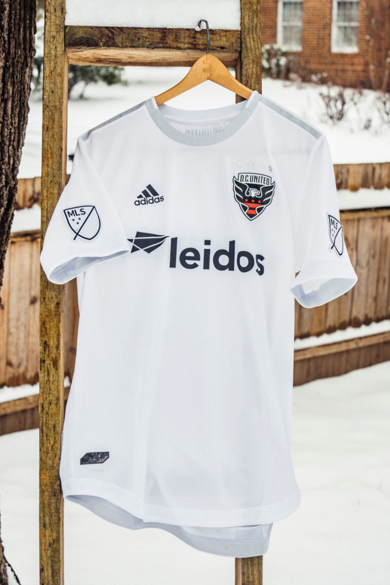
Third time’s the charm on DC United’s new alternate kit. Is there really anything more we can say? There’s a line between “clean and minimalist,” which is the description used in the official kit release, and downright lazy.
The Ugly
FC Cincinnati – Primary
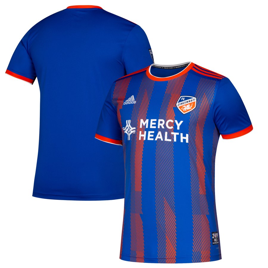
Hopefully FC Cincinnati plays better than they’ll look in this Microsoft Paint-inspired getup, which features odd orange vertical stripes on a blue backdrop. The club’s away kit doesn’t make things any better, as it got the MLS plain white shirt treatment as well.
Philadelphia Union – Secondary
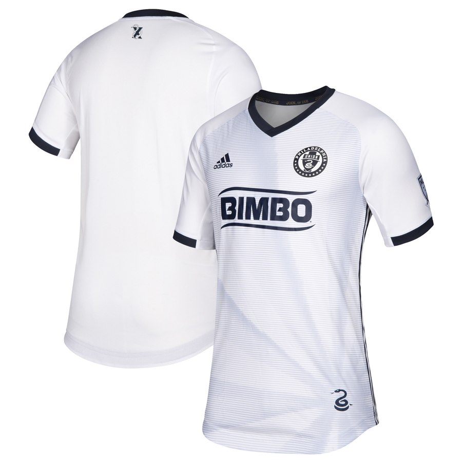
Philadelphia Union’s newest away kit is a great concept but executed horribly. Other than the snake on the bottom of the jersey it’s just sort of bland. This jersey should be better than the plain white ones, yet it’s somehow worse.
Real Salt Lake – Secondary
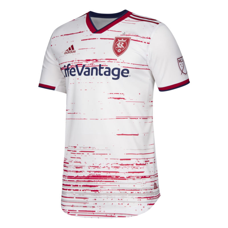
Similar to Philly’s kits, Real Salt Lake’s away shirt has a little more spice than the plain whites of other clubs, but it’s quite an eyesore. Reminiscent of a printer ink test sheet, the phrase “this ain’t it” comes to mind upon gazing on this shirt.
What is your favorite 2019 MLS kit? Let us know in the comments below!


