
With last week’s Cincinnati FC crest unveiling receiving mixed reviews, we thought we’d see how it stands up against the rest of the MLS crests.
Early last week FC Cincinnati, the fledgling MLS franchise set to join the league in 2019, officially unveiled their new club crest. While some seem to like the new emblem, others had plenty of critiques to offer. Given its polarizing nature, let’s look at where FC Cincinnati’s crest ranks among the rest of the league.
We divided all of the MLS crests into four different tiers, going from the worst (Tier 4) to the best (Tier 1).
Tier 4: Thanks For Clarifying You’re a Soccer Team
25. New York Red Bulls
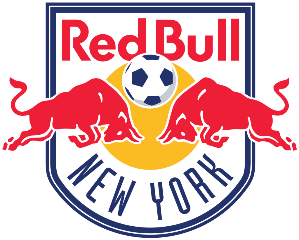
There’s really nothing worse than a soccer ball in a team crest, especially if it’s not stylized in any particular way. The New York Red Bulls somehow make the ball even more of an eyesore by surrounding it with a pair of the trademark logos from its energy drink owner. On top of that, the New York Red Bulls crest isn’t even original — other Red Bull-owned teams such as the Bundesliga’s RB Leipzig have remarkably similar crests.
24. San Jose Earthquakes
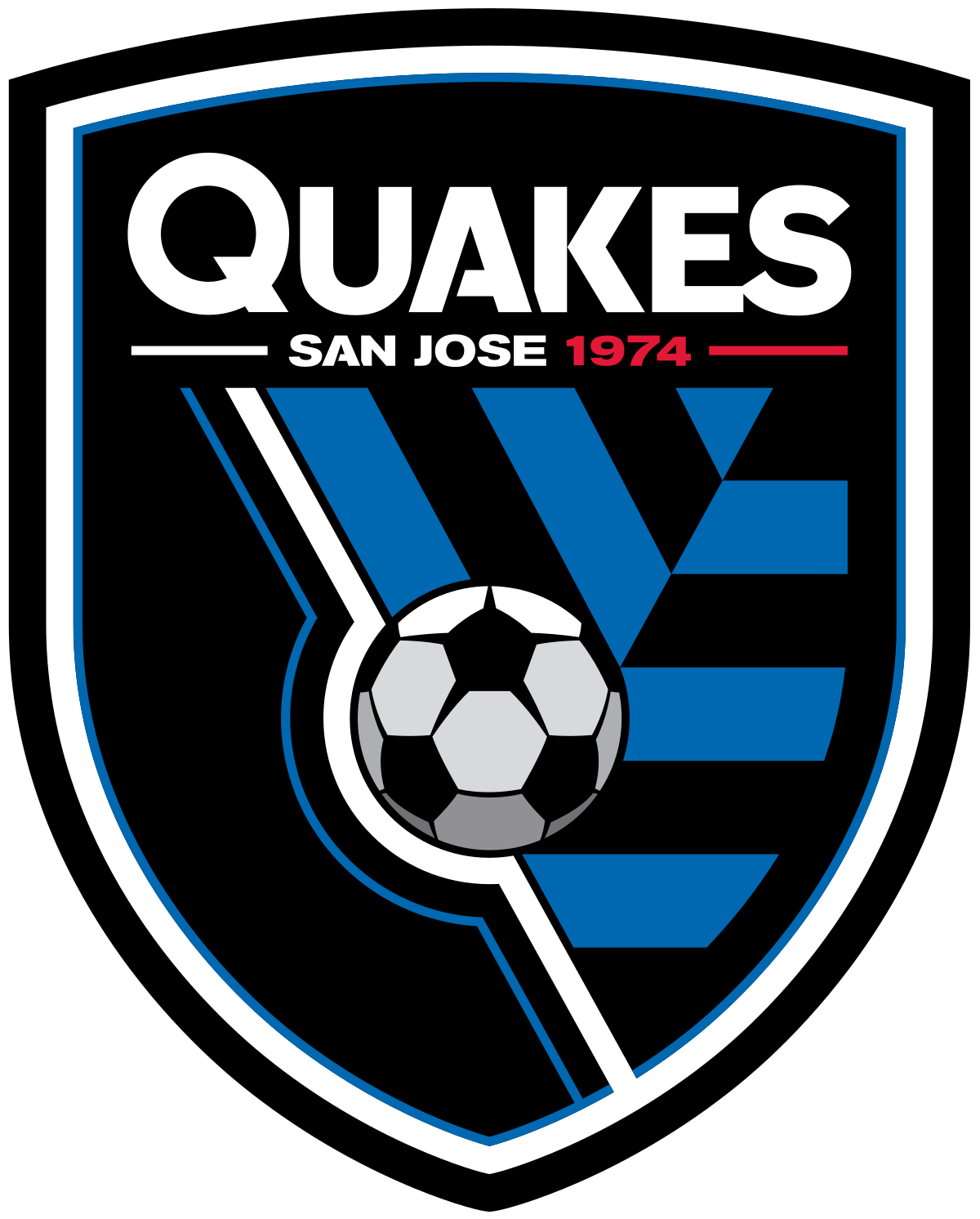
Looking like a youth club team crest more than anything else, it’s impossible to ignore the giant ball present front in center of the San Jose Earthquakes’ logo. To be fair, without the ball there, it could be a team from any sport, including Minor League Baseball’s Rancho Cucamonga Quakes. Imagine the confusion and chaos that’d ensue if the ball was removed! Also, the blue and black pattern to the right of the soccer ball is a bit nebulous, with a deeper meaning not easily apparent (if there even is one).
23. New England Revolution
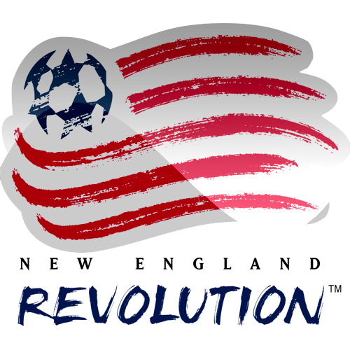
While New England Revolution’s use of a ball in their crest is better than most, it still looks rather outdated. If you were thinking that this crest looks like that of an MLS 1.0, that’s because it is. Maybe it’s time for an upgrade? Given the vast history of the New England region, one would think that the club could do better than an American flag with a soccer ball in the corner.
22. Houston Dynamo

The Houston Dynamo crest is presentable, but again, we can’t condone the soccer ball usage. While it’s not the crest’s main draw, that doesn’t make it any less lazy. The star below ‘Dynamo’ is in reference to the star on the Houston flag, which is cool, but it could use some spicing up.
21. Real Salt Lake
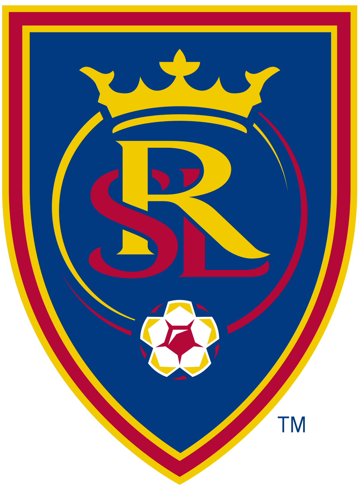
At this point, there’s really not much left to say. Trying to ignore the spherical abomination at the bottom, Real Salt Lake’s crest is passable. The color scheme along with the crown and the arrangement of the letters is OK, but it still seems like something’s missing to tie it all together.
20. Colorado Rapids
![]()
The Rapids’ crest has potential, but there’s something about the middle of that mountain that has us second-guessing it. Not quite sure what it is.
Tier 3: Solid, But Could Use an Upgrade
19. LA Galaxy
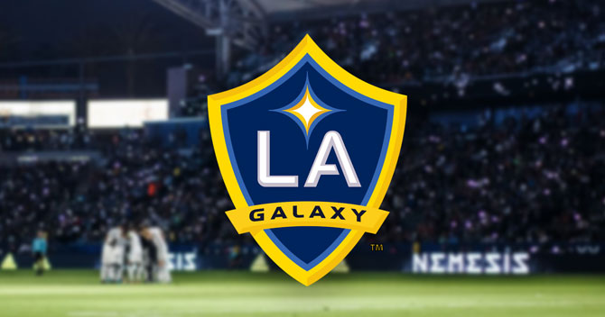
While the LA Galaxy have the most recognizable of all MLS crests, that doesn’t mean it isn’t a bit boring. It looks like a template crest, and has no real connection to the city of Los Angeles. We’d love to see the return of their original logo.
18. Chicago Fire
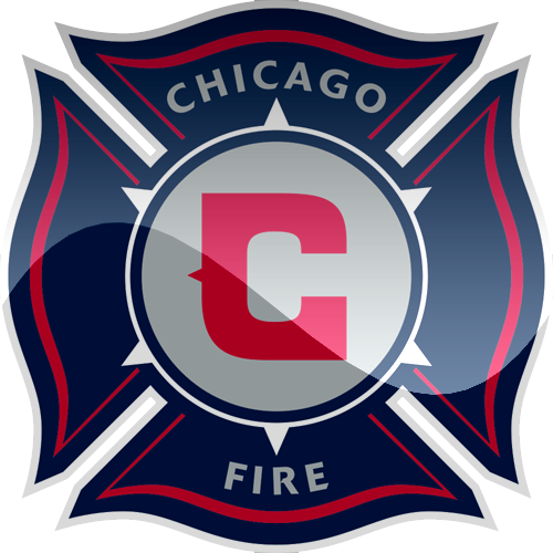
The Chicago Fire crest is OG, but there’s not much that’s visually appealing or exciting about it. The Fire may be better off doing at least an updated crest sooner rather than later.
17. FC Dallas
![]()
The FC Dallas crest could use an upgrade, with the only exciting feature being the trademark Texas longhorn. Upon closer examination, there’s a star on the longhorn’s neck and an indistinguishable flame on its forehead in a nod to the club’s original name Dallas Burn.
16. FC Cincinnati
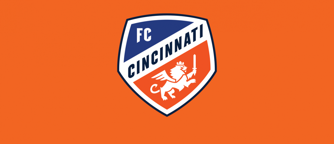
FC Cincinnati’s USL crest had so much potential, but the club jettisoned that for this one in an…interesting move to say the least. The slanted Cincinnati supposedly represents a city on the rise, and the ‘FC’ stands for football club even though the crest is supposedly celebrating the city’s German heritage (the club’s legal and official name is Fussball Club Cincinnati, however). All of this is OK at best, but what really brought down this crest in particular was the strange and overly-explanatory reveal video the team released.
15. Orlando City
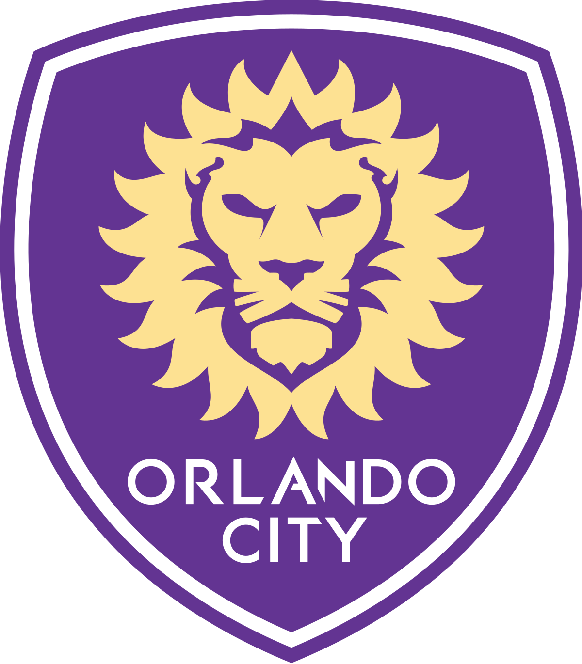
Orlando City’s crest is just too basic, with a generic template shape filled by a lion with the club’s name below it. The lion is a nod to the club’s USL dominance in the past, which is nice to acknowledge on a crest, but not if it’s the only thing.
14. Sporting Kansas City
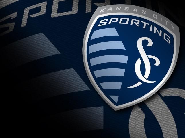
Sporting Kansas City’s crest is relatively new given the club’s age. In 2010, the then Kansas City Wiz went through a complete rebrand, changing just about everything in regards to the club’s aesthetics. The horizontal blue stripes on the left of the crest represent the state line divide in the city, but that’s the only notable thing about it.
Tier 2: Now We’re Talking
13. Toronto FC

Toronto’s crest is solid but unspectacular. Aside from the capital “T” in the backdrop, the only other distinguishing feature is the Toronto maple leaf silhouette on top of the crest. Regardless, it gets the job done.
12. Montreal Impact
![]()
There’s a lot going on in the Montreal Impact crest, but there’s a lot to like. The fleur de lys, the official emblem of Quebec found on the provincial flag, is the main attraction. The four stars to the right of it represent the four original settlers of Montreal as depicted on the city flag.
11. Inter Miami CF
![]()
While the David Beckham-backed Inter Miami CF hasn’t even officially played a match yet, they’re killing it in the style department. The black and pink color scheme combined with the herons makes for a stunning crest.
10. NYCFC
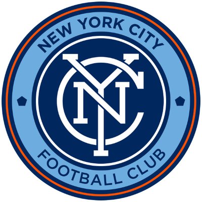
NYCFC’s crest is great, with the club’s powder blue colors mirroring parent club Manchester City. The interior of the crest with “NYC” intertwined is classic, inspired by the old New York City Subway Token created in 1953 by the Transit Authority (but also looking a bit derivative of Inter Milan).
9. Vancouver Whitecaps
![]()
Yet another Canadian club with a great crest. The Whitecaps are able to effectively incorporate their team name into the logo in an elegant and eye-catching way, which is pretty difficult to pull off.
8. Seattle Sounders
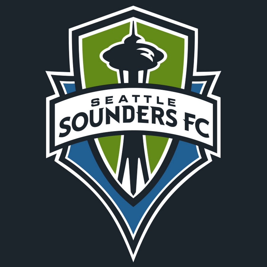
Seattle’s crest is legit, with the city’s most recognizable landmark serving as the backdrop and centerpiece. Combined with the club’s blue and green colors, it’s simple but effective.
7. DC United
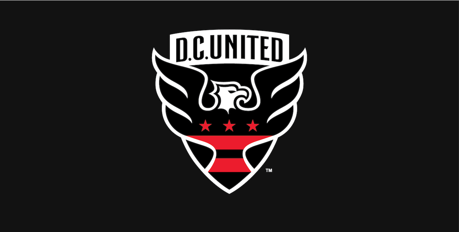
DC United’s crest has always been fresh, but it keeps getting better with every update. While the latest edition, which was introduced in 2015, has not drastically changed from the original, the club did remove soccer balls from the bottom of the crest while simultaneously enlarging the eagle. Also adding the stars and bars from the Washington, D.C. flag is a nice touch.
Tier 1: The Cream of the Crop
6. Philadelphia Union
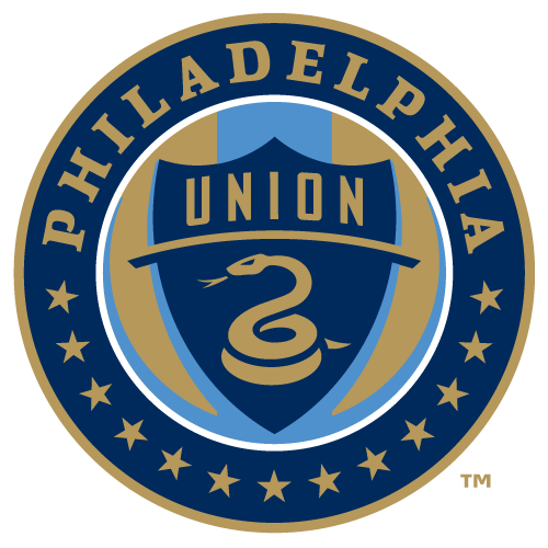
The Philadelphia Union’s crest is fantastic, with the ‘Join or Die’ snake taking center stage in an ode to Philadelphia’s son Benjamin Franklin. The blue and gold color scheme and stars on the edge of the crest really bring everything together as well. History buffs grab your kits now.
5. Columbus Crew
![]()
Like many of the original MLS clubs, Columbus has drastically changed their crest in recent years. The circular shape is a shoutout to Ohio, as well as the German heritage of the city and the generally circular crests of Bundesliga teams. The inside of the logo pays tribute to the club’s history, which to the delight of many looks as if it is going to continue in Columbus instead of uprooting to Austin, Texas.
4. Portland Timbers
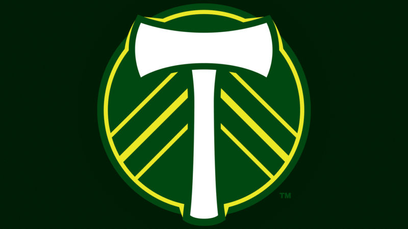
Portland’s crest is an MLS classic, with the now famous axe acting as the centerpiece and doubling as a “T” for Timbers. While it’s a simple crest, it fits so well, from the axe to the color scheme.
3. Minnesota United
![]()
Minnesota United has one of the coolest crests in all of MLS. They have the state bird, the loon, as its main piece. The North Star and upward pointing direction of the crest were inspired by the state motto as well.
2. LAFC
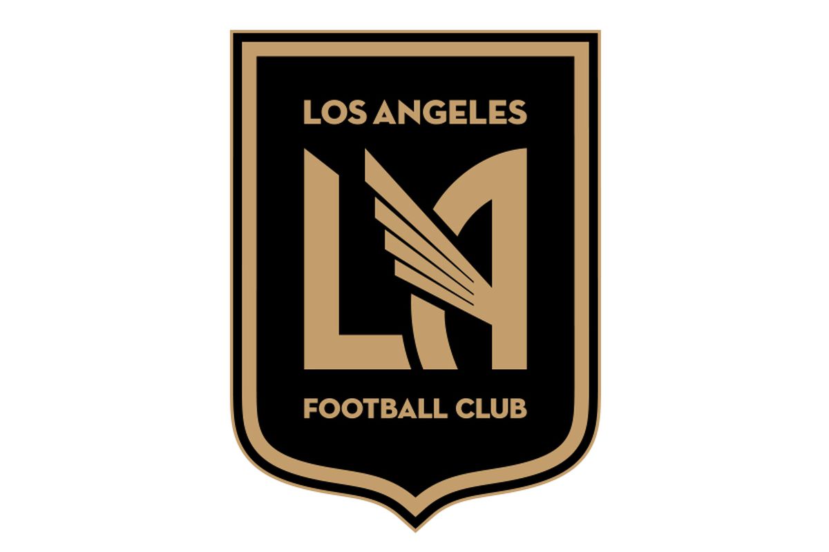
LAFC really nailed their crest, with a dope wing on the ‘A’ acting as a nod to LA’s first soccer team, the Los Angeles Aztecs. The crest is also art deco-influenced, which is part of the rich history of downtown Los Angeles.
1. Atlanta United
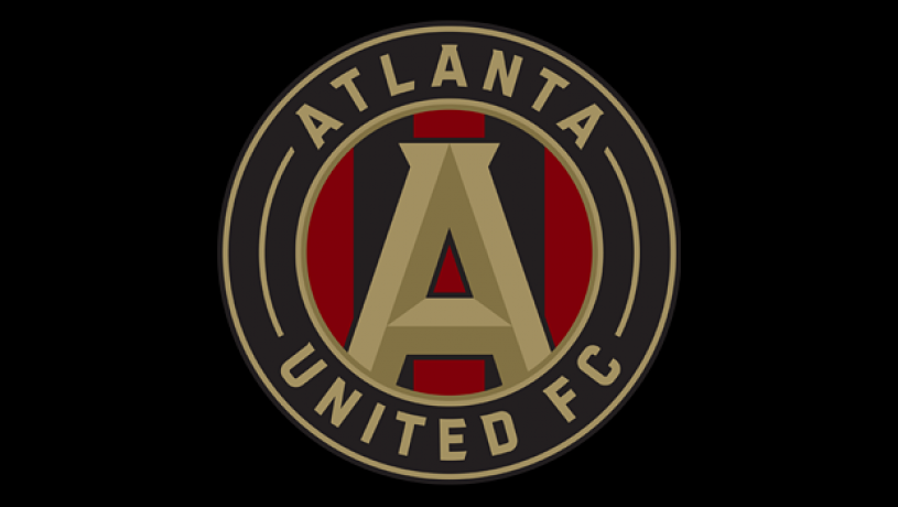
On the pitch Atlanta United is the class of MLS, and that honor extends to their crest as well. The five stripes behind the “A” represent the pillars of the team’s character — unity, determination, community, excellence, and innovation. The black stripes are also a nod to the city’s history as a railroad town.
Which of all the MLS crests reigns supreme? Sound off in the comments below!


